Anna’ Stampin’ Cave – How-To: Partial Die-Cutting To Extend Your Square Dies
Couple of weeks ago I posted on my blog this lovely card and I had an enormous response, and questions on how I turned a square from Stitched Shapes Framelits Dies into the rectangle.
I hoped to post it earlier but as always life got in the way. But finally, I got around to show you how I did it. The technique is called partial die-cutting.
By no means, I didn’t invent this technique. It’s been around for a long time and is usually used to create pop-up elements or intricate borders.
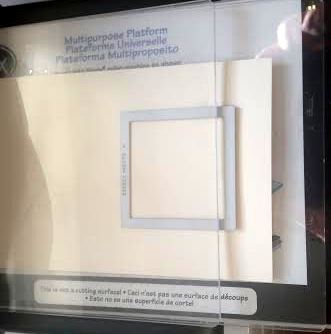
To create a rectangle I took a piece of cardstock and my square die. I’ve used Stitched Shapes Framelits Dies, but you can use any thin square dies for this technique.
I placed the die, with the cutting edge down, on a piece of cardstock. I set the top plate of my cutting sandwich so that is only partially over the die. The portion that is under the top plate is the part that will get cut out. I run it through the Big Shot.
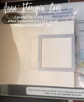
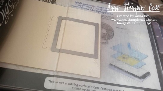
Now I lined up my die with this partially die-cut piece. It’s not difficult at all, as cutting edge of the die slip right into the grove.
And again I placed the top plate so that it’s only partially over the die. Just this time my partially die-cut piece and is on the side that won’t be cut. I run it through the Big Shot.
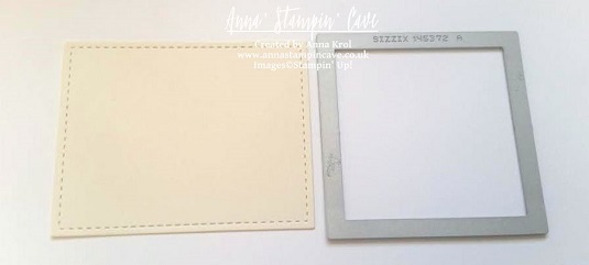
And voila, you have a stitched rectangle! But as I mentioned before you can use any thin square dies for this technique.
I hope you liked my short ‘how to’ post and that you’ll use this technique to stretch your dies.
Thank you for joining us for another Simply Sketched Saturday Challenge! We are so excited to be sharing this hop with you. The products used are all available in the current Annual, or seasonal, Stampin’ Up!® Catalogues*. Simply use the buttons at the bottom of the post to keep hopping!
Hello and welcome after a long break. Today’s brilliant sketch has been designed by lovely Sam from Sam’s Sentiments blog. Just check how beautiful this sketch is?! Sadly Sam wasn’t able to take a part in the hop. Such a shame.
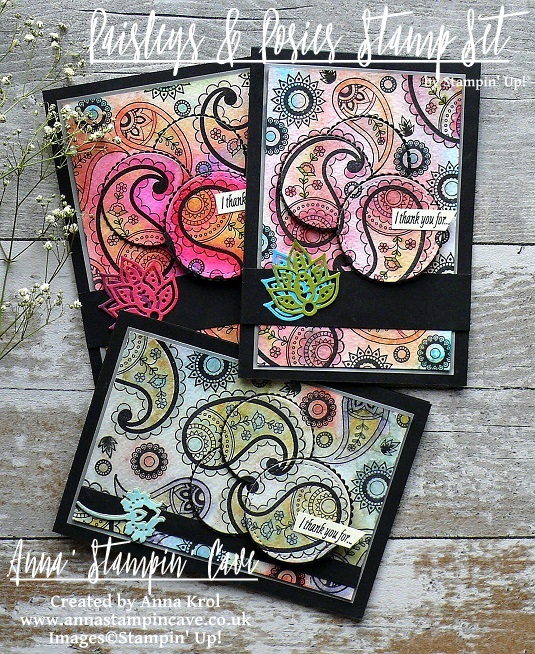
I’ve been so busy lately with home renovating and night shifts, that only a couple of days ago I realised our monthly blog hop is today. I panic slightly first but the moment I sit down to the sketch, I knew exactly what I wanted to make. I decided to ‘dig out’ my favourite stamp set from Autumn-Winter catalogue: Paisleys & Posies, as it seemed perfect for the technique I wanted to try: watercolour with markers. Well, it’s kinda watercolour. Anyhow. I had so much fun that I created not one but three cards.
Aren’t these gorgeous?! Such bold designs! And they really super easy to make.
Paisleys & Posies cards dimensions:
3x Basic Black cardstock: 11-6/8″ x 4-1/8″ scored in half at 5-7/8″ (29.7 x 10.5 cm scored in half at 14.8 cm) + 2 x strips 1″x 4-1/8″ + 1 stripe 3/8″x 5-2/8″
3x White Vellum cardstock: 3-5/8″ x 5-3/8″(9,2 x 13,6 cm)
3x Water Colour Paper: 3-1/2″ x 5-2/8″ (8,9 x 13,3 cm)
3x Very Vanilla cardstock: 3-1/2″ x 5″ for the inside panels + scraps for sentiments
scraps of the following cardstocks for die-cutting: Basic Black, Rich Razzleberry, Melon Mambo, Tempting Turquoise, Old Olive, Pool Party & Pear Pizzazz
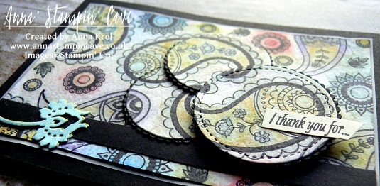
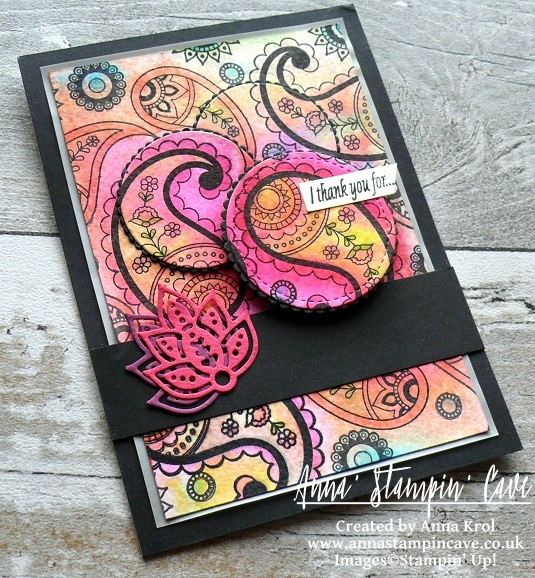
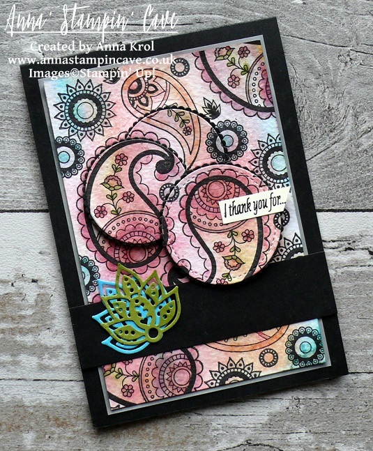
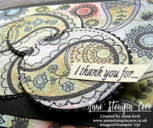
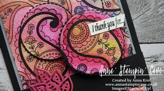
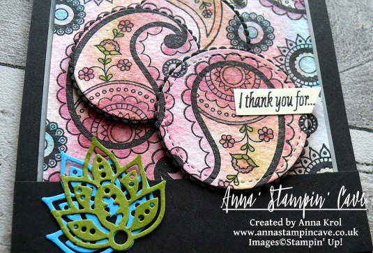
To start off, I stamped various images from Paisleys & Posies Stamp Set onto the watercolour panel in Basic Black Archival Ink.
Tip of the day: Because I did my cards late at night, I had no time for the ink to dry completely but I didn’t want to smear black all over my watercolour panels. So I sprinkled clear embossing powder over the whole piece once I was done with stamping. But I didn’t heat set it, I just let embossing powder to ‘soak in’ all the ‘moisture’. I let it sit for couple of minutes and then brush off the powder.
When my panels were ready I started to colour them in with Stampin’ Markers. Nothing fancy really, and no need to stay in lines either.
For the first card, I’ve used Melon Mambo, Tangerine Tango, Daffodil Delight, Old Olive and Tempting Turquoise. When all the images were coloured in, I spritzed the whole panel with water. And that’s when all the ‘magic’ happen, as all the colours blend together nicely creating a beautiful watercolour piece. It’s like making your own watercolour DSP. And each piece is different.
To add more colour I dried my panel with a heat tool. Next, I colour it in again with markers and spritz it with water. You can build up the colour as much as you wish, just remember to dry your panel in-between.
For my next card, I decided to use all markers from Brights family. But this time I only spritz it once, hence much more subtle look.
For the last cardI’ve used Subtles Stampin’ Markers and I have to say they needed the most work. I had to dry my piece and keep adding more colour several times until I was happy with the outcome. Once all my panels were created I decided to add some shimmer to them. I added few drops of Clear Wink of Stella to the water in my spritzer, and I spritzed all the panels.
Once the panels were dry I die-cut three circles from each panel: full circle using 1-7/8” circle from Stitched Shapes Framelits Dies and two ‘partial’ circles using Layered Circle Framelits Dies. I also die-cut slightly bigger scalloped circles from Basic Black cardstock to go underneath.
To assemble my cards I adhered vellum to card bases and watercolour panels on top. Next, I glued black scalloped circles underneath the watercolour ones and in-laid them back into the panels. I also adhered Basic Black strips, sliding them slightly underneath the die-cut circles.
I stamped my sentiments (masking a part of it) on a 3/8″ strip of Very Vanilla cardstock, and adhered it to the card with liquid glue. The full sentiment is stamped inside of the card.
For the final touch, I die-cut some leaves and flowers using a couple of intricate dies from Paisleys Framelits Dies and adhered them to the black stripes.
And these are my cards for today. I hope you like my take on the sketch. Now be sure to hop along to see more inspiring projects. Your next stop is very talented Hannah.
Anna’ Stampin’ Cave – The Creative Flow Blog Hop – No Red Romance With Large Letters Framelits Dies
Thank you for joining us on our Creative Flow Blog Hop. Each month we are set a challenge to creatively stretch our imaginations. The products we have used are all available in the current Annual and/or seasonal Stampin’ Up!® catalogues. To hop along, please use the buttons at the bottom of the post to keep hopping.
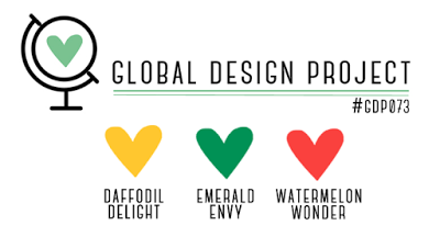
Today’s challenge was to create no-red Valentines Day card, and for some time I wasn’t sure what colour scheme to use. But Global Design Project came to the rescue with their #073 Colour Challenge. I really love this unusual, bright and oh-so-not-valentine’s colour mash-up, so I decided to combine these two together 🙂
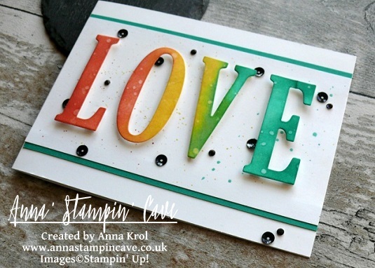
I know it supposed to be no-red, but Watermelon Wonder is rather orangy red right lol And here’s what I came up with: a perfect card to give to my hubby on that special day.
No-Red Romance card dimensions:
Whisper White cardstock: 11-6/8″ x 4-1/8″ scored in half at 5-7/8″ (29.7 x 10.5 cm scored in half at 14.8 cm)
Whisper White panel: 5-7/8″x 3″
Emerald Envy cardstock: 2 strips 5-7/8 long and briefly 2/8″wide
a piece of Whisper White for die-cutting
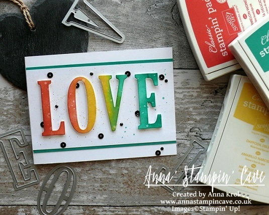
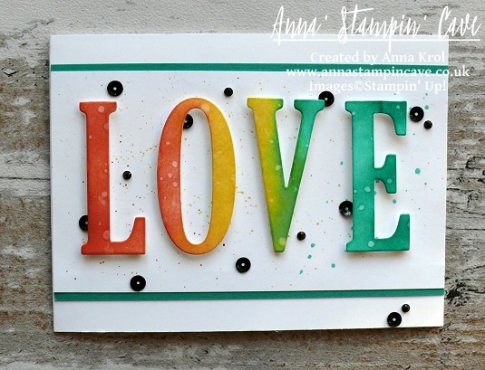
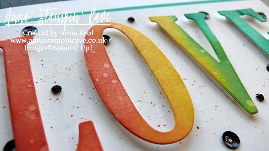
The first step was to die-cut word ‘LOVE’ using Large Letters Framelits Dies. I’ve used regular Whisper White cardstock for this. I’ve sponged the letters with my inks as follows: Watermelon Wonder first, Daffodil Delight next, and Emerald Envy as the last one creating ‘rainbow’ effect. I’ve paid special attention there’s smooth transition from one colour to another.
When I was done and happy with blending, I took a small paintbrush and flicked some water droplets all over the letters. I love how the water reactivates the ink. Such a simple step but add so much interest and texture to the (otherwise) flat surface.
Next, I took Whisper White panel and using the same small brush and my ink pads as a palette, I speckled some inks over the whole panel. I tried to keep my speckles somehow under control colour-wise, so the speckles match the letters that go over them.
Remember: The smaller is the brush, the smaller are the speckles.
When speckles dried, I adhered two strips of Emerald Envy cardstock underneath, one on top and one on the bottom of the panel.
Now to assemble the card. I adhered the panel to the card base using Fast Fuse adhesive. And I have to say I’m happy to say it seems I finally made friends with this adhesive haha.
I wanted to pop-out my letters so I’ve used Foam Adhesive Strips to adhere them to the panel. You could use any regular foam adhesive, but these strips are perfect for adhering die-cuts that are quite narrow in shape. They are long but you can easily cut them to the length you want/need.
I was really happy how nicely this card was coming together, but I was desperate to add some embellishments to it. Yes I know, a card for a hubby and embellishments?! I must have lost my mind, haha. But why not?
So I scattered black sequins from Metallics Sequin Assortment pack all over my card and tried to figure out the placing and how many I will use. Once I was happy I adhered them with Fine-Tip Glue Pen. For the final touch, I coloured some rhinestones with black Sharpie and added them to the card too.
That’s it from me for today. I really hope you enjoyed my step by step directions.
For those of you who asked about stretching your stitched dies using partial die-cutting – I will have a short how-to post for you soon. So watch this space.
Now be sure to hop along our tiny blog hop to see more inspiring projects. Your next stop is lovely and talented Helen.
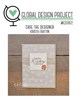
Anna’ Stampin’ Cave – Faux Watercolour For GDP#072 Case The Designer Challenge
Hello and welcome everyone! Today I’m back with my entry for Global Design Project. This week’s challenge is ‘CASE the Designer’ – we are casing extremely talented Krista Frattin.
If you’re not sure what ‘CASE’ stands for, at least in crafty world, here are few decipherings: Copy And Selectively Edit or Copy And Share Everything. Generally speaking, it means that you take inspiration from someone else’s project, like colours, layout, stamp set used, etc, and add your own twist to it.
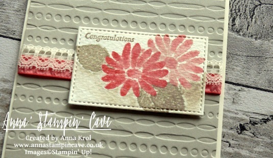
I really loved this simple layout and toned palette with a little pop of colour, so this is what I ‘borrowed’ from Krista’s card. But I’ve decided to use a new stamp set from Stampin’ Up! Spring Summer Catalogue called Special Reason.
Faux Watercolour Special Reason card dimensions:
Very Vanilla cardstock: 11-6/8″ x 4-1/8″ scored in half at 5-7/8″ (29.7 x 10.5 cm scored in half at 14.8 cm)
Sahara Sand cardstock: 4″x 5-6/8″(10,2 x 14,5 cm)
Water Colour Paper: 2″ x 3″ (briefly as it will be die-cut later)
Flirty Flaming Ruched Ribbon: length 6″ approx
Very Vanilla Lace Trim: length 6″ approx
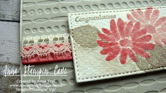
I began with dry embossing Sahara Sand panel with a Festive embossing folder. I love this design as it’s really versatile. For my card, I’ve used de-bossed side. I added Flirty Flamingo Ruched ribbon to the panel, briefly in the middle, and secure it at the back with snail adhesive. Next, I added Very Vanilla Lace Trim on top of it, slightly overlapping both ribbons so Flirty Flamingo was peeking from underneath the lace. I adhered my panel to the card base with liquid adhesive and red-lined tape where the ribbons were for extra security.
To create my focal point I’ve used few great techniques: watercolour, faux watercolour, rock’n’roll, masking and partial die-cutting.
I started with stamping my flower onto watercolour paper. I loaded my stamp with Blushing Bride Ink and then ‘rocking’ my stamp I added Flirty Flamingo only on the edges of the stamp – that’s rock’n’roll technique, super easy hey? Once I stamped the image, I took an aqua painter and started blending both colours on each petal creating a faux watercolour effect. I also added Flirty Flamingo ink to the centre of the flower. I build up the colour (but I let it dry completely between layers) by adding more Flirty Flamingo to the top of each petal and blending it down with an aqua painter.
Next, I created a mask. I stamped the same flower onto a post-it note and fussy cut it. I stuck it to my watercolour flower (first, make sure it’s dry) and using Stamp-a-ma-jig I stamped two leaves in Sahara Sand, one below, and one on the side of my flower. Using same faux watercolour technique I blended the ink on my leaves, being careful not to lose subtle veins detail. I also created a leaf mask and added another leaf at the bottom of the flower.
Not taking off the masks, and with help of Stamp-a-ma-jig again, I stamped another flower. This time I only used Blushing Bride ink for a softer shade. But still added a hint of Flirty Flamingo ink to the edges of petals while blending them with water.
Before die-cutting my piece, I decided to add a little bit of shading beneath my composition. Nothing fancy, just a subtle watercolour wash with Sahara Sand ink and aqua painter. I love how it added an extra dimension to my piece.
To die-cut my watercolour panel I’ve used a second smallest square (1-5/8″) from Stitched Shapes Thinlits Dies. But this is a rectangle, you say. Yes, I know, but I extended my die using partial die cutting technique (if you want to know how to do it, please leave me a comment below). The final piece measure 1-5/8″ x 2-5/8″ (4.2 x 6.7 cm).
I assembled my watercolour panel using Stampin’ Dimensionals.
I really like how this card turned out. No need for extra embellishments, it’s beautiful as it is. I hope you like it too, and that I inspired you to try some of the techniques I showed, especially mess-free, faux watercolour.
I really want to encourage you to check the Global Design Project challenge blog. They have a new challenge every week with various themes and extremely talented Design Team – they will simply blow your mind with their creativity! Just click on their logo below to visit the website
As always, if you wish to purchase any of the products I have used, simply click the images below to go directly to my online shop.
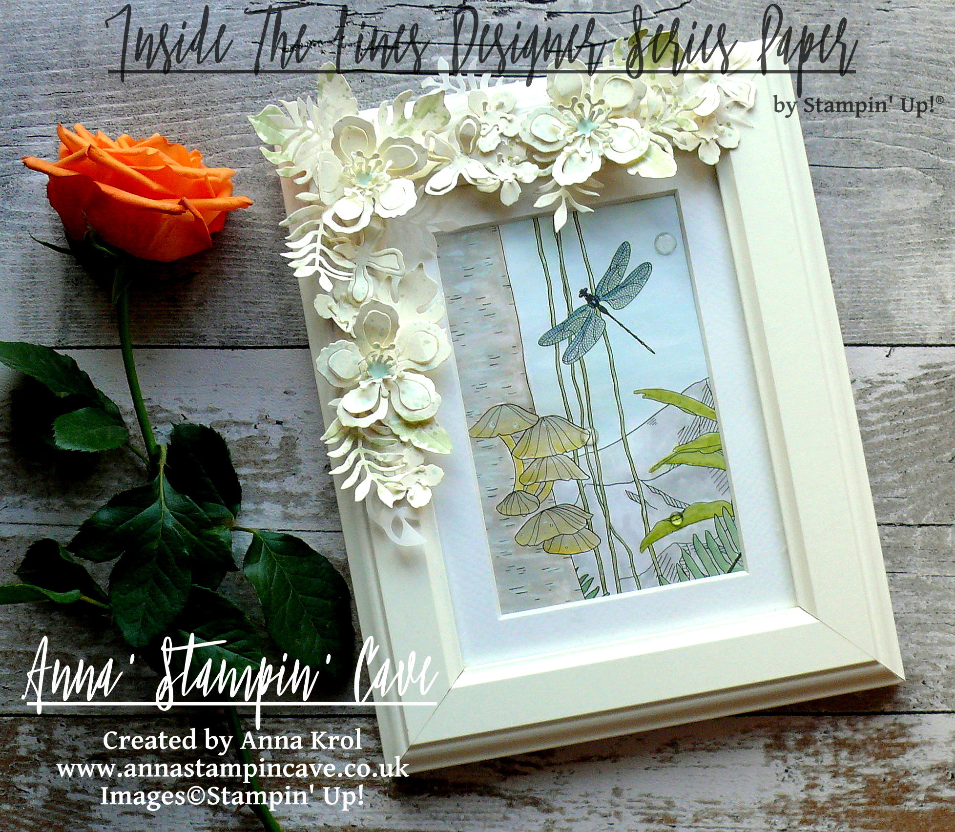
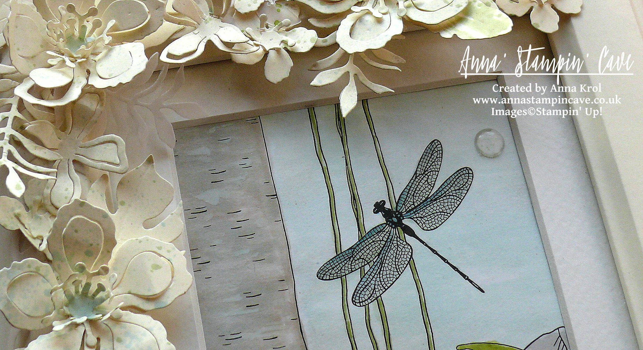
Anna’ Stampin’ Cave – Inside The Lines Altered Photo Frame
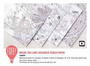
In my project today I decided to create altered photo frame with beautiful, Inside The Lines Designer Series Paper. With an ever-growing trend in adult colouring books, this paper is just spot on.
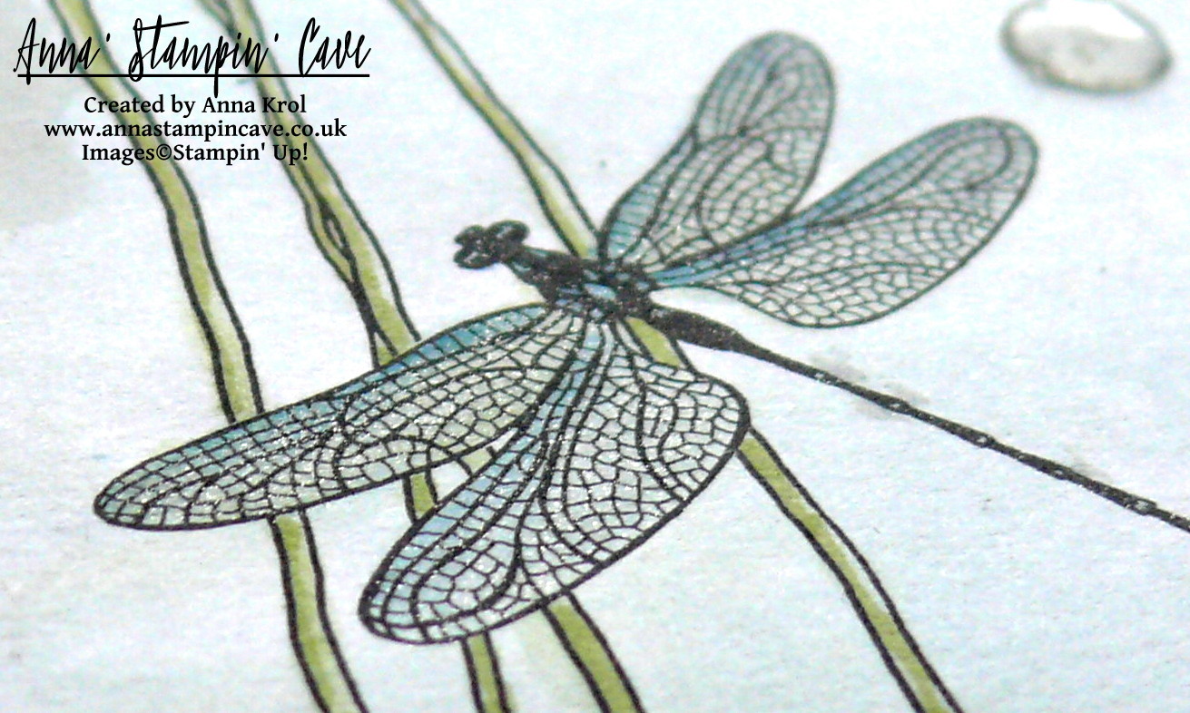
I don’t know about you, but I love these bold botanical designs. They coordinate with Dragonfly Dreams Stamp Set & Dies, but you can use them on their own too. Colour them in with markers, inks or watercolour pencils – it’s fun and very therapeutic…or leave them black&white. Whatever tickles your fancy.
The frame is from Ikea and is called Virserum. It measures 7-1/2 x 9-1/2″ (19 x 24 cm) and comes with inside mount, hence I only needed 4″x 6″ (10 x 15 cm) piece of DSP to fit inside.
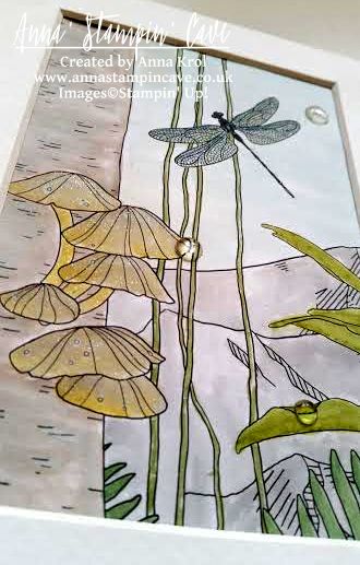
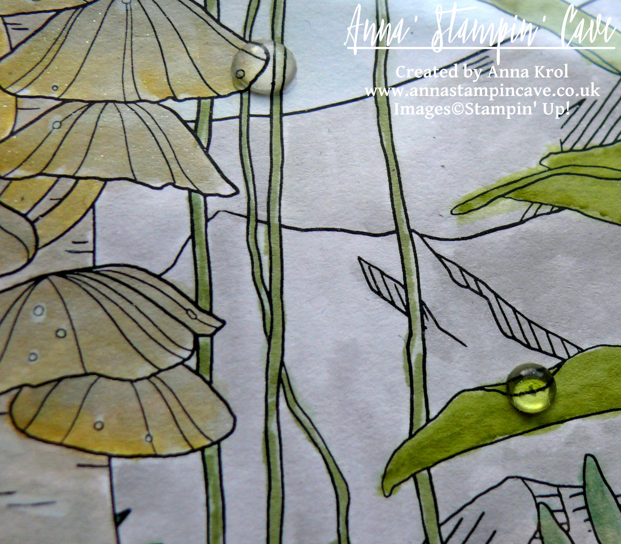
I’ve chosen this lovely, jungle-like design and cut it into 4″x 6″ rectangle. Because I was aiming for a subtle look I decided to watercolour my piece.
Bear in mind this is not watercolour paper so you can’t add too much water to it.
For the foliage, because it’s such a small area, I’ve used Stampin’ markers: Pear Pizzazz, Wild Wasabi, Old Olive, Garden Green and Always Artichoke. First, I scribbled my markers on a craft mat. I also spritz some water on my craft mat, next to the markers. I did it deliberately, to have more control of how much water I use. Next, I took dry aqua painter, picked up some water with its brush, next picked up some colour from the mat and started colouring my foliage. I was adding more colour and more water to the mat when needed. There are 4-5 layers of colour on leaves, each layer added when the first one was dry.
To colour in the rest of the image, I’ve used ink pads as my palettes.
I’ve used Soft Sky for sky and dragonfly (with a little dab of Island Indigo marker). Mountains are coloured with Smoky Slate.
For the tree trunk, I’ve used Tip Top Taupe ink pad. To add some highlights I’ve used Whisper White Craft Ink (yes, I’ve used it with aqua painter too).
Polypores or conks (I’m not sure how they are called in the UK so forgive me if I’m wrong) are watercoloured with a mix of Sahara Sand, Crushed Curry and again some white craft ink for highlights.
For the final touch, I’ve added White Perfect Accents as dew drops (one on the sky is hiding a little boo-boo). And as a must, I had to add some shimmer with clear of Wink of Stella to the dragonfly, mountain tops, and polypores. Sadly it’s really hard to capture this lovely shimmer on photos. But now to the frame.
Believe it or not, this is my first ever altered photo frame. I knew I want flowers, but for a long time, I couldn’t decide on a colour. First, I wanted to go with quite a feminine look, so pinks and oranges. But once I had all my flowers ready I didn’t really like it. Typical haha. But no worries, I will use them to something else. And then I had this revelation: how about Very Vanilla?! Genius!
I die-cut oodles of flowers and leaves from Very Vanilla and Vellum cardstock. Arranged them around the frame and once I was happy with the placing, I adhered them with glue dots.
But as you may know me already, nothing can be too easy haha And when I looked at my frame something was missing, in my humble opinion. Oh right, it was too ‘clean’, too ‘white’. I needed some ‘controlled mess’.
I pressed Pear Pizzazz and Soft Sky ink pads next to each other on the craft mat and spritz it with water. I covered the glass with a piece of paper, and using a clean brush I added random and less random splatters to the flowers and leaves. And I have to say I love it now! And I hope you like my little project too.
I also want to add this project to the #071 Theme Challenge over at Global Design Project Challenge Blog. This weeks theme is ‘3D Or Off The Page’
As always, if you wish to purchase any of products I have used, simply click the images below to go directly to my online store.


 Lace Trim")
 Ruched Ribbon")