Brusho Love – Kylie Bertucci’s International Project Highlights

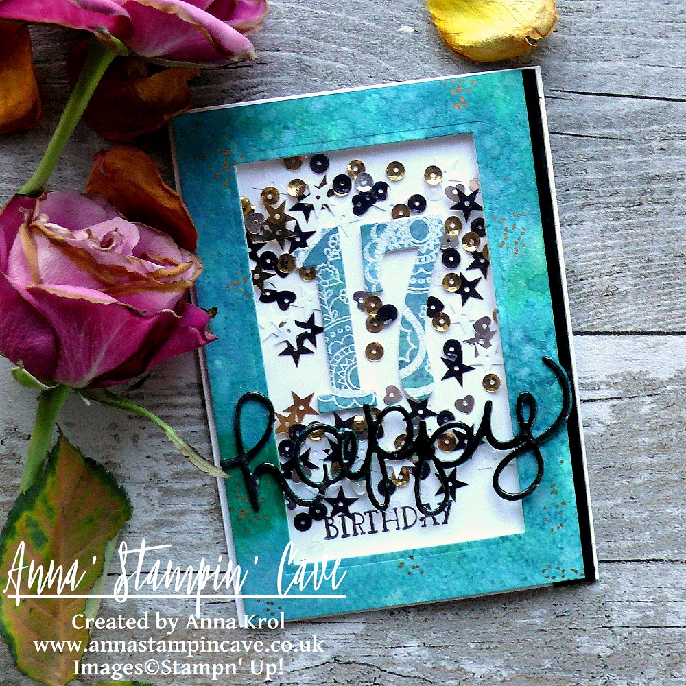
Anna’ Stampin’ Cave – Brusho Love for Kylie Bertucci’s International Project Highlights

Thanks for coming to my blog today! We are being highlighted internationally by Kylie Bertucci and you are able to VOTE  for my project. The top ten winners will get to be part of an international blog hop so please vote for my project. My project is under number 7!  You can do it here or use a button at the end of my post.

Our theme for this highlight is ‘Favourite Sale-a-bration Or Occasions Catalogue Products’. So what else could it be for me if not Brusho Crystal Colour!!

I literally squealed with delight (ask my hubby haha) when I saw them in our new Spring Summer Catalogue!! Truly couldn’t ask for more!

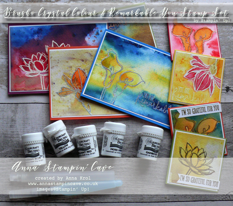
They are high quality, highly pigmented paint powders, water-based and most of all completely non-toxic.

They come in a selection of five colours:

  • Brilliant Red – the name says it all
  • Gamboge – orange with hints of yellow
  • Moss Green – beautiful earthy green colour with speckles of purple
  • Prussian Blue – very vibrant blue, must be my fav
  • Yellow – again, very vibrant

These are not a Stampin’ Up! colours, but as you will see in a minute, you can easily match them.

Brusho is not a product that you can bring to the table, create one card and then put it back. Nope, it won’t happen. Once you take it out and start playing with these colours, the fun has no end! And I warn you: It’s highly addictive!

You can use these colours separately but you can also mix &match and just have fun with them. Add more or less water to create more vibrant, or softer look.

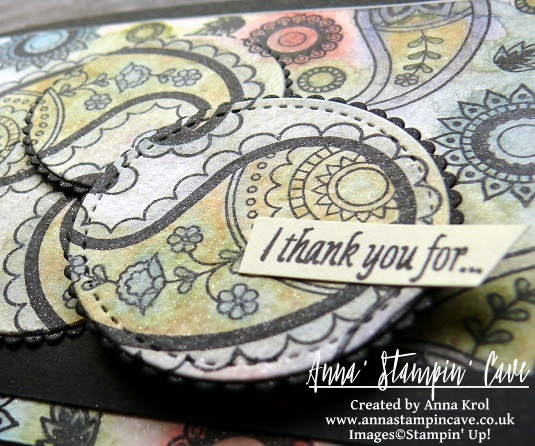
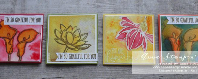
To highlight this amazing product I created eight cards: four standard A6 size and four tiny 3×3″.

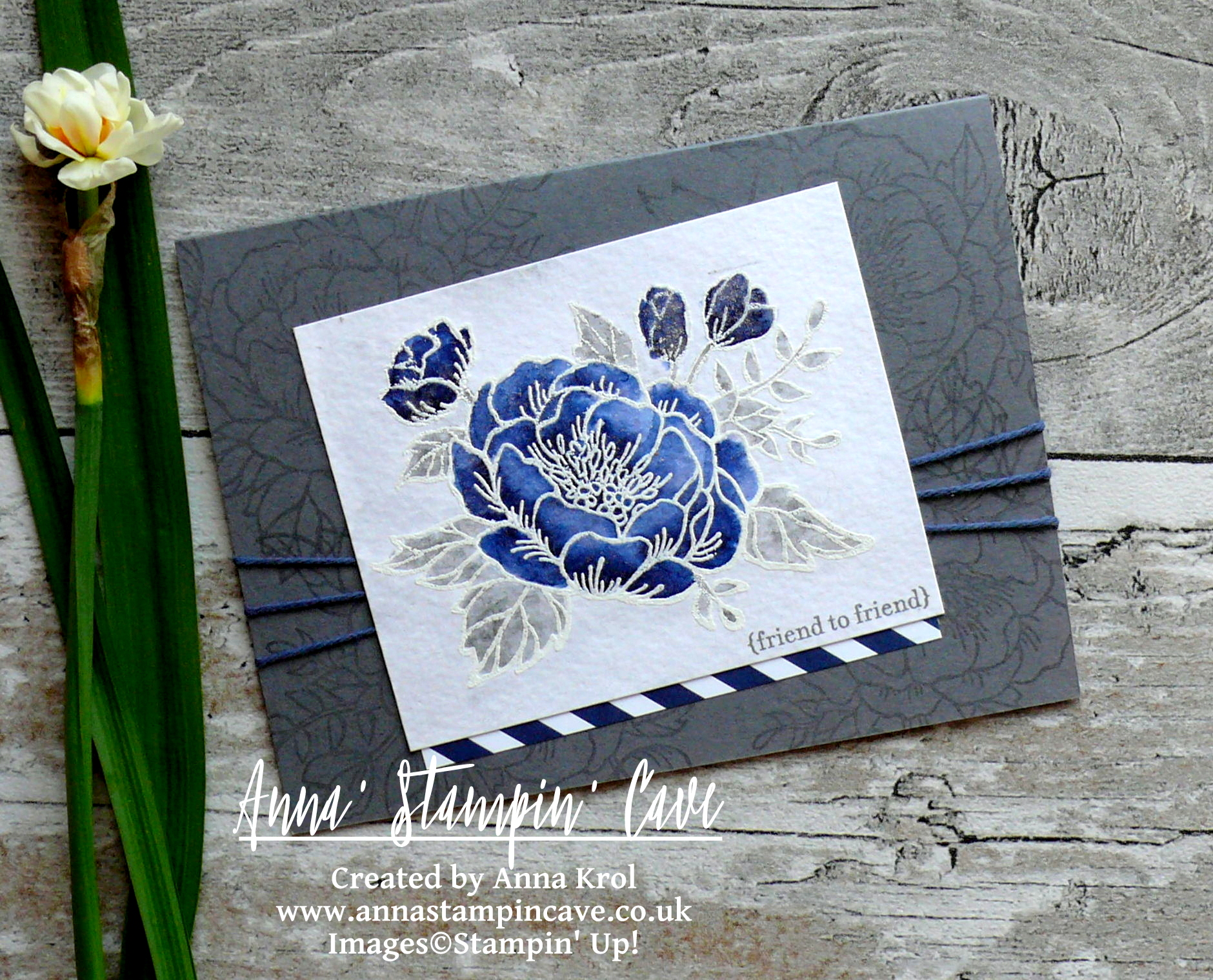
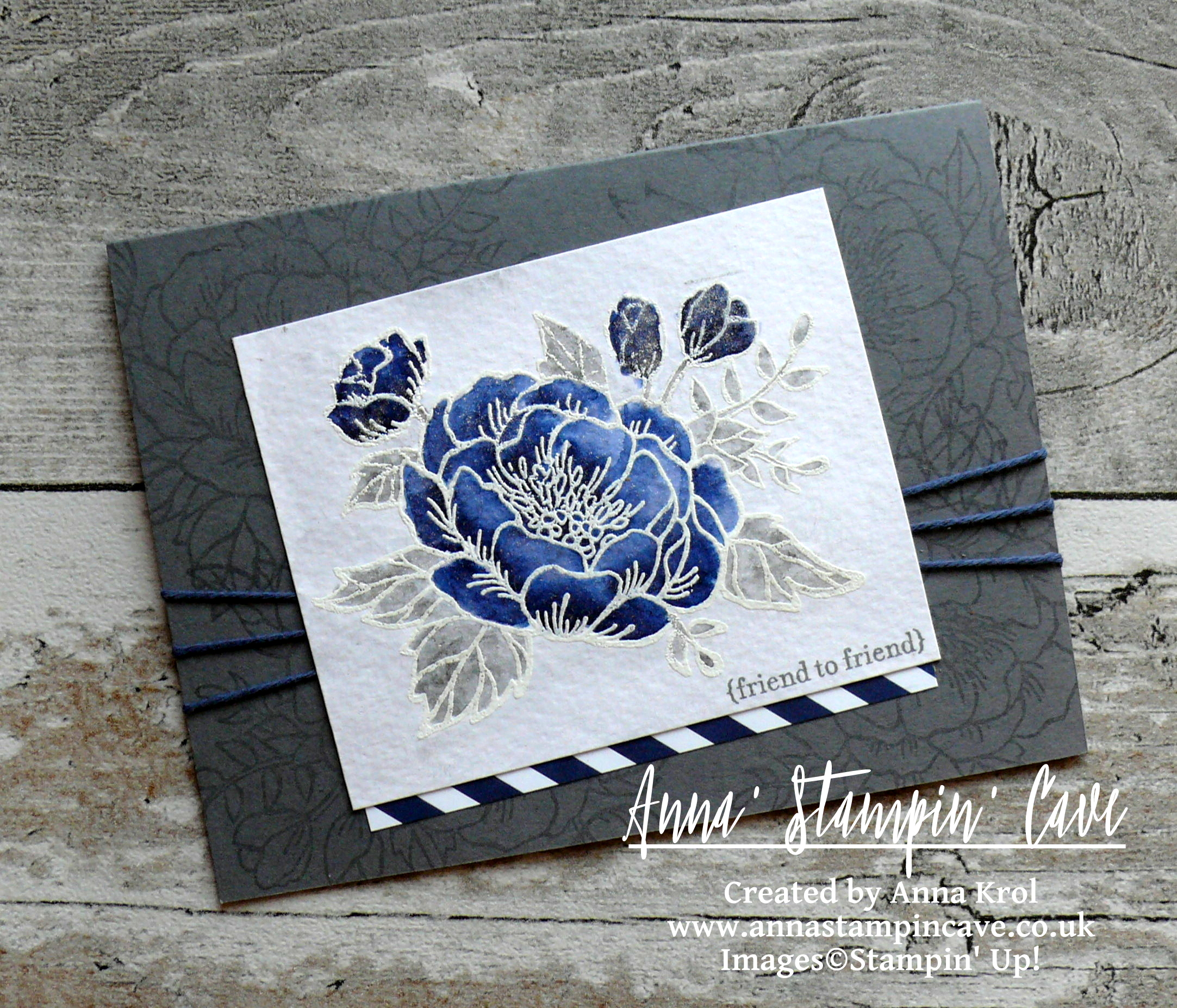
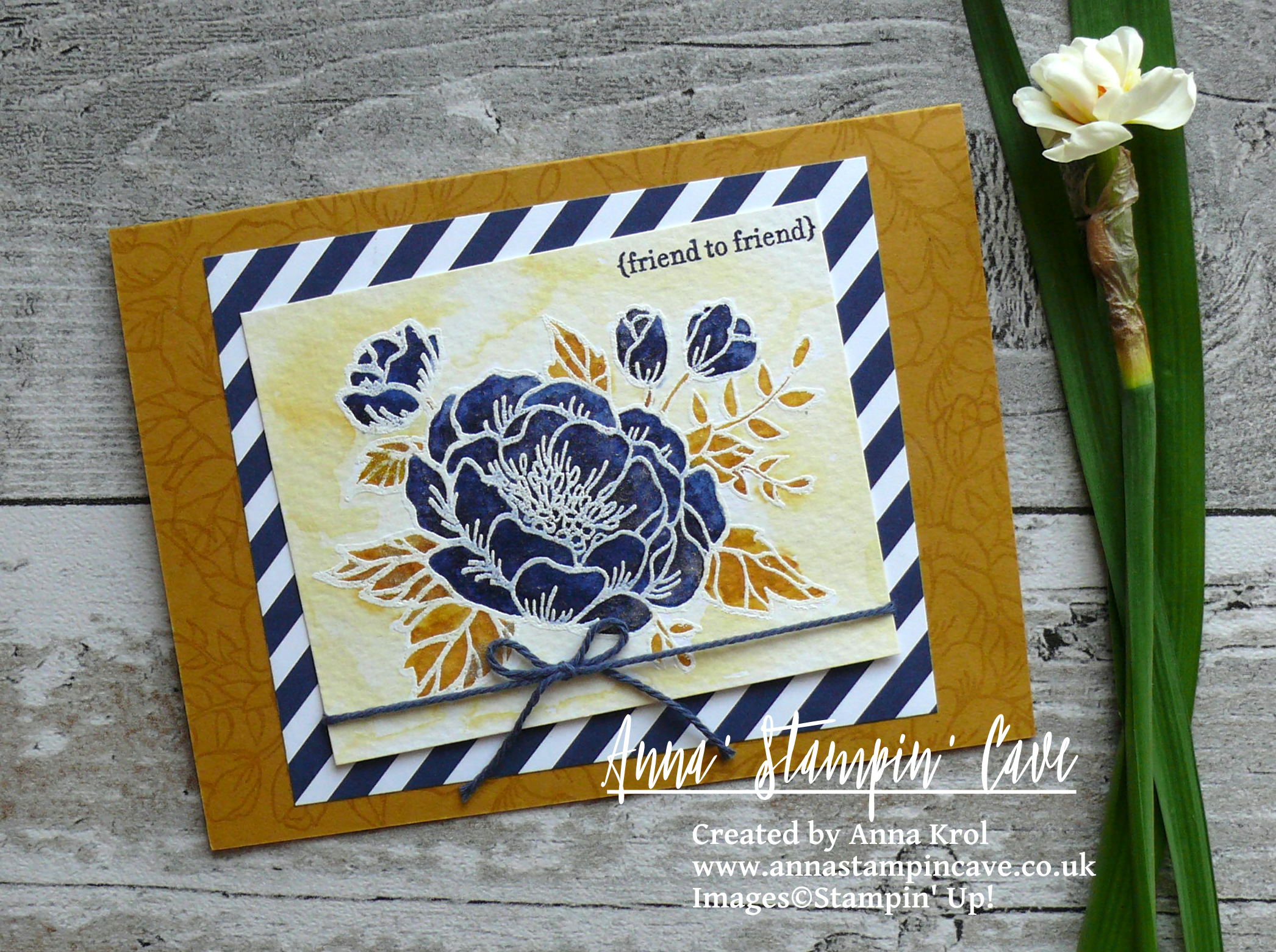
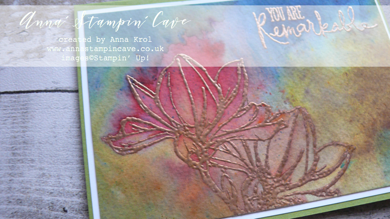
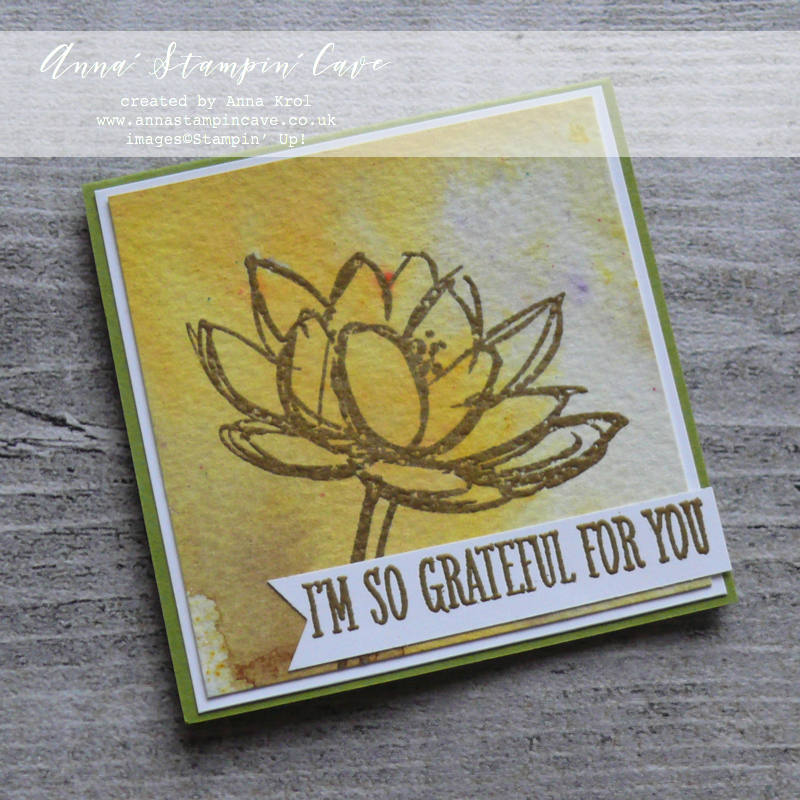
Before I start few details: I only used watercolour paper; to keep it as easy as possible I only used one stamp set: Remarkably You; each card has been heat-embossed first in either white, silver, gold or copper before I added Brusho.

Card base: Rich Razzleberry

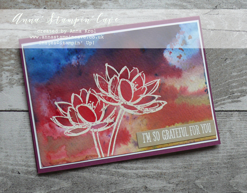
For this first card, I simply wet paper entirely with my aqua painter and sprinkled brusho crystals over the surface. It’s actually quite therapeutic to watch how the colour travels. And…I’ve used all 5 colours of brusho too! Brave, I know haha, but how fun! Once I’ve added my first batch of crystals, I spritz it with water to help the colours move and I added more colour. I kept adding water and colour until I was happy.

I looked at my still quite wet paper and had a thought, that I’ve got so much pigmented water pool on this piece, I could actually create another card so…I took next piece of watercolour paper, pressed it to the top, and waited few moments for the water/colour to transfer.

Card base: Old Olive

And this is what it looked like. Nearly, because I spitz it once or two and sprinkled some Moss Green sparingly. I love how much softer this card came out.

Same technique, brusho to wet, I’ve used for this cute 3×3″ card

Brusho: Yellow, Moss Green; card base: Old Olive

For this next card, I decided to sprinkle Brusho on the dry watercolour panel first, and spritz it with water later.

Card base: Pacific Point

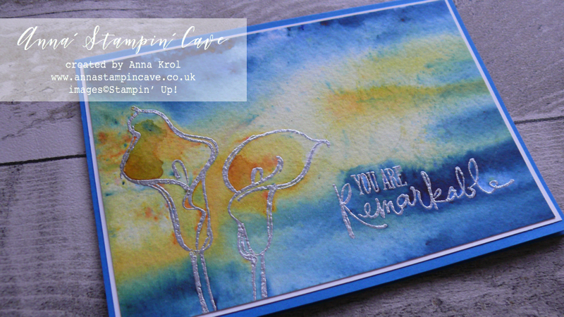
I’ve used Prussian Blue and Yellow and tried hard not to mix both colours too much. I really loved this effect! Which gave me an idea of ‘colour-blocking with Brusho’ technique. Not sure if there was such a technique before (never heard of). So if not, now it is, and I invented it hahaha (j/k)

Flower: Gamboge; background: Brilliant Red; stem: Moss Green; card base Real Red
Flower: Gamboge; background: Moss Green and Prussian Blue; card base Tangerine Tango
Flower: Brilliant Red; background: Yellow; stem: Moss Green; card base: Pacific Point

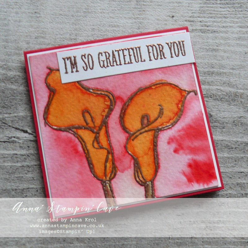
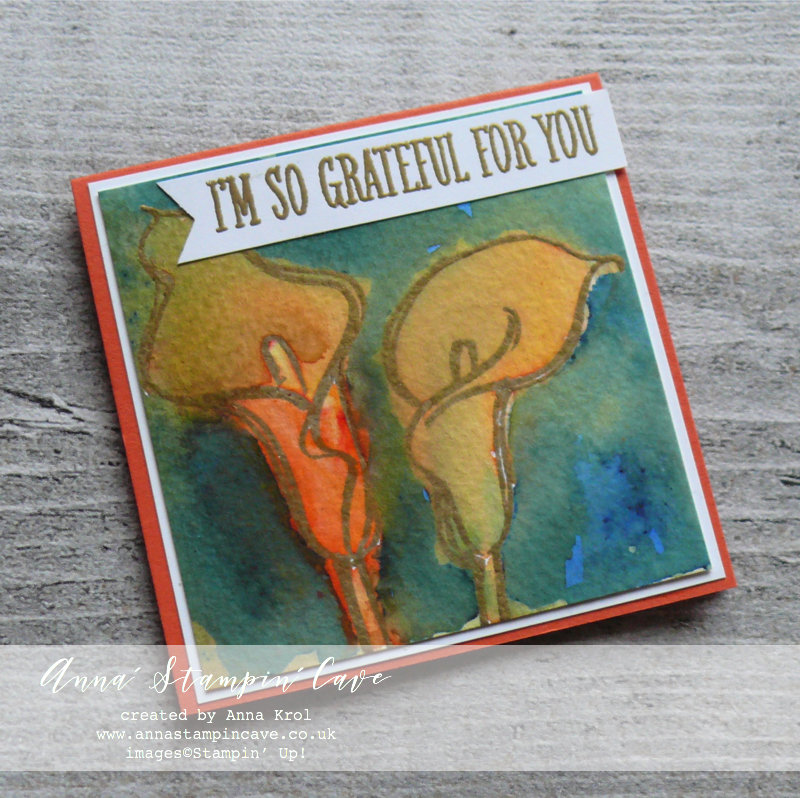
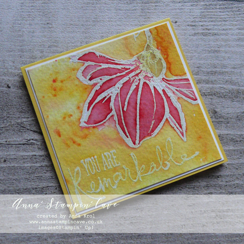
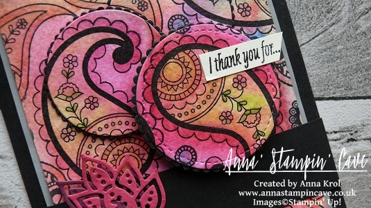
For each of these cards above, I’ve added a solid pool of water inside the flowers, sprinkled with Brusho powder and moved the colour around using aqua painter. Once flowers were dry, I wet the background and added brusho in contrasting colour. Again, I helped the colours move around with aqua painter. Please do not stress if the colours bleed into each other. It creates beautiful, organic, watercolour look.

Card base: Tangerine Tango

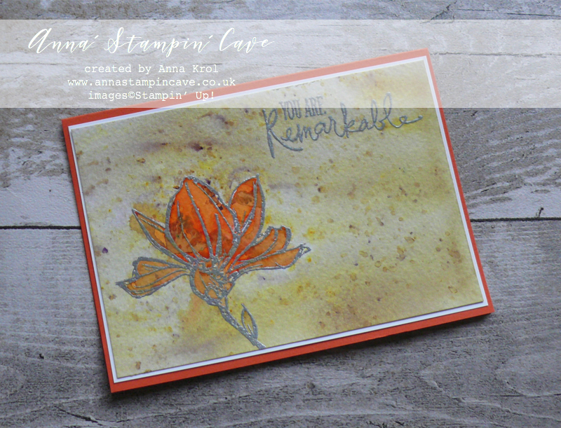
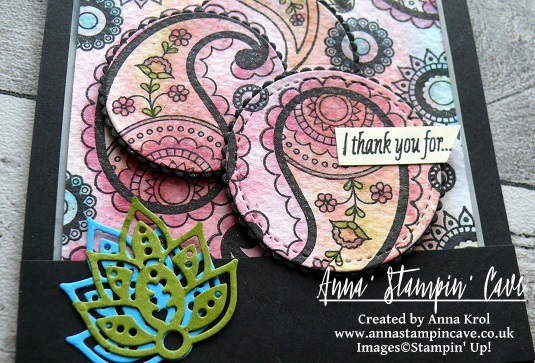
I really love the effect brusho created on my last card. I’ve used same ‘colour-blocking with Brusho’ technique. For the flower, I’ve used this amazingly vibrant Gamboge. Once my Flower was dry I masked it with a piece of copy paper (smaller than a flower itself, I didn’t aim for perfection here). I sprinkled Moss Green powder all-over the background and spritz it with water very well until all powder dissolved. When the background was still slightly wet, I’ve added some more of the Moss Green powder. But this time I let the powder dry itself, without adding more water to it. I love these speckles of purple it created!

And these are all my cards for today. I hope that it inspired you to give your brusho some love too. Just take a watercolour paper, brusho, and have some fun. Let your imagination run wild. There’s no right or wrong. Can’t wait to see what you come up with!

Thank you so much for visiting my blog today! Make sure you head over to Kylie’s blog to check all lovely projects and vote for your favourites. Hope my project will be among them. My project is under number 7!

As always, if you wish to purchase any of products I have used, simply click the images below to go directly to my online store and don’t forget to enter the hostess code for the month of January GK3G3AR3  to receive a gift from me.

Thank you for stopping by and have a blessed day,

Hostess Code for January 2018 GK3G3AR3 Use this code in the month of January and receive a gift from me.

Special Notes:1) Make sure you select Anna Krol as your demonstrator;
2) If you select “No Contact” box I do not have access to your name and can’t send you a gift;
3) If your order is £150 or more do not use the code and grab your own Stampin’ Rewards + gift from me

Aqua Painters

£15.50


Don’t forget to check:

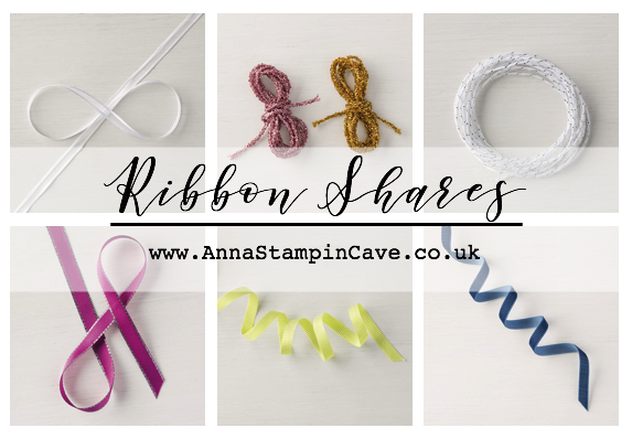
Spring Summer Catalogue Paper & Ribbon Shares. Shares are open to Austria, France, Germany, Netherlands & United Kingdom. 102 sheets of DSP & 2 yards of each type of ribbon from Spring/Summer Catalogue. Click here for more details —>

The New Stampin’ Up! Spring/Summer 2017 Catalogue and Sale-A-Bration is LIVE and it’s AMAZING! For every 60 €/£45, you spend either from Spring Summer Catalogue or Annual Catalogue, you will get to choose one FREE  level 1 product from SAB brochure! If you spend 120 €/£90, you get one FREE level 2 product, OR, you can choose two level 1 items. If you spend 180 €/£135, you have the option to choose three level 1 items or one level 1 item and one level 2 item. Click here for more details —>

Watercolour Wash Using Colorful Seasons Bundle For #GDP088

Phewww! Finally, some air in the air after a heat wave we experienced lately. Don’t get me wrong: I love summertime. I’m just not a fan of hot weather when you can’t do any activity without gasping for the air. And how funny it may sound, in the UK 26C is hardly bearable. But today I woke up very early to the amazingly fresh breeze. I jumped out of bed (well not literally as I still can hardly walk), fixed some quick breakfast to take my medications, got my Bible study done (book of Judges – loveee) and off I go to my ‘cave’ before the ‘house’ woke up.

Since over a week, I’ve been ‘dying’ to crack open the Colorful Seasons Photopolymer Stamp Set and coordinating Seasonal Layers Thinlits Dies. And what a better excuse (not that I need one haha) than taking a part in Global Design Project. Especially that this week we are CASE’ing extremely talented, Shawn De Oliveira.

Rose Wonder Stamp Set and Rose Garden Thinlits Dies are one of my favourites from 2016-17 catalogue and I’m really happy that they are staying with us for another year (at least). But for my project today I really wanted to ‘play’ with new products.

What I ‘borrowed from Shawn’s card is the colour combination of soft pink and green with a touch of gold. And because I had all my supplies out I’ve made not one but six cards. Since a couple of months, I belong to amazing facebook group Random Act Of Kindness, where each month we are sending cards to random recipients. ‘It is more blessed to give than to receive.’ (Acts 20:35)

Colorful Seasons card dimensions:

  • Whisper White Thick cardstock card base: 11-6/8″ x 4-1/8″ scored in half at 5-7/8″ (29.7 x 10.5 cm scored in half at 14.8 cm)
  • Shimmery White cardstock: 3-1/2″ x 4-1/8″ (8.9 cm x 10.5 cm)
  • Old Olive cardstock two stripes: 4-1/8″ x 7/16″(briefly) and 4-1/8″ x 1″ (10.5 cm x 1.2 cm and 10.5 cm x 2.6 cm)
  • white cardboard from the back of DSP: 4-1/16″ x 2-1/2″ (10.4 cm x 6.3 cm)

I started with creating a scalloped edge to my card base. On the front of the card base, I measured 1″ from the bottom, centred the scallop edge die and secured it with a piece of washi tape (so it won’t shift) and run it through the big shot. Next, using the same die I created a scalloped edge on the wider strip of Old Olive cardstock.

For the watercolour wash, instead of watercolour paper, I’ve used Shimmery White cardstock. It’s beautiful on its own but great for light watercolouring too; plus gives your work delicate shimmery look (hence the name).

Watercolour tip: While your ink pad is closed give the lid a gentle squeeze. It will transfer a little pool of ink from the ink pad into the lid.  Open your ink pad. Now you can pick up the ink with your aqua painter or with the tip of your blender pen.

I took aqua painter and I wet the surface of my panel slightly. I didn’t add the water to the entire piece, just to the centre. I picked some Blushing Bride ink with my aqua painter and I’ve done a quick wash of colour over the panel. Dried it with my heat tool.

When the panel was completely dry I rubbed it with embossing buddy to make sure embossing powder won’t stick where it shouldn’t. I stamped the sentiment and maple leaves with Versamark ink, covered them with gold embossing powder and heat set it.

I adhered Old Olive stripes behind the watercoloured panel with liquid adhesive. And now the #facepalm moment: paper + water = warping! …what was I thinking?! To rescue my watercolour pieces: strengthen and straighten them up, I cut rectangles from the white cardboard (I always save backings from DSP) and adhered them behind the panels, between two Old Olive pieces, with a fast fuse.

I assembled my cards with liquid glue. For a final touch, I decided to add few rhinestones. And that’s my cards done.

As always, I really want to encourage you to visit the Global Design Project challenge blog to see other beautiful projects from all around the world. Just click on their logo below to visit the website

Thanks for visiting my blog today. Have a blessed day

Global Design Project #081 Colour Challenge – Watercolour Birthday Blooms

Anna’ Stampin’ Cave – Global Design Project #081 Colour Challenge – Watercolour Birthday Blooms

GDP81

Hello and welcome! Today I decided to play along with Global Design Project and their Colour Challenge. I love that one of the colours can be our own choice.

I had couple of ideas which colour to use, but because I couldn’t decide which one to choose I created two cards instead of one 🙂

Anna' Stampin' Cave_Stampin' Up! Birthday Blooms Stamp Set_Watercolour Card_Basic Grey Night Of Navy

Basic Grey/Night of Navy ‘Friend To Friend’ card dimensions:

  • Basic Grey cardstock: 8-1/4″ x 5-7/8″ scored in half at 4-1/8″ (21cm x 14.8 cm scored in half at 10.5 cm)
  • Watercolour Paper: 3-6/8″ x 3″  (9.5 cm x 7.6 cm)
  • Regals Designer Series Paper Paper Stack: 3-5/8″ x 3/8″ (9.2 cm x 1 cm) strip of diagonal stripes design paper in Night of Navy
  • Night of Navy Solid Baker’s Twine: approx 33″ (84 cm) + strip of Basic Grey cardstock to secure/hide the twine ends inside the card

For this first card, I decided to use rather classic Night of Navy with Basic Grey colour combination.

Anna' Stampin' Cave_Stampin' Up! Birthday Blooms Stamp Set_Watercolour Card_Basic Grey Night Of Navy 2.JPG

I heat embossed beautiful floral image from Birthday Blooms Stamp Set on a piece of Watercolour Paper in Whisper White Embossing Powder. Next, I watercolour the image using my ink pads as palettes.  For the flower, I’ve used Night of Navy ink pad. For the leaves, I’ve used Basic Grey Archival ink pad, which was a little bit tricky but doable. Just had to work really fast once I squished some ink onto my ink pad cover flap. When finished my leaves, I’ve added more water to the ink that left on the cover and I’ve done a quick wash of light grey around the flower.

For the sentiment, I chose sweet ‘friend to friend’ from Teeny Tiny Wishes Stamp Set and stamped it in Basic Grey Archival Ink in the bottom right corner of my watercolour panel.

Tip: If using clear mount or wood mount stamp sets, always use Stamp-A-Ma-Jig to align your sentiment. It’s best tool ever!

Anna' Stampin' Cave_Stampin' Up! Birthday Blooms Stamp Set_Watercolour Card_Basic Grey Night Of Navy 3.JPG

To prepare my base I stamped the same floral image all over the card front with Versamark ink. Next, I wrapped Night Of Navy Solid Baker’s Twine around the front of the card and secured it at the back with a piece of cardstock.

I adhered a strip of DSP underneath the watercolour piece and added it to the card base, slightly offsetting my piece. The final touch was to add Clear Wink Of Stella to my floral.

For my next card colour combination, I took an idea from Stampin’ Up!’s Annual Catalogue, page 76.  I love how Night of Navy and Delightful Dijon complement each other creating distinguished look.

Anna' Stampin' Cave_Stampin' Up! Birthday Blooms Stamp Set_Watercolour Card_Delightful Dijon Night Of Navy

Delightful Dijon/Night of Navy ‘Friend To Friend’ card dimensions:

  • Delightful Dijon cardstock: 8-1/4″ x 5-7/8″ scored in half at 4-1/8″ (21cm x 14.8 cm scored in half at 10.5 cm)
  • Regals Designer Series Paper Paper Stack, Night of Navy diagonal stripes design: 4-2/8″ x 3-5/8″ (10.8 cm x 9.2 cm)
  • Watercolour Paper: 3-6/8″ x 3″  (9.5 cm x 7.6 cm)
  • Night of Navy Solid Baker’s Twine: approx 12″ (30 cm)

Same as with my first card, I stamped the whole card front with a floral image from Birthday Blooms Stamp Set in Versamark Ink and adhered the piece of DSP in the middle of my card base.

Anna' Stampin' Cave_Stampin' Up! Birthday Blooms Stamp Set_Watercolour Card_Delightful Dijon Night Of Navy 2

Next, I stamped and heat embossed the same image on the watercolour panel in Whisper White. Flowers, as before, are watercoloured with Night of Navy ink, just this time I decided for darker, deeper shade. For the leaves, however, I’ve used Delightful Dijon ink, with a very light wash of DD in the background.

Anna' Stampin' Cave_Stampin' Up! Birthday Blooms Stamp Set_Watercolour Card_Delightful Dijon Night Of Navy 3

A sentiment, same again, is stamped in Night of Navy ink in the top right corner of the panel. I took a piece Night of Navy Solid Baker’s Twine, wrapped it at the bottom of my watercolour piece and tied a little bow. I adhered my panel to the card base, offsetting again. Clear Wink of Stella finishes off the look.

And here are both of my cards together:

Anna' Stampin' Cave_Stampin' Up! Birthday Blooms Stamp Set_Watercolour Card_Delightful Dijon with Night Of Navy_Basic Grey with Night Of Navy

I love how they turned out! Same stamp set, same technique, and same design but two completely different looks. Which one do you like the most? Please let me know in comments below.

As always, I really want to encourage you to visit the Global Design Project challenge blog to see other beautiful projects from all around the world. Just click on their logo below to visit the website

Thank you for stopping by and have a blessed day,


Shake It In Teals – Birthday Card For Sweet 17

Hello and welcome! Today I want to share with you a card I’ve made for our daughter’s 17th birthday. I don’t know where the time has gone but I could swear she was just 7 not that long ago.

She’s not a girly-girl ( happy mamma here lol). She’s studying fine art in Sixth Form and she loves mixed media. So I had to come up with something little more ‘sophisticated’ than flowers and butterflies if you know what I mean 😉

This year I decided to make a shaker card in beautiful teal shades. [You can see her last year’s birthday card here]

P1130276

Shake It In Teals Card dimensions:

  • Thick Whisper White cardstock: 11-6/8″ x 4-1/8″ scored in half at 5-7/8″ (29.7 x 10.5 cm scored in half at 14.8 cm)
  • Watercolour Paper: 5-6/8″ x 3-7/8″ (14.5 cm x 9.7 cm)
  • Basic Black cardstock: 1/2″ x 5-6/8″ (14.5 cm x 1.2 cm)
  • for die-cutting word happy pieces of Basic Black, Island Indigo and Emerald Envy

It’s very simple, a straightforward card so I won’t include a whole step by step instructions, just some hints, and tips.

Frame: To create a teal-like shade for the watercolour panel I’ve mixed Island Indigo ink with Emerald Envy ink in a watercolour wash. When the panel was dry I die cut a rectangle from the middle of the panel, creating a frame.

P1130298

Numbers: I didn’t want the number to look flat and boring, so I took that watercoloured rectangle, stamped two paisley images in Versamark in the middle, heat embossed them in white and die cut numbers 1 and 7 from that piece.

‘Happy’: I die cut it three times: one from Basic Black cardstock, 2nd from Island Indigo and 3rd from Emerald Envy and adhered them together. To add shine to it I cover my word in Versamark and heat embossed in clear. I did the same with the Basic Black strip.

P1130289

Before I put my shaker card together I adhered few sequins to the base of my card so not all sequins fall down when the card is standing on the shelf. For the final touch, I added some random gold dots to the frame with my gold Sharpie.

There’re few things that didn’t come out as I hoped for, but with my numb hands, I think that overall the card looks nice. The most important is the fact that our girl loved it, so YAY!

If you wish to purchase any of products I have used, simply click the images below to go directly to my online store and don’t forget to enter the hostess code for the month of March G3JKVASG to receive a gift from me.

Thank you for stopping by and have a blessed day

Simply Sketched Saturday Challenge #17 – Paisleys & Posies

Anna’ Stampin’ Cave – Simply Sketched Saturday Challenge #17 – Paisleys & Posies

SSSC Header

Thank you for joining us for another Simply Sketched Saturday Challenge!  We are so excited to be sharing this hop with you. The products used are all available in the current Annual, or seasonal, Stampin’ Up!®  Catalogues*. Simply use the buttons at the bottom of the post to keep hopping!

Hello and welcome after a long break. Today’s brilliant sketch has been designed by lovely Sam from Sam’s Sentiments blog. Just check how beautiful this sketch is?! Sadly Sam wasn’t able to take a part in the hop. Such a shame.

sssc-17

I’ve been so busy lately with home renovating and night shifts, that only a couple of days ago I realised our monthly blog hop is today. I panic slightly first but the moment I sit down to the sketch, I knew exactly what I wanted to make. I decided to ‘dig out’ my favourite stamp set from Autumn-Winter catalogue: Paisleys & Posies, as it seemed perfect for the technique I wanted to try: watercolour with markers. Well, it’s kinda watercolour. Anyhow. I had so much fun that I created not one but three cards.

anna-stampin-cave-stampin-up-paisleys-posies-stamp-set-diy-watecolour-dsp

Aren’t these gorgeous?! Such bold designs! And they really super easy to make.

Paisleys & Posies cards dimensions:

  • 3x Basic Black cardstock: 11-6/8″ x 4-1/8″ scored in half at 5-7/8″ (29.7 x 10.5 cm scored in half at 14.8 cm) + 2 x strips 1″x 4-1/8″ + 1 stripe 3/8″x 5-2/8″
  • 3x White Vellum cardstock: 3-5/8″ x 5-3/8″(9,2 x 13,6 cm)
  • 3x Water Colour Paper: 3-1/2″ x 5-2/8″ (8,9 x 13,3 cm)
  • 3x Very Vanilla cardstock: 3-1/2″ x 5″ for the inside panels + scraps for sentiments
  • scraps of the following cardstocks for die-cutting: Basic Black, Rich Razzleberry, Melon Mambo, Tempting Turquoise, Old Olive, Pool Party & Pear Pizzazz

To start off, I stamped various images from Paisleys & Posies Stamp Set onto the watercolour panel in Basic Black Archival Ink.

Tip of the day: Because I did my cards late at night, I had no time for the ink to dry completely but I didn’t want to smear black all over my watercolour panels. So I sprinkled clear embossing powder over the whole piece once I was done with stamping. But I didn’t heat set it, I just let embossing powder to ‘soak in’ all the ‘moisture’. I let it sit for couple of minutes and then brush off the powder.

When my panels were ready I started to colour them in with Stampin’ Markers. Nothing fancy really, and no need to stay in lines either.

anna-stampin-cave-stampin-up-paisleys-posies-stamp-set-diy-watecolour-dsp-vivid-brights

For the first card, I’ve used Melon Mambo, Tangerine Tango, Daffodil Delight, Old Olive and Tempting Turquoise. When all the images were coloured in, I spritzed the whole panel with water. And that’s when all the ‘magic’ happen, as all the colours blend together nicely creating a beautiful watercolour piece. It’s like making your own watercolour DSP. And each piece is different.

To add more colour I dried my panel with a heat tool. Next,  I colour it in again with markers and spritz it with water. You can build up the colour as much as you wish, just remember to dry your panel in-between.

For my next card, I decided to use all markers from Brights family. But this time I only spritz it once, hence much more subtle look.

anna-stampin-cave-stampin-up-paisleys-posies-stamp-set-diy-watecolour-dsp-brights

For the last cardI’ve used Subtles Stampin’ Markers and I have to say they needed the most work. I had to dry my piece and keep adding more colour several times until I was happy with the outcome. Once all my panels were created I decided to add some shimmer to them. I added few drops of Clear Wink of Stella to the water in my spritzer, and I spritzed all the panels.

anna-stampin-cave-stampin-up-paisleys-posies-stamp-set-diy-watecolour-dsp-subtles

Once the panels were dry I die-cut three circles from each panel: full circle using 1-7/8” circle from Stitched Shapes Framelits Dies and two ‘partial’ circles using Layered Circle Framelits Dies. I also die-cut slightly bigger scalloped circles from Basic Black cardstock to go underneath.

anna-stampin-cave-stampin-up-paisleys-posies-stamp-set-subtles

To assemble my cards I adhered vellum to card bases and watercolour panels on top. Next, I glued black scalloped circles underneath the watercolour ones and in-laid them back into the panels. I also adhered Basic Black strips, sliding them slightly underneath the die-cut circles.

anna-stampin-cave-stampin-up-paisleys-posies-stamp-set-vivid-brights

I stamped my sentiments (masking a part of it) on a 3/8″ strip of Very Vanilla cardstock, and adhered it to the card with liquid glue. The full sentiment is stamped inside of the card.

anna-stampin-cave-stampin-up-paisleys-posies-stamp-set-brights

For the final touch, I die-cut some leaves and flowers using a couple of intricate dies from Paisleys Framelits Dies and adhered them to the black stripes.

And these are my cards for today. I hope you like my take on the sketch. Now be sure to hop along to see more inspiring projects. Your next stop is very talented Hannah.

Thank you for stopping by and have a blessed day,

SSSC Previous  SSSC Next Blog