Anna’ Stampin’ Cave – For The Love of Creating – Beautiful Day Stamp Set
Hello and welcome to our very first For the Love of Creating with Stampin’ Up! Blog Hop run by the amazing Australian demonstrator, Kim Oliver. We are super excited to share with you an array of creations showcasing products from 2018 Occasions (Spring-Summer in the UK) catalogue and Sale-A-Bration freebies too. We hope you find great inspiration from our projects. If you have arrived here from Jay Soriano a big welcome to you. You are currently visiting Anna Krol from the United Kingdom.
I really want to encourage you to hop along with us – you are in for a real treat, as we are demonstrators from all over the world. Below is a list of all designers, but you can also use the NEXT button further down to continue your journey on this blog hop.
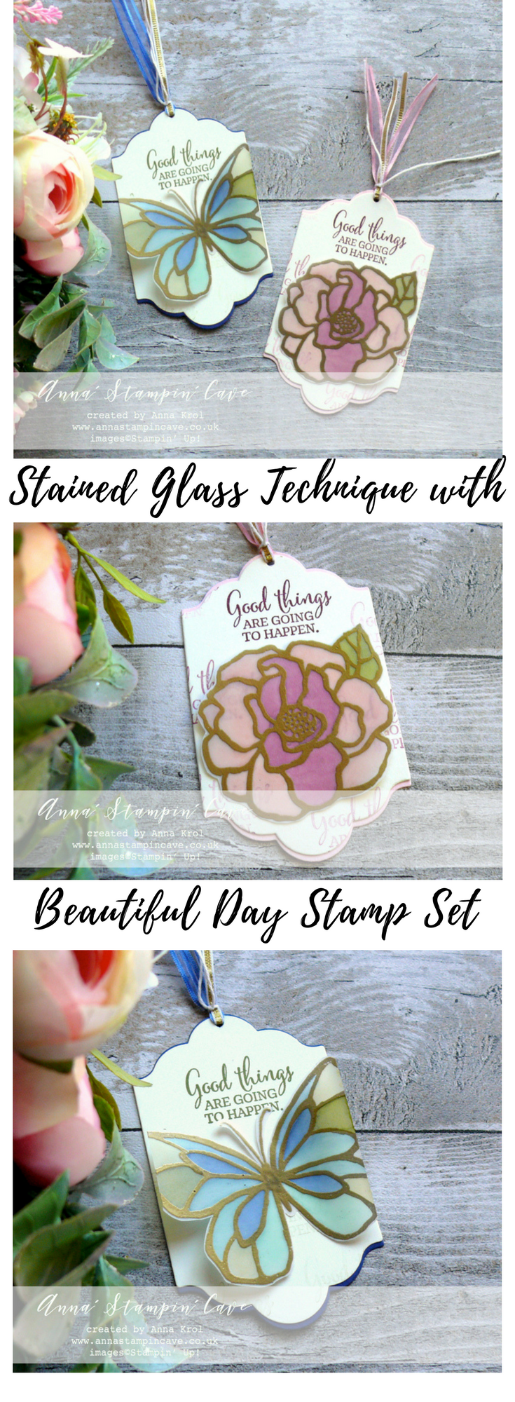
For my projects today I decided to showcase beautiful stamp set called (not mistakenly) Beautiful Day. I will show you how to achieve stained glass effect using two different mediums.
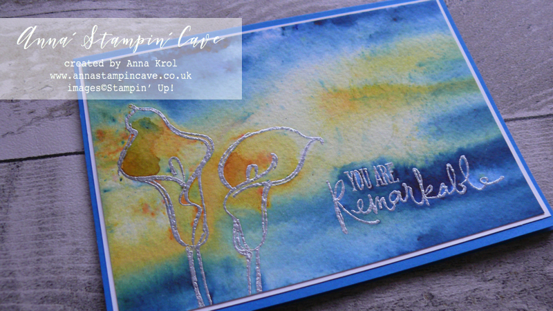
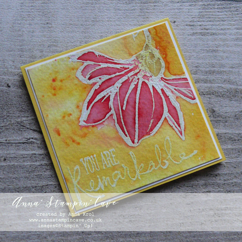
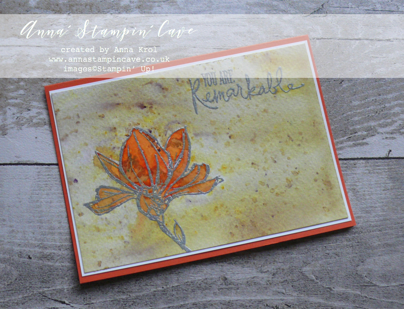
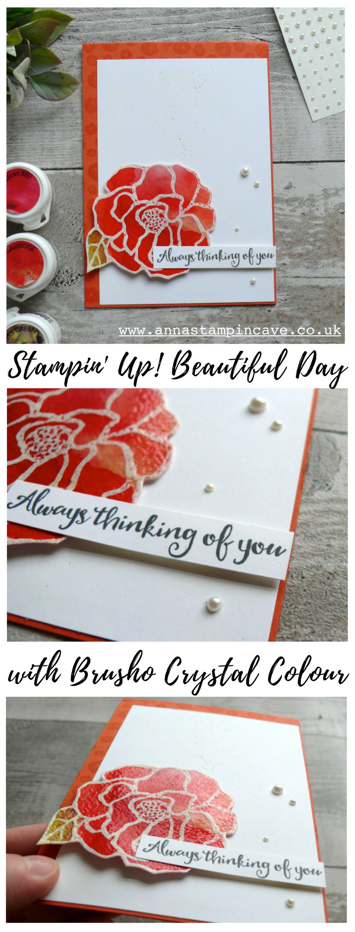
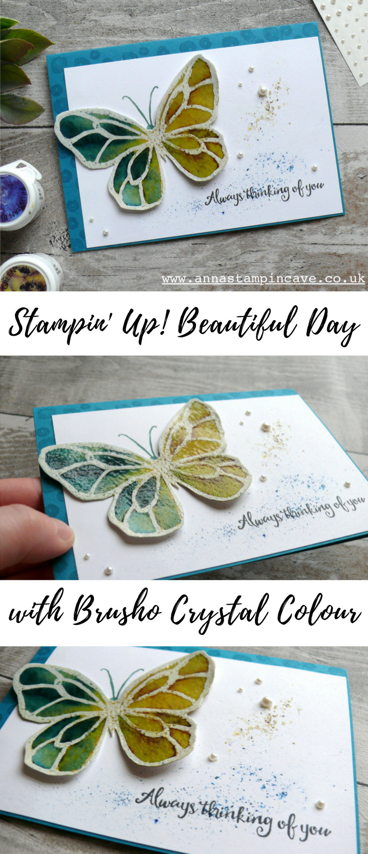
Stained Glass Effect With Brusho –
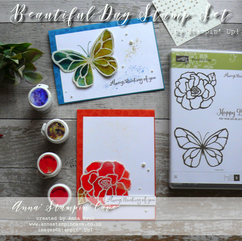
I love these bold images with its stained glass look – perfect for techniques and colouring. And that’s exactly what I did.
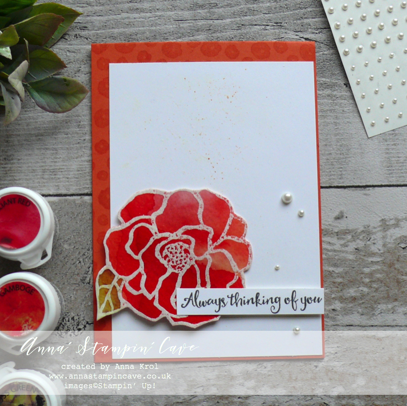
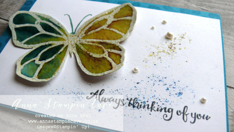
I stamped the flower and the butterfly on a piece of watercolour paper in Versamark and heat embossed them in white. Next, I filled them in with water and sprinkled Brusho Crystal Colour over the top.
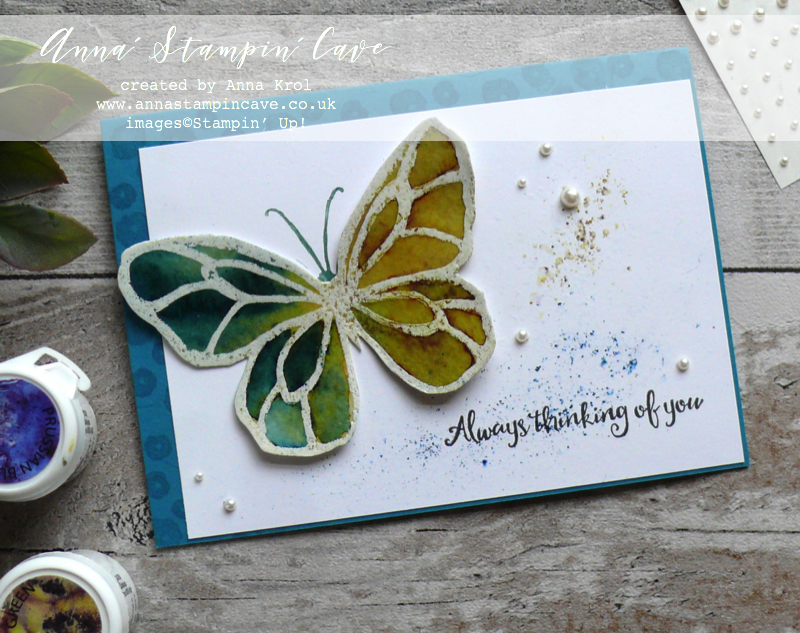
Heat embossing creates a barrier for the water and colour, so you can easily control how the colour spread. I’ve also used the aqua painter to move the colour around.
For the flower, I’ve used Brilliant Red, Gamboge and Moss Green for the leaf. The butterfly is a mix of my favourite Prussian Blue and Moss Green.
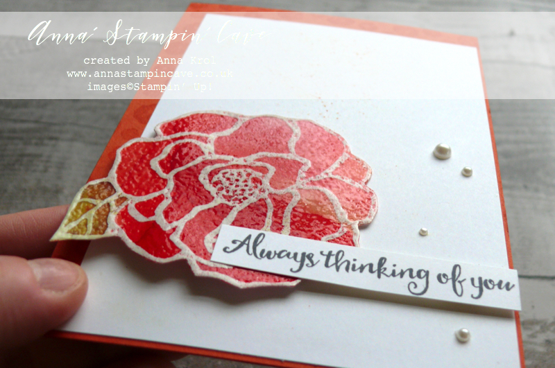
Once the flower and butterfly were dry I fussy cut them. To add that stained glass look, I smooshed Versamark on top of both images, sprinkled with clear embossing powder and heat set it.
I love this rough texture of watercolour paper!
I kept the rest of design very clean. I sprinkled some brusho on Whisper White panels and spritzed with water (very, very lightly) before assembling my cards.
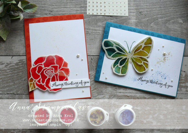
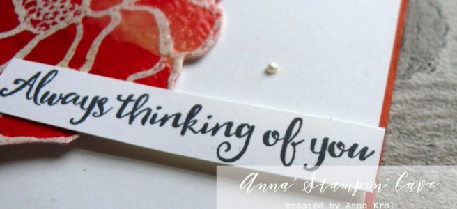
The edges of both card bases are stamped with three tiny flowers from the same stamp set, and I’ve used Versamark ink. Sentiments are stamped in Archival Basic Black ink. Few pearls finish off the look. I love these vibrant colours.
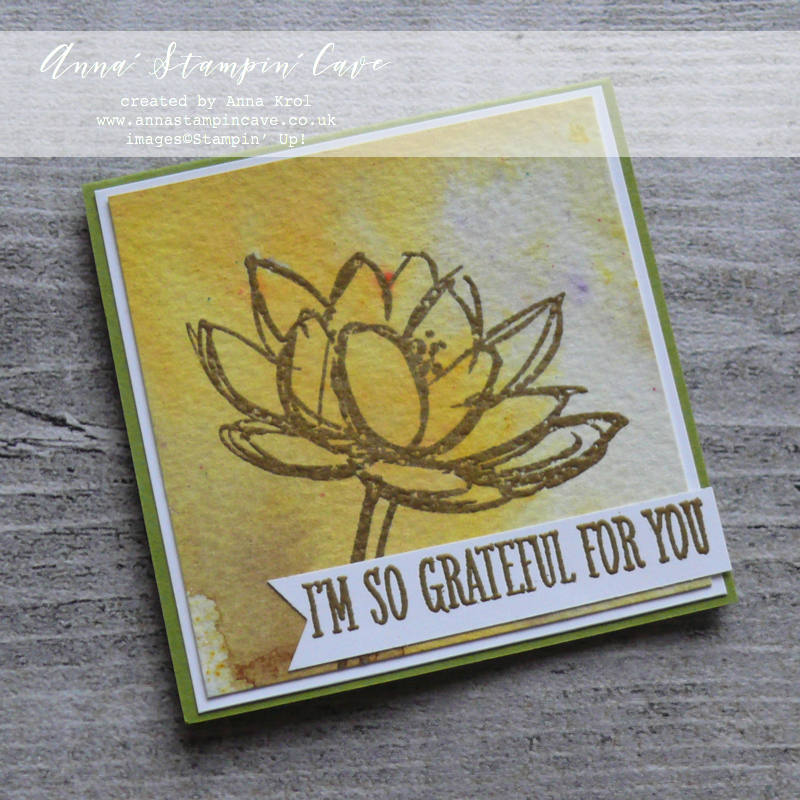
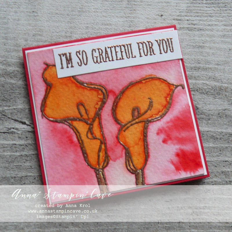
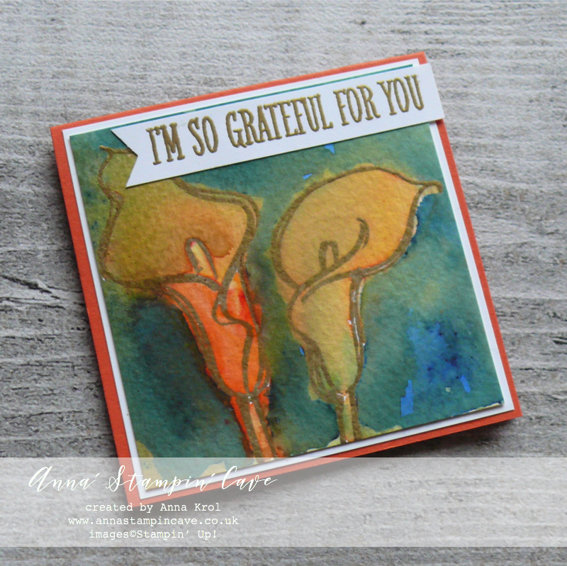
Stained Glass Effect With Stampin’ Blends –
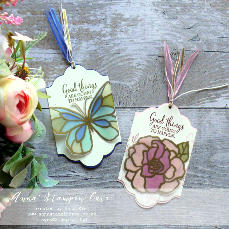
First, I stamped both images onto two pieces of vellum using Versamark ink and heat embossed them in gold.
Next, I colour on the back of te vellum with Stampin’ Blends Alcohol Markers as follows:
- flower – Pink Pirouette, Calypso Coral, Rich Razzleberry & Old Olive
- butterfly – Pool Party, Night of Navy & Old Olive
I even used Stampin’ Blends to dye Whisper White Organza Ribbon so it coordinates with my bookmarks – so much easier and quicker than using reinkers!
I fussy cut my images.
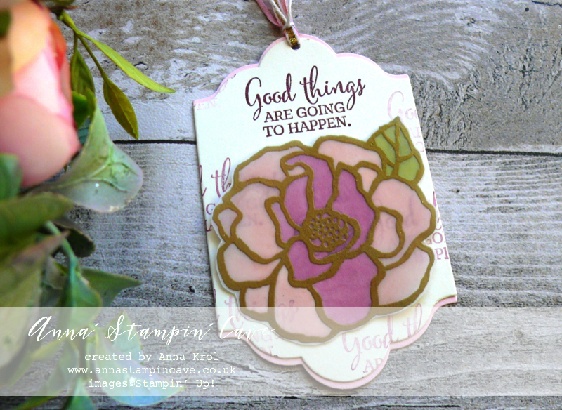
I die-cut four labels using Lots of Labels Framelits dies – two in Very Vanilla, one in Pink Pirouette and one in Night of Navy so they would coordinate with colours on the images. I die cut the Very Vanilla pieces slightly shorter.
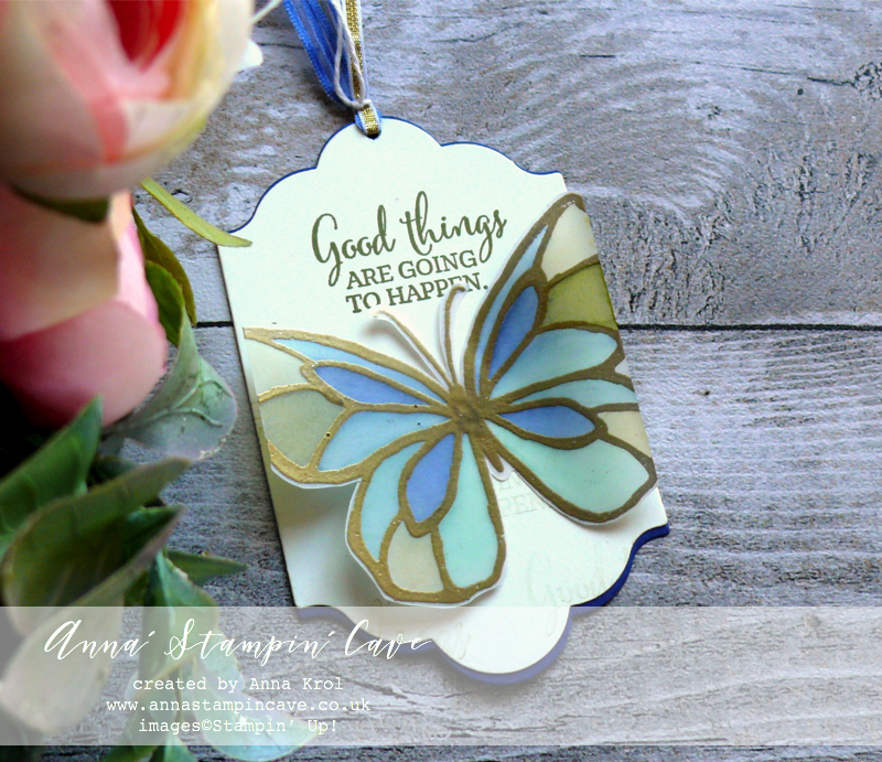
I stamped, repeatedly. greeting from You’ve Got This Stamp Set (without re-inking) on my Very Vanilla pieces: For the butterfly bookmark using Old Olive ink pad; and for the flower bookmark in Rich Razzleberry.
I assembled my bookmarks and adhered butterfly and the flower in the middle using Fast Fuse.
Hope you like my little showcase and that you give the stained glass technique a go.
Now, be sure to hop along and see more inspiring projects. Below is the list of all the participants but you can also use the buttons to keep hopping. Your next stop is lovely Pia Gerhardt from Germany – go and see her beautiful projects

If you wish to purchase any of products I have used, simply click the images below to go directly to my online store and don’t forget to enter the hostess code RRMR76JH to receive a gift from me.
Thank you for stopping by and have a blessed day

Hostess Code for February: RRMR76JH – Use this code in the month of February and receive a gift from me.

Special Notes:1) Make sure you select Anna Krol as your demonstrator;
2) If you select “No Contact” box I do not have access to your name and can’t send you a gift;
3) If your order is £150 or more do not use the code and grab your own Stampin’ Rewards + gift from me
Product List
|
|
|
|||
|
|
|
|
|
|
|
|
|
|
||
|
|
|
|
||
|
|
||||
|
|
|
|
|
|
|
|
|
|
|
|
|
|


 Organza Ribbon")


Pin me
Summary of the project which gives all the views of the card in one photo. I’d love if you pinned and called by on Pinterest xx
Don’t forget to check:
Spring Summer Catalogue Paper & Ribbon Shares. Shares are open to Austria, France, Germany, Netherlands & United Kingdom. 102 sheets of DSP & 2 yards of each type of ribbon from Spring/Summer Catalogue. Click here for more details —>
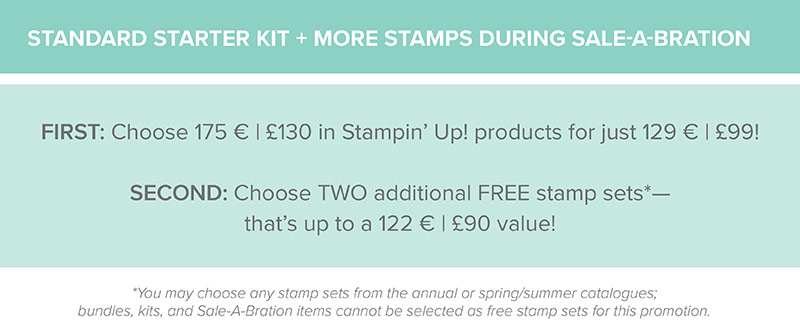
 The New Stampin’ Up! Spring/Summer 2017 Catalogue and Sale-A-Bration are LIVE and it’s AMAZING! For every 60 €/£45, you spend either from Spring Summer Catalogue or Annual Catalogue, you will get to choose one FREE level 1 product from SAB brochure! If you spend 120 €/£90, you get one FREE level 2 product, OR, you can choose two level 1 items. If you spend 180 €/£135, you have the option to choose three level 1 items or one level 1 item and one level 2 item. Click here for more details —>

Ever wondered what it’s like to join Stampin’ Up!’s community? I may have few answers for you. Click here for more details –>