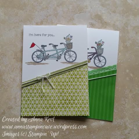
Stampin’ Up! Demonstrator Anna Krol Casing Catalogue – I’m Here For You Card Using Pedal Pusher SAB Free Stamp Set
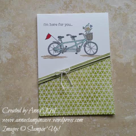
The base of my card is standard top folded Whisper White. I stamped my image using Stampin’ Up! Archival Basic Grey. Both Basic Grey and Basic Black Archival inks are perfect to use when you plan to colour in your image, as they don’t bleed. I coloured my tandem and flowers using Stampin’ Write Markers. For the bottom part of my card, I used a piece of white Color Me Irresistible Specialty Designer Series Paper. I cut it diagonally and sponged with Old Olive ink. I finish it off with a strip of Wildflower Fields DSP and Whisper White Baker’s Twine.
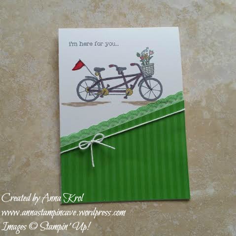
For my second card, I used darker colours. And again, I’ve used a piece of Color Me Irresistible Specialty DSP but, this time, I’ve used a Cucumber Crush stripes design piece. To finish my card off I added a Cucumber Crush Dotted Lace Trim and again a Whisper White Baker’s Twine.
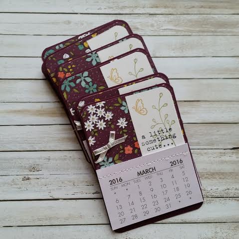
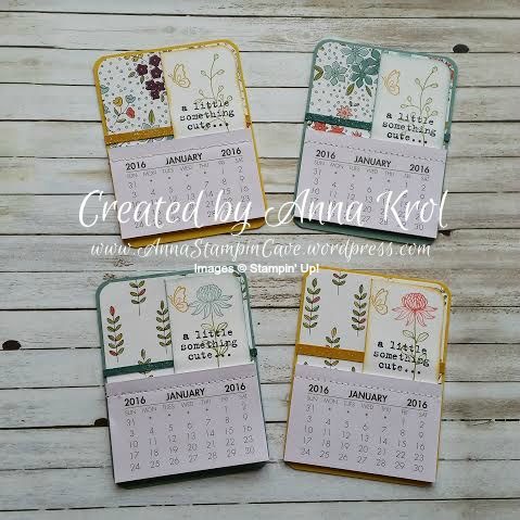
Good evening everyone. A few days ago, on my facebook page, I’ve posted some fridge mini calendars I’ve made as a thank you gifts for my customers. But they were such a hit that I thought I will make a blog post, to show how to make them. Just a warning, it’s gonna be picture heavy 😉
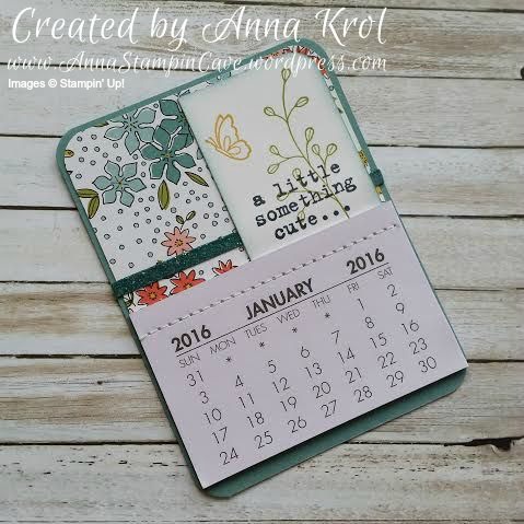
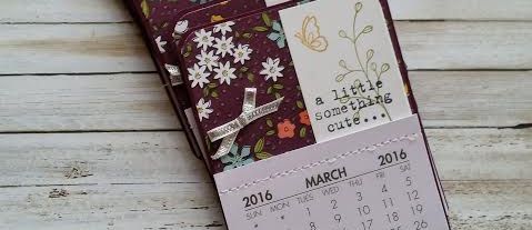
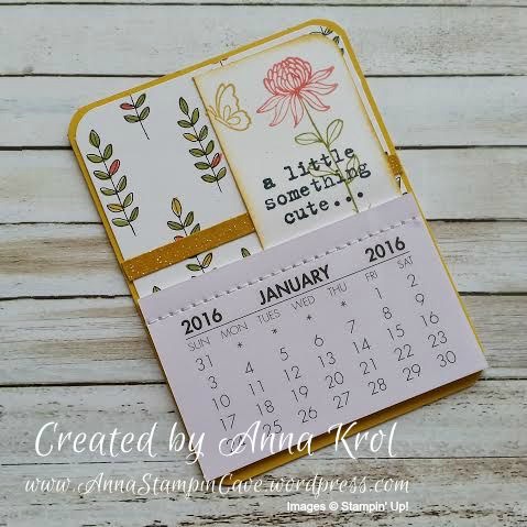
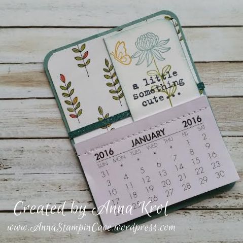
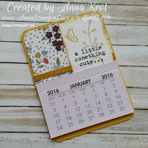
I’ve bought these mini calendars on eBay while ago, but due to chronic fatigue I just couldn’t push myself to sit down and craft – maybe except for the cards once in a while. But I was wondering about customers gifts the other day and had a lightbulb moment – why not make cute magnetic fridge calendars?! Each calendar measures approx 2-7/8″ x 1-7/8″, and on their size, I’ve based my design.
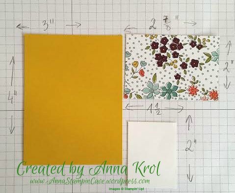
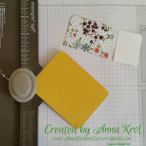
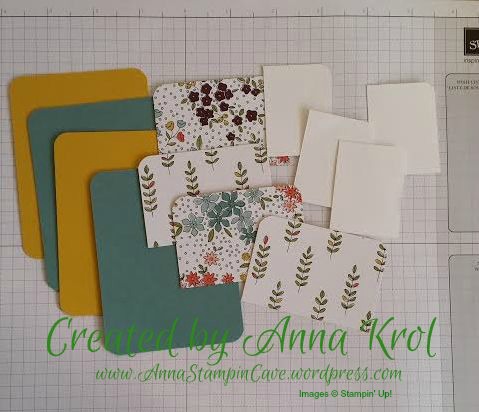
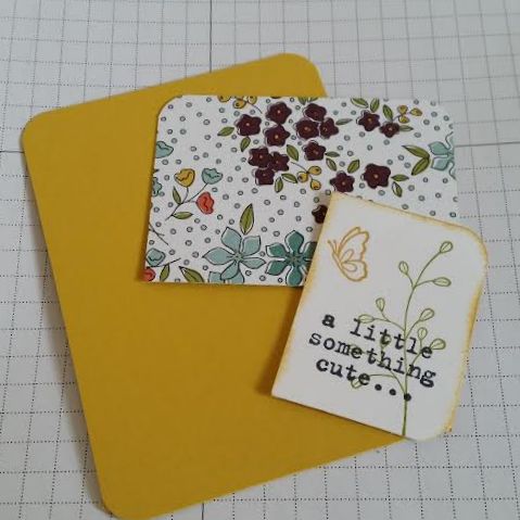
The base for my calendar measures 3″x 4″ – here I’ve used Hello Honey. Designer Series Paper measures 2-7/8″x 2″ and Whisper White piece for stamping measures 1-1/2″x 2″. I rounded all the edges of my base, top edges of DSP and right top corner of Whisper White. I’ve used my Envelope Punch Board to do so, but you could use the corner rounder punch if you have one.
I stamped “a little something cute…” sentiment from Something To Say stamp set on my Whisper White pieces. Next, I stamped floral images from Flowering Fields stamp set. I just love this set! Don’t forget that this beautiful stamp set you can earn free with every £45 purchase during Sale-a-bration.
I’ve used Hello Honey for butterflies, Old Olive for stems and leaves, and Lost Lagoon and Calypso Coral for flowers. I’ve used ink pads as well as Stampin’ Markers to do my stamping. I have to say here, I love that all Stampin’ Up’s Designer Series Papers got all coordinating colours listed at the back of the paper pack. It makes creating so much easier if you don’t have to work out which colours to use. I also sponged stamped panels, so they stand out nicely from the background.
To embellish my Blackberry Bliss calendars I’ve used Silver 1/8″ Ribbon as it looked pretty neat on a dark background. But it didn’t work as good on the light one. So I cut “skinny” strips of cardstock in Lost Lagoon and Hello Honey, smooshed Versamark over them and heat embossed with Iridescent Ice Embossing Powder. I love this gentle shimmer.
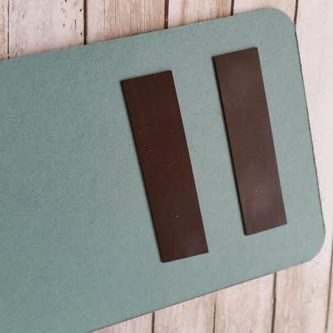
I assembled my calendars using Tombow glue. I also added two strips of a magnet at the back of each one.
I really hope you like my little project and that you give them a go. Or maybe you have different ideas to use these little calendars for? I would love to hear from you!
Thank you for joining us for another Simply Sketched Saturday Challenge! We’re so excited to be sharing this hop with you. The products used are all available in the current Annual, or seasonal, Stampin’ Up!® Catalogues*. Simply use the buttons at the bottom of the post to keep hopping!
Today’s sketch was designed by Hannah, and I have to admit that for me it was the hardest of all sketches I’ve worked with. Even though it’s the simplest one, that for sure.
And here’s my take on the sketch:
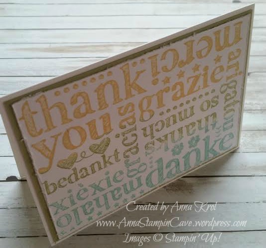
To create my card I’ve used Whisper White for the card base, Pear Pizzaz for the first layer and again Whisper White for stamping. The stamp I’ve used is called A World of Thanks and I love the grungy feel to it.
I’ve used 3 different ink colours for my stamping: Daffodil Delight, Pear Pizzazz and Pool Party. I simply dabbed ink pads over the image, pressed the card on top and rubbed it well to make sure all ink was transferred. Next, I distressed the edges with scissors and attached my stamped image to Pear Pizzazz and next to card base.
Now I would love to hear from you. Do you like my take on the sketch?
Now, be sure to hop along and see more inspiring projects. Your next stop is Karen’s blog – go and see what she has made for you.
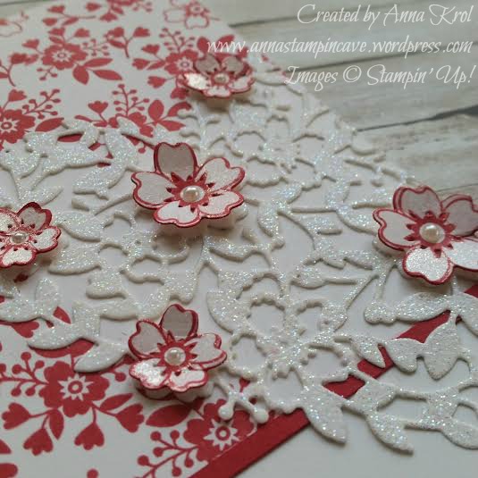
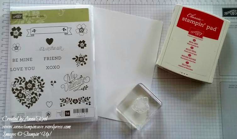
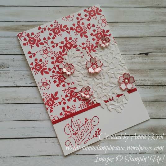
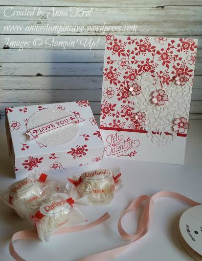
Today I’ve got for you beautiful Valentine’s Day card I’ve made to match cuteValentine’s Day gift box I posted two weeks ago. Again I’ve used Bloomin’ Love stamp set and Real Red Stampin’ Pad. This time I also used matching Bloomin’ Heart Thinlit Dies.
The card is a standard A6 top folded card. Because I didn’t want the stamping underneath the heart, I die-cut my heart first and used it as a stencil to lightly mark where the heart will be. I also masked around 1-1/2″ of the bottom of the card base using post-it notes. I wanted to keep it clean for the sentiment.
I stamped the base carefully around the marked line first, and then just filled in the rest of the space. Next, I stamped the sentiment. I cut a tiny strip of Real Red cardstock and adhered it just above the sentiment to hide where the stamping ends.
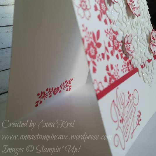
I also stamped the inside of the card using this cute floral stamp.
When I put my card together I decided to add some pop to it.
I stamped 3 small and 2 large flower outlines on the piece of Whisper White and die-cut them. I sponged their edges and attached them to the heart with glue dots. Just a little touch of Clear Wink of Stella glitter pen and few mini pearls and the card was ready.
I love how this card turned out and how it matches the box. Perfect little gift for Valentine’s Day.
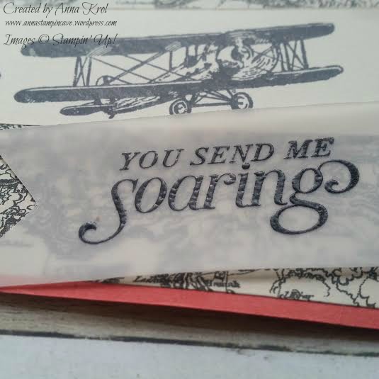
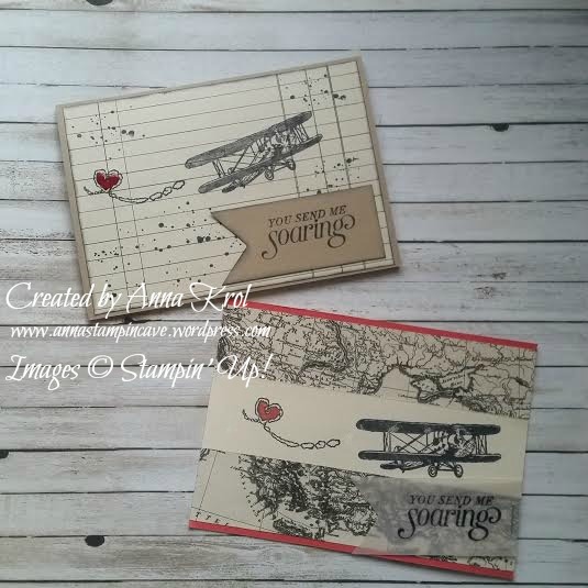
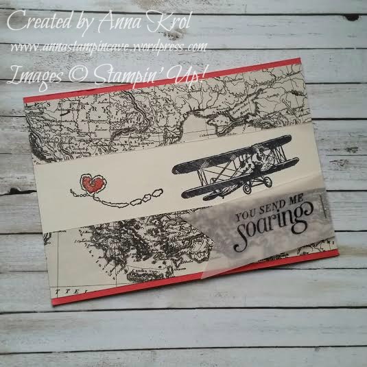
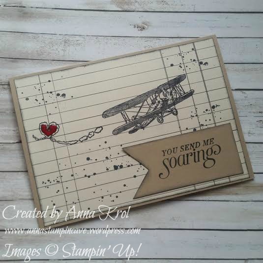
I love the vintage feel to Sky is the Limit stamp set from Stampin’ Up! and I’ve used it recently to create cute Valentine’s Day cards perfect for men in our lives.
First card I’ve made for a card-swap in our group of demonstrators. As all stampers, we love to swap! Swapping lets you share your creativity, enjoy the creativity of other stampers, and gather and collect ideas.
The base of my card is Watermelon Wonder cardstock. For the layer, I cut two pieces of Typeset Specialty DSP (each measure 5-7/8″ x 1-3/8″) and a strip of Very Vanilla cardstock that measure 5-7/8″ x 1-1/4″. Before I adhered them on my base I stamped my images on Very Vanilla using Basic Black Archival Stampin’ Pad, as I was planning to do a little colouring. Our archival ink pads are perfect for watercolouring as they do not bleed. I coloured heart using Watermelon Wonder ink pad and a blender pen and added a little shimmer with clear Wink of Stella Glitter Brush. Yeah, I know that most of the guys do not like a bling. But come on: he loves you, so you can sneak a little shimmer here and there, and he won’t say a word 😉 I stamped the sentiment on a piece of vellum and heat embossed in black. Cut it into a banner and attached to the card using a regular stapler.
For the second card base, I chose cardstock in my favourite neutral colour – Crumb Cake.
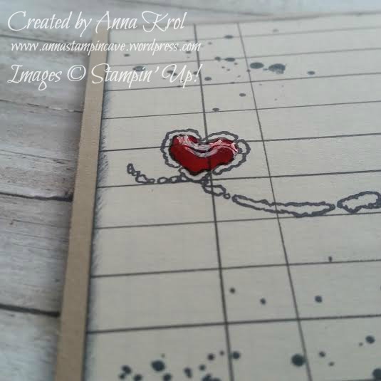
For the layer again I reached for Typeset DSP. But this time I stamped directly onto my designer paper. I also added some splotches from Gorgeous Grunge stamp set and sponged the edges to add to the vintage look. This time I stamped sentiment onto a piece of Crumb Cake instead of vellum. I attached everything to the base using snail adhesive. The plan for the heart was to leave it blank this time, but when the card was put together I’ve changed my mind. I colour the heart using a Real Red marker and then filled it with Crystal Effects. I have to say I love how a little of Crystal Effects makes the heart just POP!
It’s been ages since last time I’ve made masculine cards, so rather pleased how these turned out. I was wondering which of the finishes get more votes: Wink of Stella or Crystal Effects. So I’ve asked my fellow crafters (showing them just a hearts sneak peek) what they think. And I’m not surprised that Crystal Effects gets more votes. And which finish do you prefer? Let me know in the comments below.


 And here’s my take on the sketch: