Thank you for joining us for another Simply Sketched Saturday Challenge! We’re so excited to be sharing this hop with you. The products used are all available in the current Annual, or seasonal, Stampin’ Up!® Catalogues*. Simply use the buttons at the bottom of the post to keep hopping!
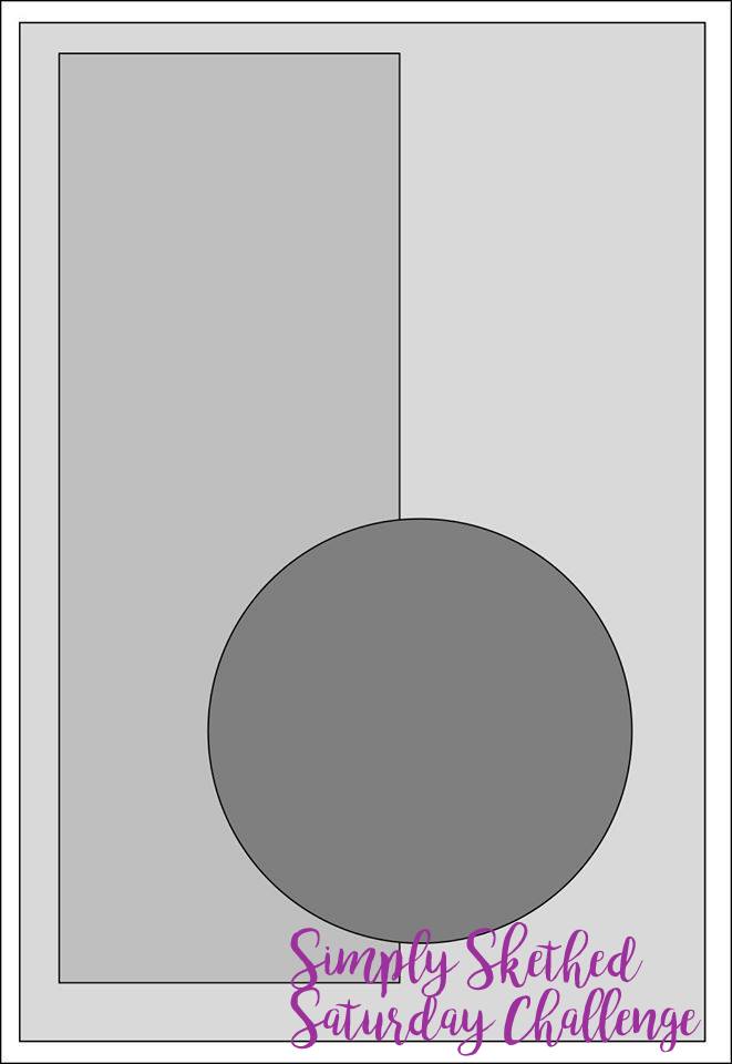
The sketch we’re working today with was designed by talented Keren Howell.
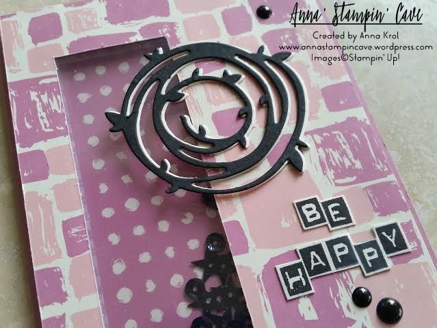
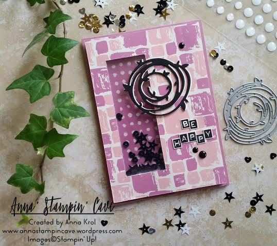
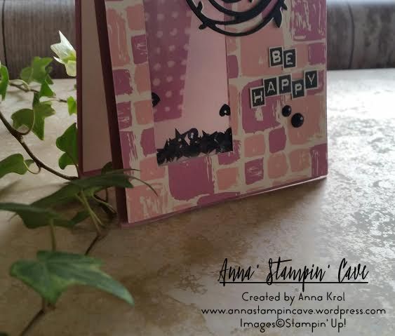
I really like this sketch. And funny how many cards I created recently could fit this sketch perfectly. But today I wanted to make something slightly different: a see-through window shaker card.
Don’t you just love Playful Palette Designer Series Paper Stack?! 48 sheets of such fun designs! I couldn’t decide which one to choose. But because I wanted to use Sweet Sugarplum cardstock for my base, these fun, wonky squares were perfect.
I cut out the window in my base first. Next, I traced the “window” on my DSP and cut it out too. Save that piece as you will need it later. I’ve used our new Foam Adhesive Strips to create the shaker. I added them around the window on the base and adhered a piece of acetate. I’ve used more foam strips around the base to adhere my piece of DSP. To finish my shaker window, I added black sequins and adhered another piece of acetate on the inside of the card.
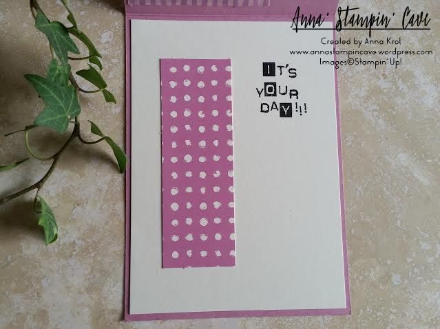
For the inside, I’ve used a Very Vanilla panel and a piece of DSP that I cut out when creating the window. But this time I’ve used the reverse side of that DSP. The placing is the key, so when the card is closed, you can see that piece through the window. The sentiment “It’s Your Day” was stamped in Basic Black Archival Ink, using Labeler Alphabet Stamp Set (which I truly love). And yes, I stamped it wonky on purpose 😉
When the shaker bit and the inside of the card were done I could concentrate on the front. I die-cut two wreaths using Swirly Scribbles Thinlits Dies. One in Basic Black, and one in Very Vanilla. I glued them together slightly off-setting, so the Very Vanilla is peeking from underneath. I adhered it to the base with Multipurpose Liquid Glue. My sentiment, again, was stamped using Labeler Alphabet Stamp Set. I stamped it on a piece of Very Vanilla, and hand-cut it leaving a little border around the letters. Adhered it with liquid glue.
For embellishments, I’ve used White Perfect Accents, which I coloured black using a permanent marker. And that finish off my card.
Do you like my project?! If so please leave me a comment. I would love to hear from you!
Now, be sure to hop along and see more inspiring projects. Your next stop is Helen’s blog – go and see what she has made for you.
Thank you for joining us on another Pootlers Blog Hop! We’re showcasing lots of gorgeous projects using products from the new Stampin’ Up!® Annual Catalogue. Simply use the buttons at the end of each post to keep hopping!
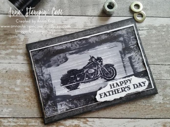
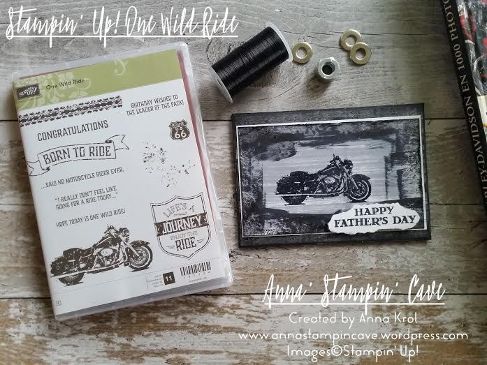
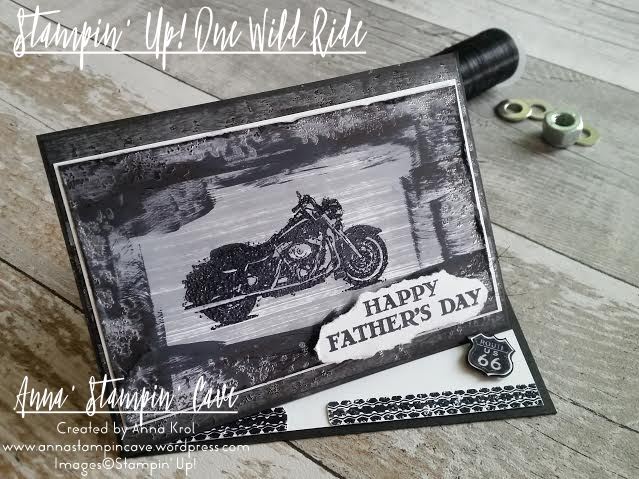
I hope you had a chance to look through our Annual Catalogue and you’ve got your favourites already. For today’s project, I’ve used One Wild Ride Stamp Set from page 115, to create a Father’s Day card for my hubby.
Why did I choose this set? As a teenager I was a rebel girl: I was listening to Gun’s N’ Roses, Aerosmith and other rock stars, wearing skinny jeans, long hair and combat boots, I always dreamed of having my own Harley-Davidson. Silly, I know, but who wasn’t those days 😉 No surprise then, this set was in my first order. And what can I say, hubby has a soft spot for Good Ol’ Harry too.
To really show off this stamp set I decided to create a twisted easel card, which sounds more complicated than it sounds. I have to admit I wanted this card to look really rough and distressed, so you could nearly feel motorcycle’s grease j/k 😉 (Chris loves distressed cards with lots of layers).
The base of my card is standard top folded A6 in Basic Black. And the “front” of the card is scored in half diagonally to create an easel. For the proper card front I’ve used a piece of Basic Black again, a slightly smaller piece of Basic Black and Whisper White for stamping.
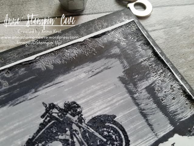
Basic Black panel I left intact. On Basic Grey, I stamped with this gravel-splatter -kinda stamp from the set, with Versamark, and heat embossed it in silver. Next, I took Basic Black Archival Ink and smooshed it across the panel, where the embossing was. It makes it look a little bit dull, but you can still see the Basic Grey card.
To add some shine and dimension to the motorcycle, I dabbed my stamp in Versamark first. Next, without stamping, I dabbed it in Basic Black Archival Ink, so once it’s stamped, Versamark was on top and I heat embossed the image using clear embossing powder. Again I’ve used gravel stamp and stamped it all around the edge of my WW panel. heat embossed it in silver and smooshed Basic Black across the panel where the embossing was. Next, I took a cloth and “took off” some of that ink which created that dull metal look. Because there was a too big contrast between Whisper White and all that black, I smooshed Basic Grey across the centre of the panel. To finish it off I added some distressing to the edges using scissors.
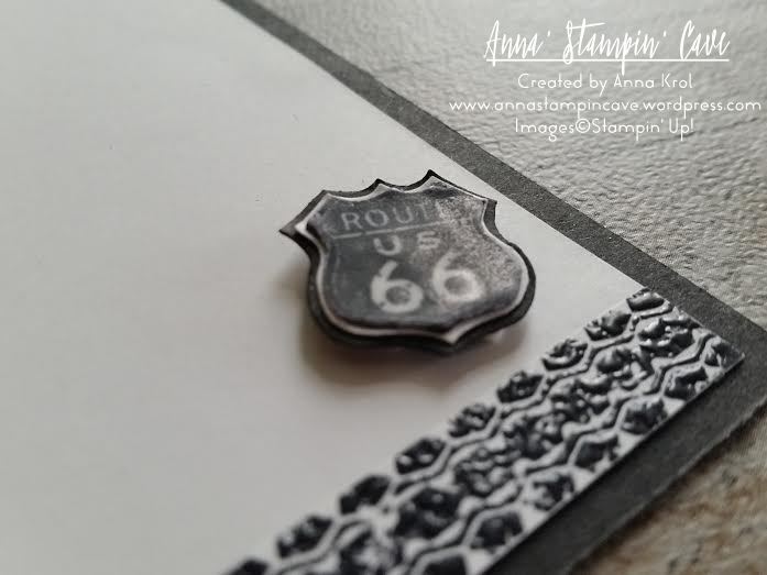
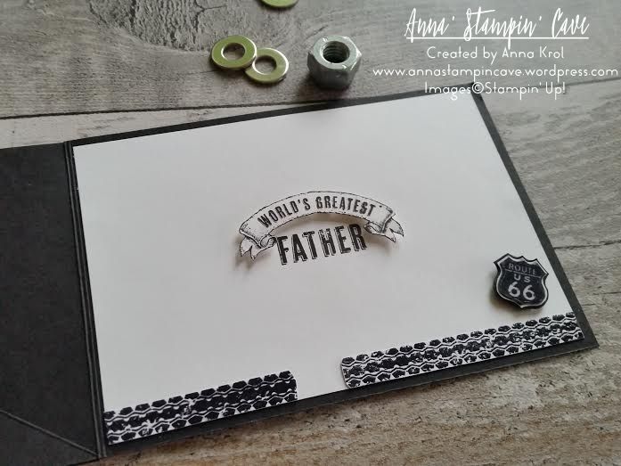
For the inside of the card, I’ve used banner and sentiment from Guy Greetings Stamp Set. I hand-cut the banner and add it to the card using dimensionals. I also stamped tire trail stamp on a scrap piece of paper, cut it out and adhere it to the bottom of the inside panel. To create a stopper for the easel I stamped Route 66 stamp on a piece of whisper white, cut it out with scissors and heat embossed it with clear embossing powder. I next used it as a guide, to create two slightly bigger layers to go underneath the original image. One in Whisper White and one in Basic Black. Glued them together and adhered it in the corner of the inside panel. I could now assemble the whole card.
The sentiment for the front comes, again, from Guy Greetings Stamp Set. I stamp it on a scrap of Whisper White and just simply tore it out. It’s hard to see on the picture, but I added few strings of new Basic Black Metallic Thread underneath the sentiment before adhered it with dimensionals.
I’m really happy with this card(it’s got our daughter approval too haha). I know Chris will love it too.
How about you? Do you like my card? Let me know in the comments below.
Now, be sure to hop along and see more inspiring projects. Your next stop is lovely Kathleen from Lilypopcrafts – go and see what she has made using the new products.
Thank you for joining us on another Pinkies Blog Hop! We’re showcasing lots of gorgeous projects using products from the new Stampin’ Up!® Annual Catalogue. Simply use the buttons at the end of each post to keep hopping!
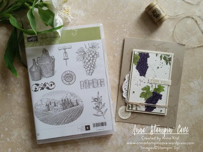
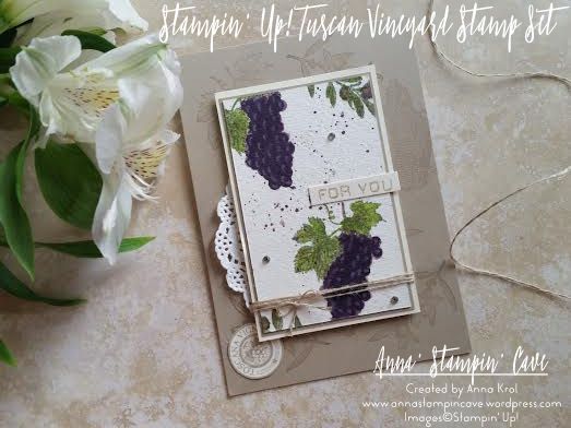
When Chris, my husband, saw Stampin’ Up! Tuscan Vineyard Stamp Set he said: “we have to have it” ;). In our home, we love to have a glass of good wine on special occasion, or when friends come over. We also make our own wine from the fruits of our garden. Chris (my husband) is very passionate about it. When he was young he’s spent some time on a French vineyard, and he fell in love with the art of making wine.
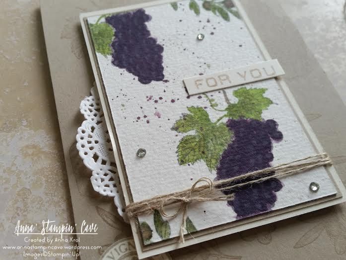
I think this set is perfect for collages, but I decided to use my favourite technique – watercolour. First, I randomly stamped the base of my card using various images from the stamp set. I used Crumb Cake cardstock and ink pad for tone on tone look. Next, I took a piece of watercolour paper and I stamped bunches of grapes and olive branches using Basic Grey Archival ink and water coloured them with an aqua painter. For fine lines, I’ve used Blender Pens.
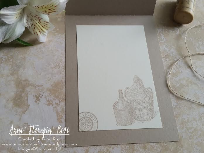
When I was happy with the results I made some random splotches with Perfect Plum and Wild Wasabi. To assemble my card I backed my watercolour panel with a piece of Crumb Cake and Very Vanilla. I wrap linen thread around the panel, added a piece of new doily underneath, and adhere it to the card base using dimensionals. I stamped round image from the same set, that reads Toscana Vigneto on a piece of Very Vanilla and tucked it underneath the panel. Few rhinestones, simple sentiment, and my card was done. I also stamped inside of the card.
I truly hope you enjoyed coming to my blog today and see my card. As always, if you wish to purchase any of the products I have used, simply click the images below to go directly to my online shop.
Now, be sure to hop along and see more inspiring projects. Your next stop is lovely Kim – go and see what she has made using the new products.
Thank you for stopping by and have a blessed day! Product List
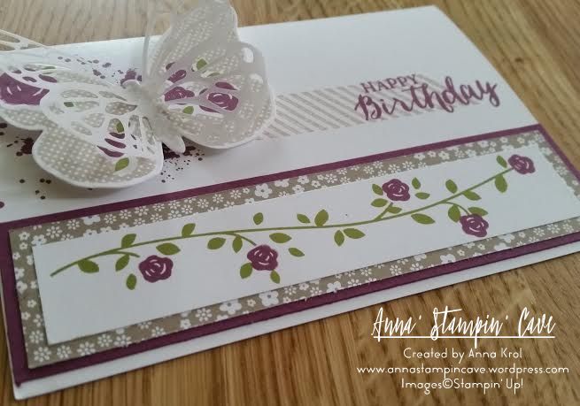
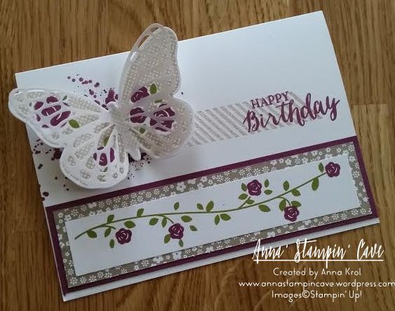
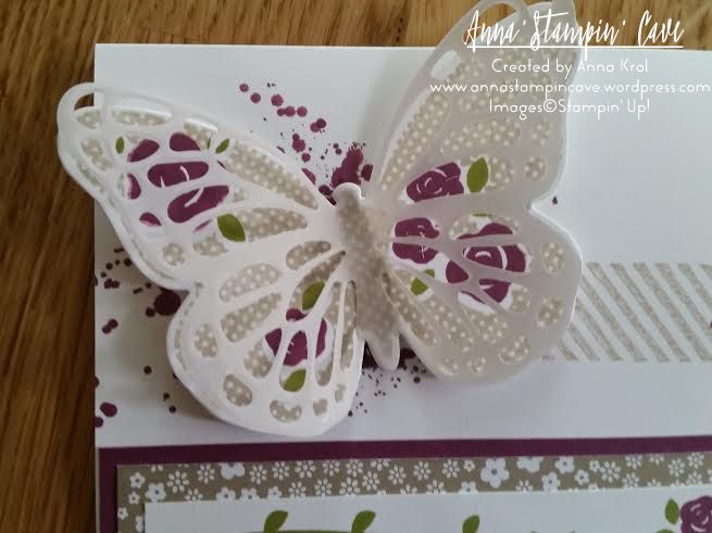
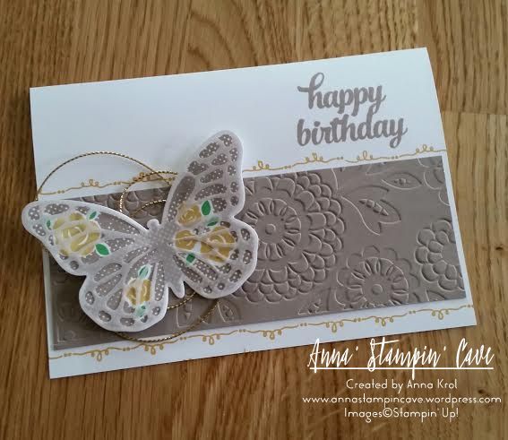
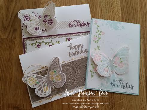
Just get back from night shift and to be honest I should be in bed now and be sleeping. But I really, really, really wanted to stick to my plan and show you few birthday cards I created back in May for ladies in our swap group. For all cards I’ve used, sadly retired, Floral Wings stamp set. But it could be easily substituted with Butterfly Basic stamp set. So here are my cards:
For first one I’ve used Rich Razzleberry, Crumb Cake and Old Olive colour combination
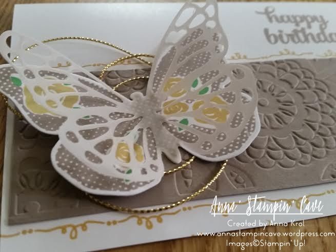
Next one is a Tip Top Taupe, Hello Honey and Cucumber Crush combination
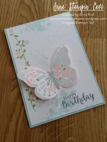
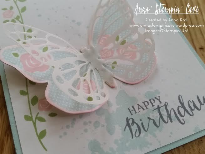
And last, but not least is Soft Sky, Pink Pirouette with a little of Pear Pizzazz
I had lots of fun creating these. And I’m really chuffed that the ladies liked them too 🙂 Here’s once again all three cards
Hope you like my cards. I’m heading to bed now for my well-earned rest.
Thank you for stopping by, and have a blessed day,