Anna’ Stampin’ Cave – Celebrate You with Go For Greece Training Group Blog Hop
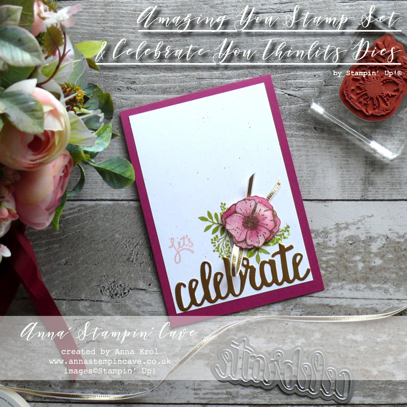
Sale-a-bration is coming to an end and today I’ve got for you beautiful, clean & simple card using Amazing You Stamp Set and Celebrate You Thinlits Dies – both of which you can still earn FREE (Sale-a-bration ends on 31st March).
But there’s also something you may don’t know about Celebrate You Thinlits Dies – they are carrying over to the new Stampin’ Up! 2018-2019 Annual Catalogue!! But why pay for something if you can gave it for FREE, right?
 Let’s Celebrate card dimensions:
– Berry Burst cardstock: 11-6/8″ x 4-1/8″ scored in half at 5-7/8″ (29.7 x 10.5 cm scored in half at 14.8 cm)
– Whisper White cardstock: 3-5/8″ x 5-3/8″ (9.3 cm x 13.6 cm)
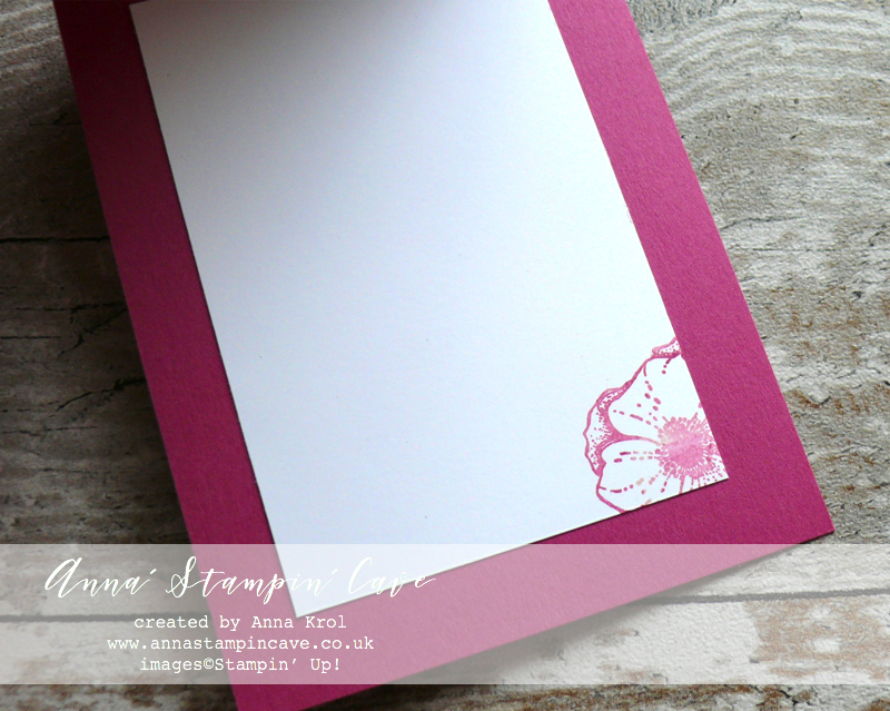
– Whisper White cardstock (for inside): 3″ x 4-5/8″ (7.6 cm x 11.7 cm)
– A piece of watercolour paper for Stamping
– A strip of Gold Foil cardstock for die cutting
– Gold 1/8″ Ribbon: 8″ approximately
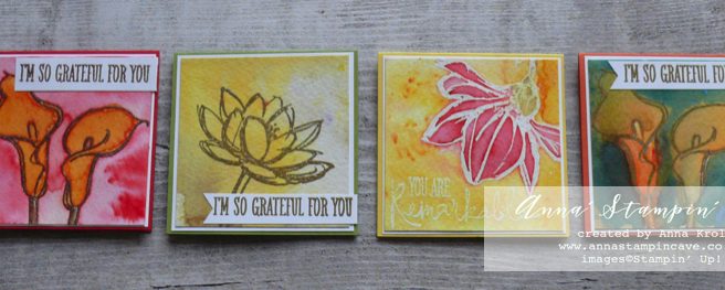
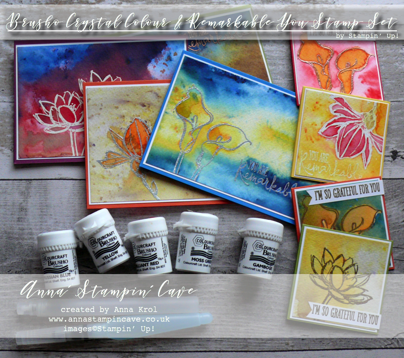
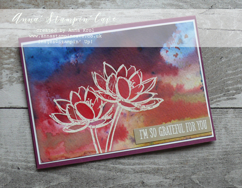
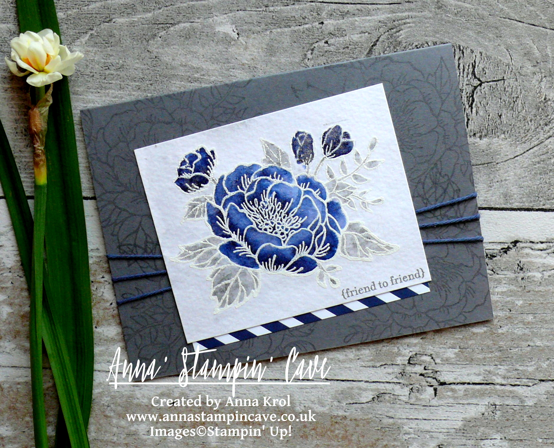
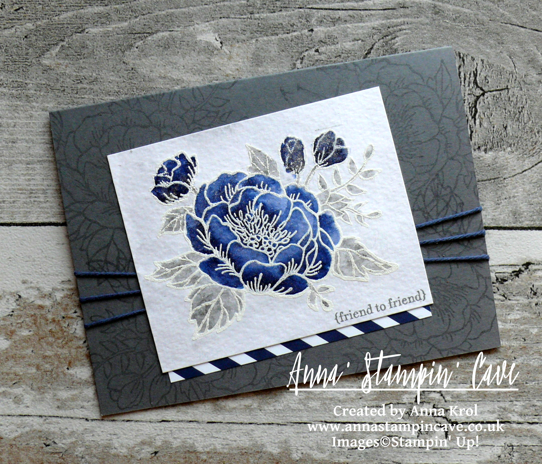
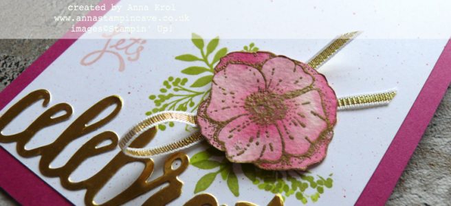
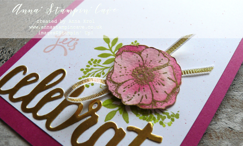 First, I stamped my flower on a piece of watercolour paper in Versamark, heat embossed it in gold, and fussy cut it (without leaves).
To paint the flower I’ve used aqua painter. For the first layer of colour I chose Powder Pink ink pad. Once it dried, I’ve used Berry Burst ink pad to add more depth to the petals.
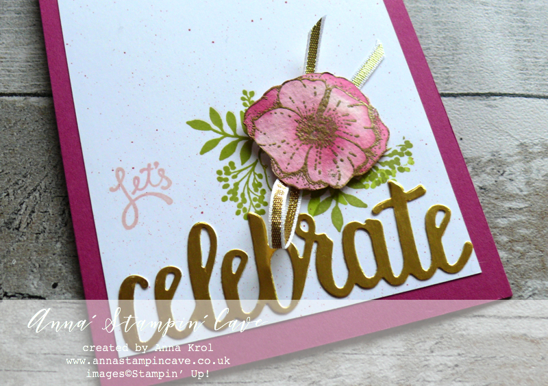 I took a Whisper White panel, decided where my flower will be placed, and using Stamp-a-ma-jig I stamped leaves in Lemon Lime Twist. Next, I stamped over them with Pear Pizzazz to darken them a bit and also stamped more leaves in Pear Pizzaz.
Using dry brush I picked some of that Berry Burst ink, flicked it over the Whisper White panel and assembled my card before adding the flower.
I cut a piece of Gold 1/8″ Ribbon (briefly 8″), added it underneath the flower and adhered it to the card base with dimensionals.
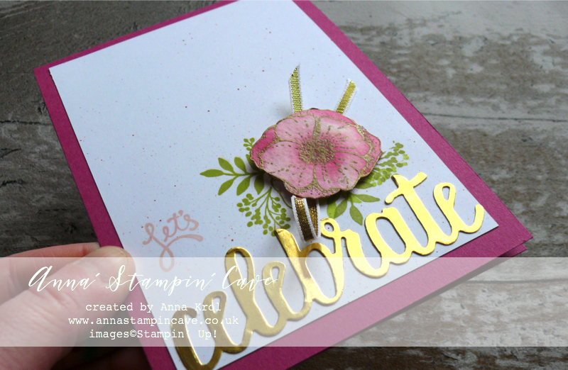
For the sentiment I die cut the word “celebrate” from Celebrate You Thinlits Dies in gold foil and also stamped “Let’s” from Amazing You Stamp Set in Powder Pink next to the flower. And that’s my card for today.
I really hope you enjoyed visiting my blog today and I would love to encourage you to hop along with us and see the rest of beautiful projects designed by amazing artists. Please be sure to continue to hop using the list below. You don’t want to miss any!
Thank you for stopping by and have a blessed day

Hostess Code for a month of March: CWKGWDD7 – Use this code in the month of March and receive a gift from me. Spend £25 or more and use the code, and you will receive a Sweet Soiree Suite embellishments sample: one Silver Mini Gable Box + samples of ribbon and ‘shreddies’ (pink, silver or white) + a handmade gift from me.
 Special Notes:
1) Make sure you select Anna Krol as your demonstrator;
2) If you select “No Contact” box I do not have access to your name and can’t send you a gift;
3) If your order is £150 or more do not use the code and grab your own Stampin’ Rewards + gift from me
|
|
|
|
||
|
|
|
|||
|
|
|
|
|
|
|
|
|
|
|
|
|
|


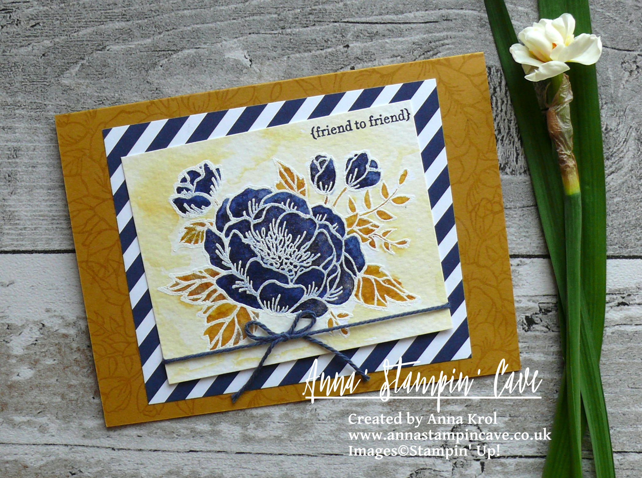
Pin me
Summary of the project which gives all the views of the card in one photo. I’d love if you pinned and called by on Pinterest xx
Don’t forget to check:

New Sale-a-bration release is LIVE. Click here for more details –>
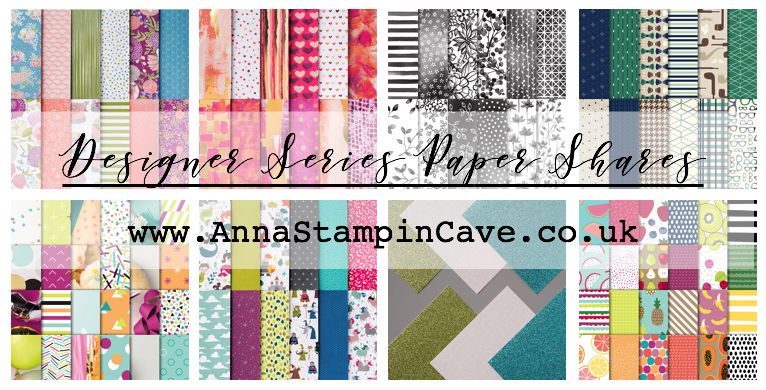
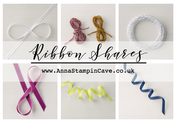
Spring Summer Catalogue Paper & Ribbon Shares. Shares are open to Austria, France, Germany, Netherlands & United Kingdom. 102 sheets of DSP & 2 yards of each type of ribbon from Spring/Summer Catalogue. Click here for more details —>
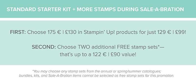
 The New Stampin’ Up! Spring/Summer 2017 Catalogue and Sale-A-Bration are LIVE and it’s AMAZING! For every 60 €/£45, you spend either from Spring Summer Catalogue or Annual Catalogue, you will get to choose one FREE level 1 product from SAB brochure! If you spend 120 €/£90, you get one FREE level 2 product, OR, you can choose two level 1 items. If you spend 180 €/£135, you have the option to choose three level 1 items or one level 1 item and one level 2 item. Click here for more details —>

Ever wondered what it’s like to join Stampin’ Up!’s community? I may have few answers for you. Click here for more details –>