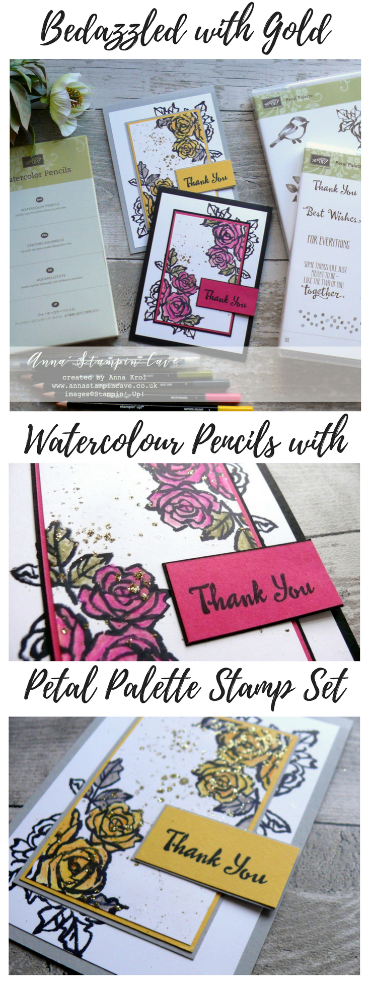
Anna’ Stampin’ Cave – Petal Palette Bedazzled with gold
Hello everyone! Welcome to the monthly Stampin’ Dreams Blog Hop. This month’s theme is Colouring. You are currently visiting Anna Krol from the United Kingdom.
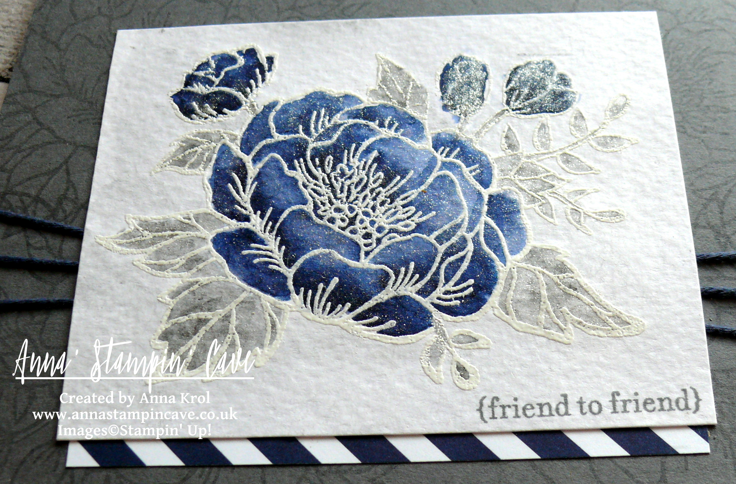
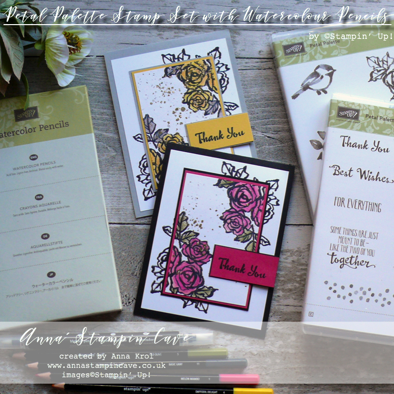
Colouring and painting must be my favourite hobby. And it does not really matter what medium I use. For today’s hop, I’ve created two beautiful cards in different colour combinations, using amazing Petal Palette Stamp Set and Watercolour Pencils.
To showcase beautiful roses from Petal Palette Stamp Set, I decided to try a double layer stamping technique.
Dimensions for both cards:
- card base: 11-6/8″ x 4-1/8″ scored in half at 5-7/8″ (29.7 x 10.5 cm scored in half at 14.8 cm) – Basic Black & Smoky Slate cardstock
- Whisper White cardstock panels: 3-3/4″ x 5″ and 2-1/2″ x 3-3/4″ (9.5 cm x 12.7 cm and 6.3 cm x 9.5 cm)
- Basic Black & Smoky Slate panels: 2-3/4″ x 4″ (7 cm x 10.1 cm)
- Daffodil Delight & Melon Mambo panels: 2-5/8″ x 3-7/8″ (6.7 cm x 9.8 cm)
- both sentiment strips (Basic Black & Smoky Slate) measure 2″ x 1″ (5 cm x 2.5 cm) with Melon Mambo & Daffodil Delight strips are just a smidge smaller
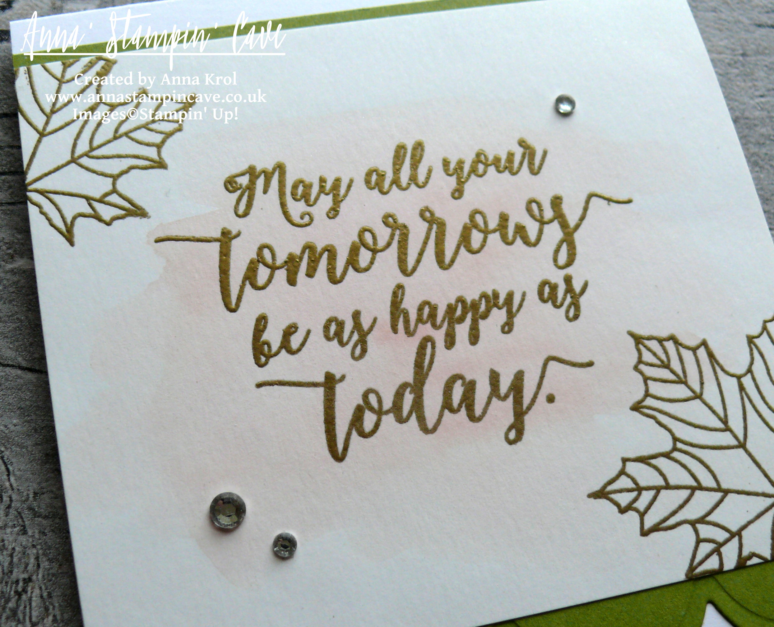
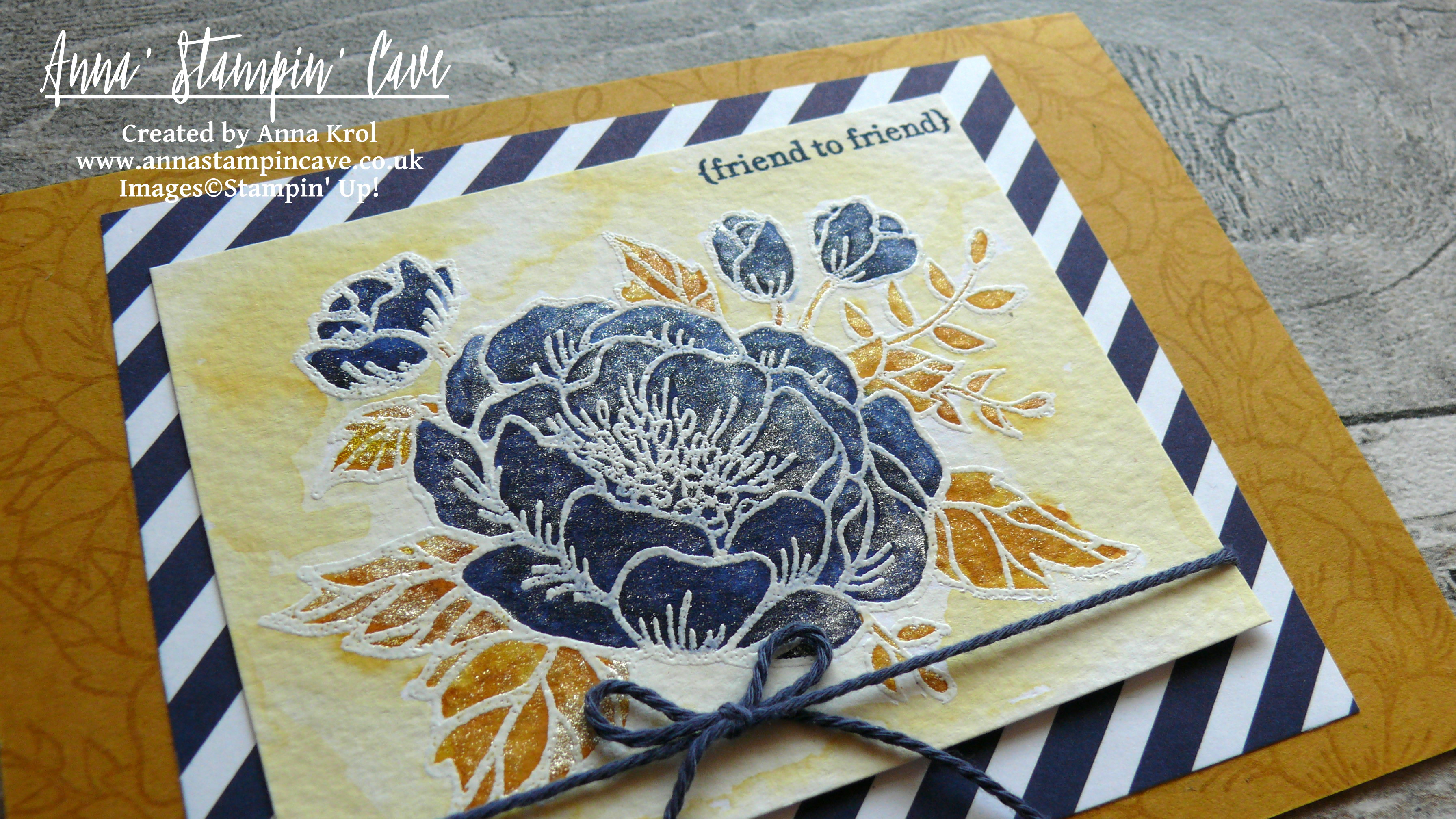
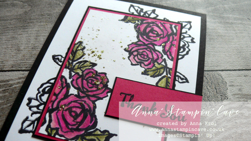
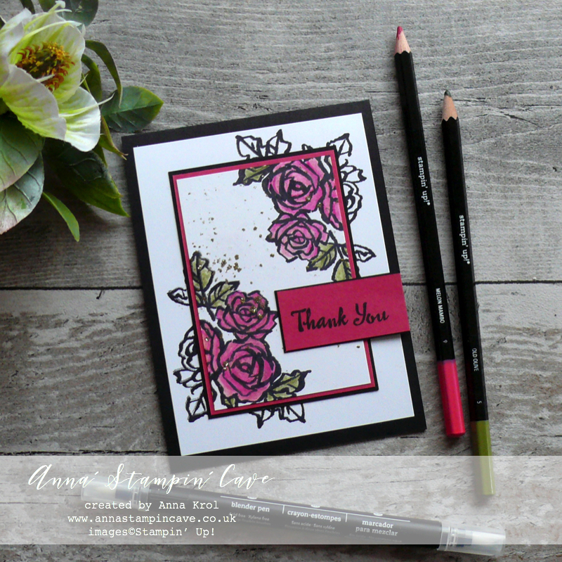 For one of my cards, I’ve used a classic colour combination: Basic Black & Melon Mambo with a hint of Old Olive on the leaves.
I’ve layered together two panels of Whisper White cardstock (smaller & larger) securing them together with a dab of snail adhesive in the middle so they won’t move.
 I stamped roses from Petal Palette Stamp Set in two corners of my panel making sure they overlap both layers. Because I planned to use Watercolour Pencils, I stamped them using Basic Black Archival ink.
Next, I took apart those layers and decided to colour only the images on a small panel, and leave the rest just black and white.
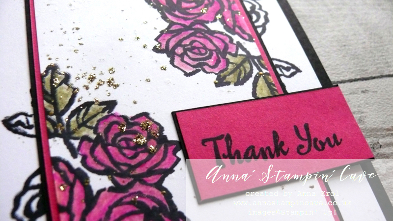
To colour my roses, I’ve used Watercolour Pencils in Melon Mambo and Old Olive. Blender Pens helped me to blend those colours nicely.
 Blender Pens are colourless, but the solution they hold, helps moving colour around, even on regular cardstock.
To add more colour to the image, you can either colour over the image or use Blender Pen to pick up the colour straight for the pencil.
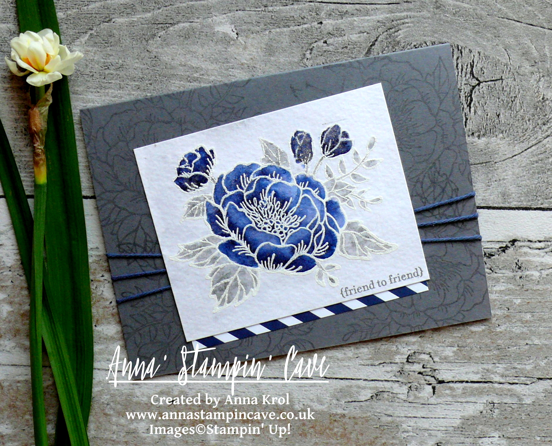
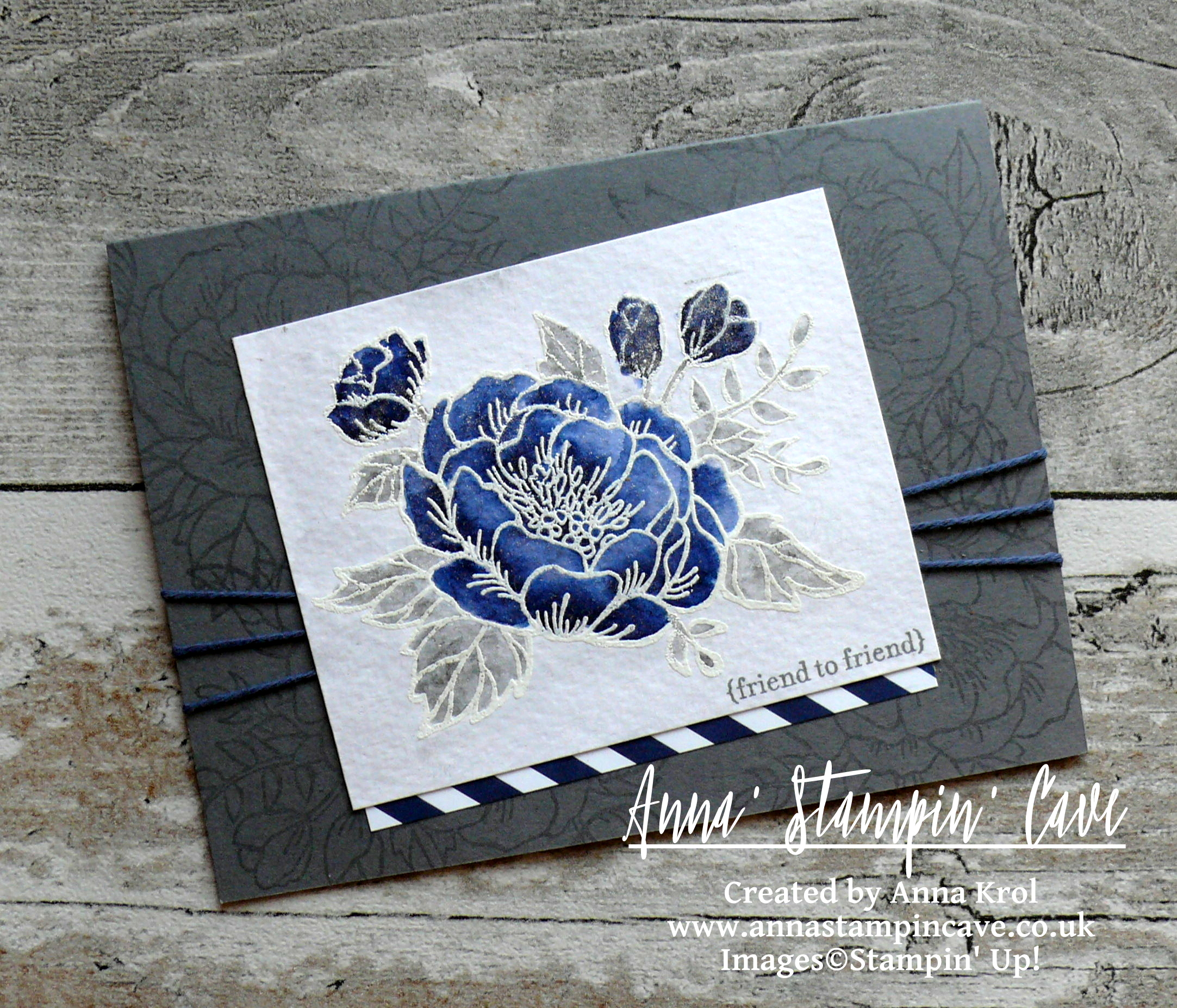
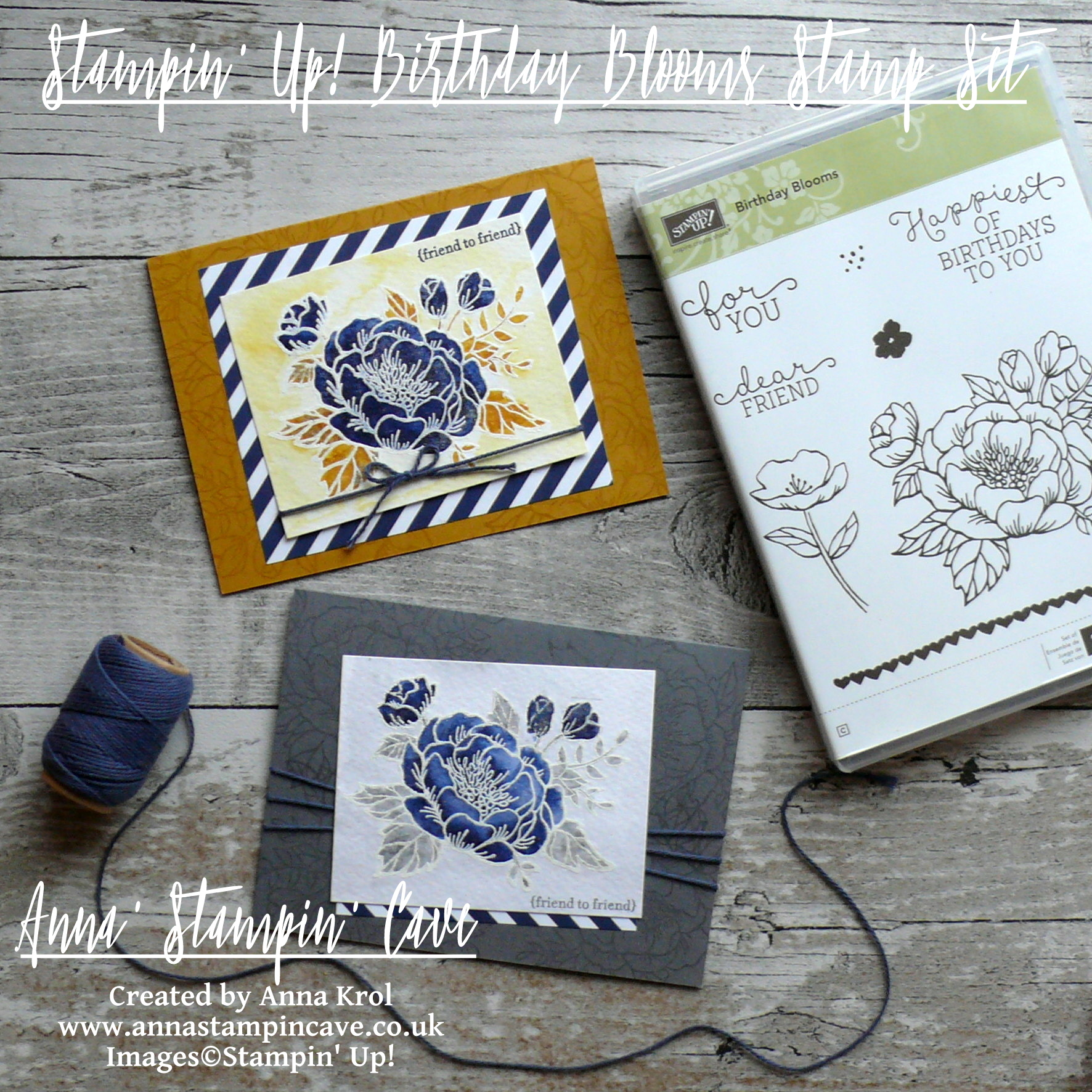
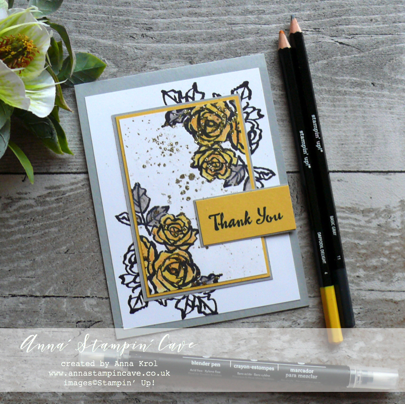
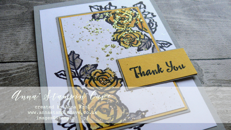
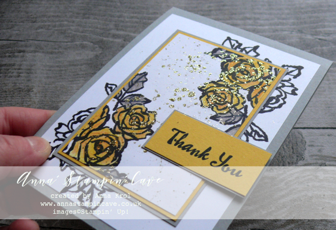
For my second card, I decided to use a rather ethereal colour combination of shades of grey with a pop of yellow.
Same technique but completely different look.
For the roses, I’ve used Daffodil Delight watercolour pencil. I’ve added more colour to the edges of each petal and then using Blender Pen blended the colour towards the centre.
Leaves are coloured with Basic Grey watercolour pencil
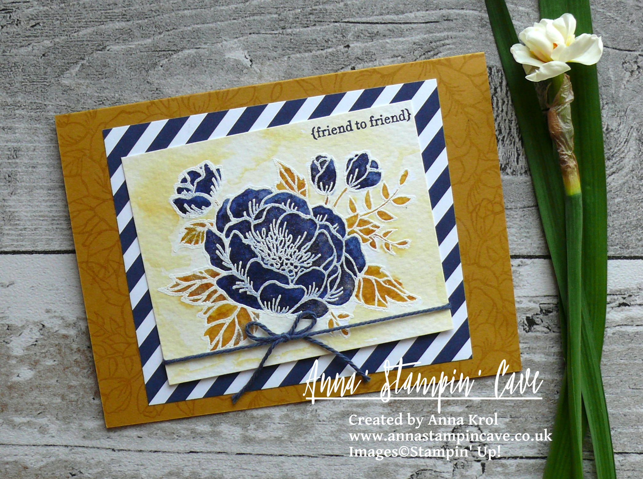
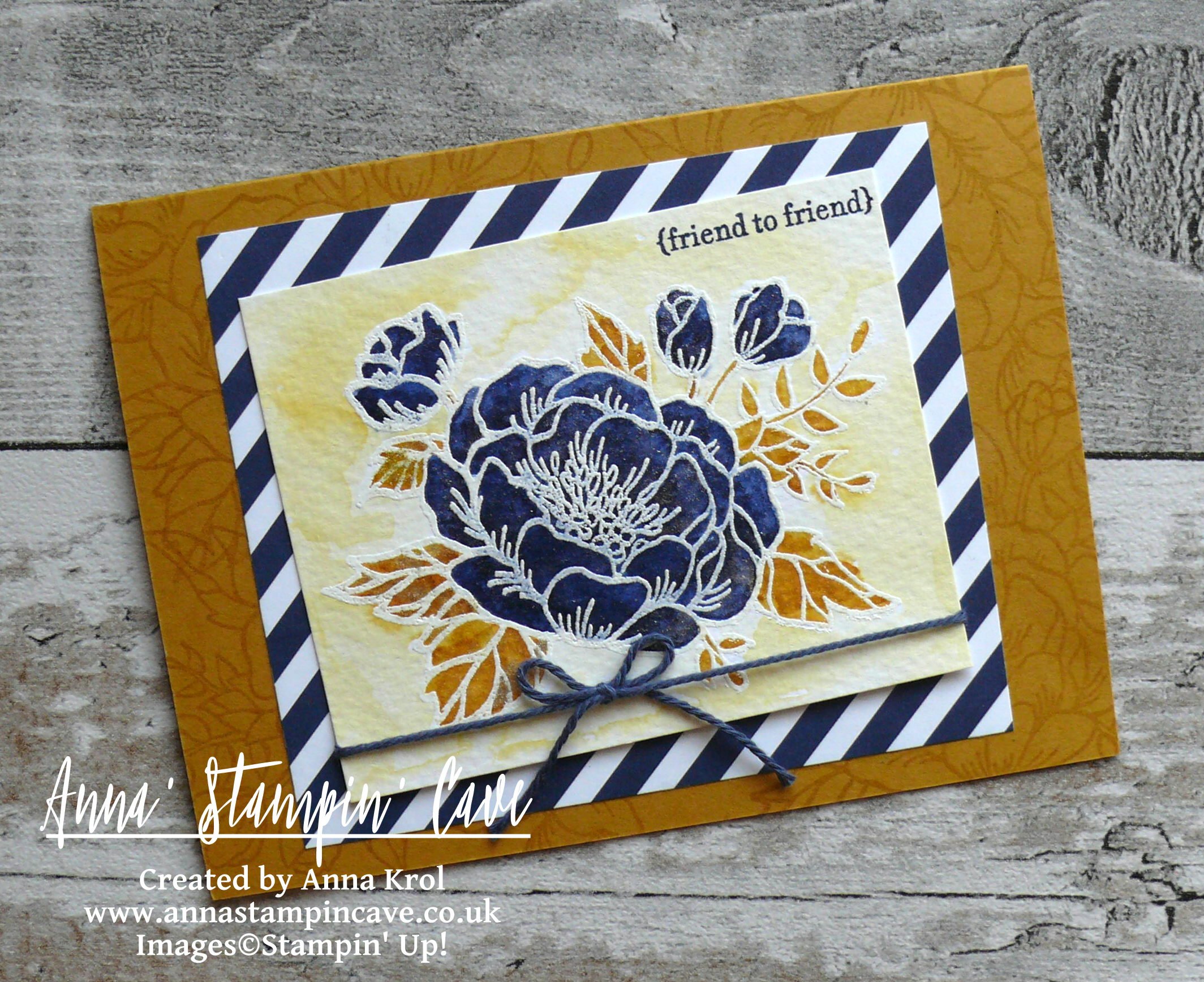
And now comes the magic…
I really loved how these cards coming up together, but they seemed too plain to me. So I did a small experiment hoping it will work (and it did!Yay!).
Before assembling my cards, and all the layers together I took those small panels (one at a time of course), flicked water droplets all over them and immediately sprinkled with gold embossing powder.
Did you know that water can hold embossing powder if you act fast enough? Just apply heat from the back.
I heat set it with a heat tool. Once it cools down, I prepped the cardstock with Embossing Buddy, re-applied the heat to those droplets of gold embossing and quickly sprinkled with Gold Stampin’ Glitter. Dabbed off any excess back to the container and heat set it again to set the glitter in place.
 I admit it is a VERY MESSY TECHNIQUE!! But it was so worth to have a glitter all over the house haha. Do I have to say it wasn’t last time I used this technique?! Can’t say more now lol
Hope you’ve enjoyed visiting my blog today. I’m wondering which card do you like the most? Classic black & pink or maybe the one in greys and pop of yellow? Please let me know in comments below.
I would love to encourage you to hop along with us and see the rest of beautiful projects designed by amazing artists. Please be sure to continue to hop using the list below. You don’t want to miss any!
If you wish to purchase any of products I have used, simply click the images below to go directly to my online store and don’t forget to enter the hostess code RRMR76JH to receive a gift from me.
Thank you for stopping by and have a blessed day

Hostess Code for February: RRMR76JH – Use this code in the month of February and receive a gift from me. Spend £50 or more and use the code, and you will receive a Whisper White 1/4″ (6.4mm) Organza Ribbon + a handmade gift from me
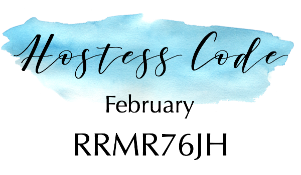
Special Notes:1) Make sure you select Anna Krol as your demonstrator;
2) If you select “No Contact” box I do not have access to your name and can’t send you a gift;
3) If your order is £150 or more do not use the code and grab your own Stampin’ Rewards + gift from me
Product List
|
|
|
|
|
|
|
|
|
|
|
|
|
|
|
|
|
|
|
|
|
|


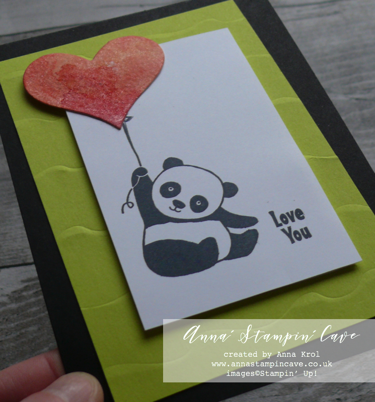
Pin me
Summary of the project which gives all the views of the card in one photo. I’d love if you pinned and called by on Pinterest xx
Don’t forget to check:
Spring Summer Catalogue Paper & Ribbon Shares. Shares are open to Austria, France, Germany, Netherlands & United Kingdom. 102 sheets of DSP & 2 yards of each type of ribbon from Spring/Summer Catalogue. Click here for more details —>
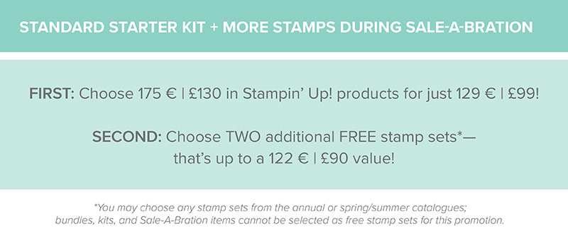
 The New Stampin’ Up! Spring/Summer 2017 Catalogue and Sale-A-Bration are LIVE and it’s AMAZING! For every 60 €/£45, you spend either from Spring Summer Catalogue or Annual Catalogue, you will get to choose one FREE level 1 product from SAB brochure! If you spend 120 €/£90, you get one FREE level 2 product, OR, you can choose two level 1 items. If you spend 180 €/£135, you have the option to choose three level 1 items or one level 1 item and one level 2 item. Click here for more details —>

Ever wondered what it’s like to join Stampin’ Up!’s community? I may have few answers for you. Click here for more details –>