Shake It In Teals – Birthday Card For Sweet 17

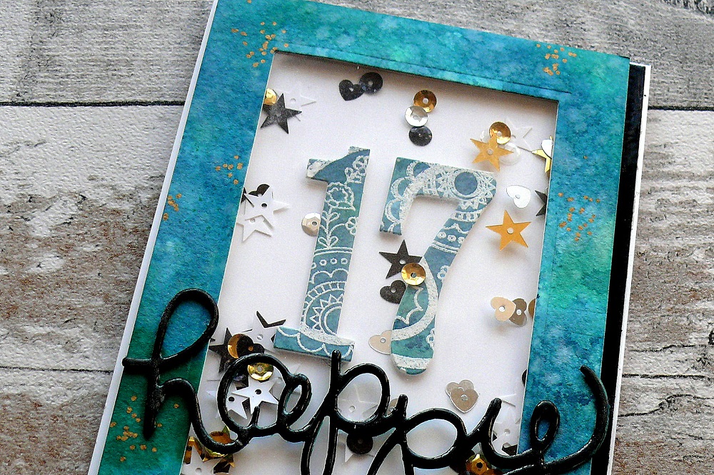
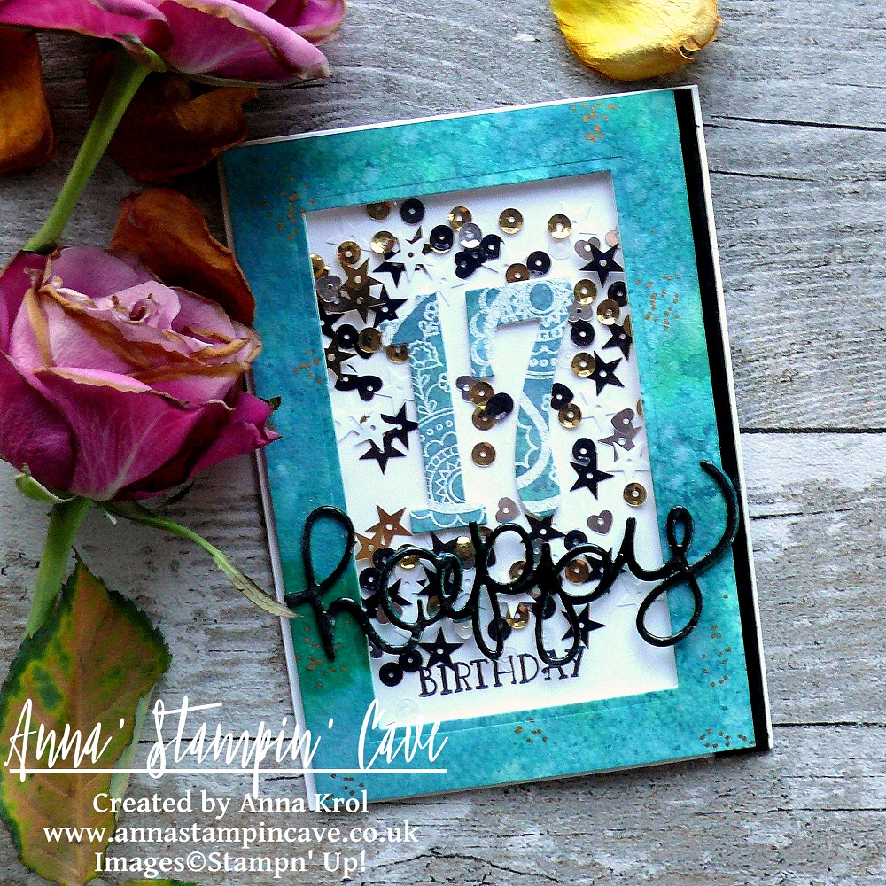
Hello and welcome! Today I want to share with you a card I’ve made for our daughter’s 17th birthday. I don’t know where the time has gone but I could swear she was just 7 not that long ago.

She’s not a girly-girl ( happy mamma here lol). She’s studying fine art in Sixth Form and she loves mixed media. So I had to come up with something little more ‘sophisticated’ than flowers and butterflies if you know what I mean 😉

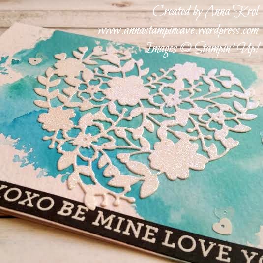
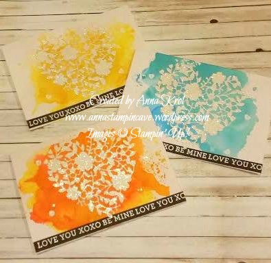
This year I decided to make a shaker card in beautiful teal shades. [You can see her last year’s birthday card here]

P1130276

Shake It In Teals Card dimensions:

  • Thick Whisper White cardstock: 11-6/8″ x 4-1/8″ scored in half at 5-7/8″ (29.7 x 10.5 cm scored in half at 14.8 cm)
  • Watercolour Paper: 5-6/8″ x 3-7/8″ (14.5 cm x 9.7 cm)
  • Basic Black cardstock: 1/2″ x 5-6/8″ (14.5 cm x 1.2 cm)
  • for die-cutting word happy pieces of Basic Black, Island Indigo and Emerald Envy

It’s very simple, a straightforward card so I won’t include a whole step by step instructions, just some hints, and tips.

Frame: To create a teal-like shade for the watercolour panel I’ve mixed Island Indigo ink with Emerald Envy ink in a watercolour wash. When the panel was dry I die cut a rectangle from the middle of the panel, creating a frame.

P1130298

Numbers: I didn’t want the number to look flat and boring, so I took that watercoloured rectangle, stamped two paisley images in Versamark in the middle, heat embossed them in white and die cut numbers 1 and 7 from that piece.

‘Happy’: I die cut it three times: one from Basic Black cardstock, 2nd from Island Indigo and 3rd from Emerald Envy and adhered them together. To add shine to it I cover my word in Versamark and heat embossed in clear. I did the same with the Basic Black strip.

P1130289

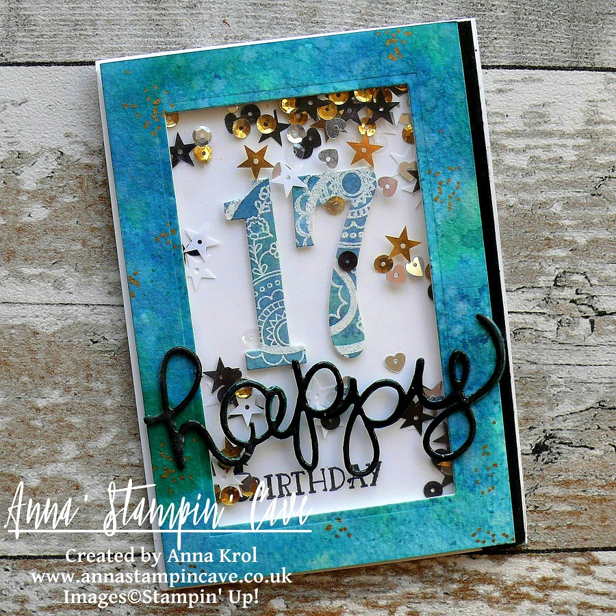
Before I put my shaker card together I adhered few sequins to the base of my card so not all sequins fall down when the card is standing on the shelf. For the final touch, I added some random gold dots to the frame with my gold Sharpie.

There’re few things that didn’t come out as I hoped for, but with my numb hands, I think that overall the card looks nice. The most important is the fact that our girl loved it, so YAY!

If you wish to purchase any of products I have used, simply click the images below to go directly to my online store and don’t forget to enter the hostess code for the month of March G3JKVASG to receive a gift from me.

Thank you for stopping by and have a blessed day

The Creative Flow Blog Hop – No Red Romance With Large Letters Framelits Dies

Anna’ Stampin’ Cave – The Creative Flow Blog Hop – No Red Romance With Large Letters Framelits Dies

the-creative-flow-header

Thank you for joining us on our Creative Flow Blog Hop. Each month we are set a challenge to creatively stretch our imaginations. The products we have used are all available in the current Annual and/or seasonal Stampin’ Up!® catalogues. To hop along, please use the buttons at the bottom of the post to keep hopping.

Today’s challenge was to create no-red Valentines Day card, and for some time I wasn’t sure what colour scheme to use. But Global Design Project came to the rescue with their #073 Colour Challenge. I really love this unusual, bright and oh-so-not-valentine’s colour mash-up, so I decided to combine these two together 🙂

gdp_colour_challenge73_png

I know it supposed to be no-red, but Watermelon Wonder is rather orangy red right lol And here’s what I came up with: a perfect card to give to my hubby on that special day.

anna-stampin-cave-stampin-up-large-letters-framelits-dies-no-red-valentines-day-card

No-Red Romance card dimensions:

  • Whisper White cardstock: 11-6/8″ x 4-1/8″ scored in half at 5-7/8″ (29.7 x 10.5 cm scored in half at 14.8 cm)
  • Whisper White panel: 5-7/8″x 3″
  • Emerald Envy cardstock: 2 strips 5-7/8 long and briefly 2/8″wide
  • a piece of Whisper White for die-cutting

The first step was to die-cut word ‘LOVE’ using Large Letters Framelits Dies. I’ve used regular Whisper White cardstock for this. I’ve sponged the letters with my inks as follows: Watermelon Wonder first, Daffodil Delight next, and Emerald Envy as the last one creating ‘rainbow’ effect. I’ve paid special attention there’s smooth transition from one colour to another.

anna-stampin-cave-stampin-up-large-letters-framelits-dies-no-red-valentines-day-distressed-card

When I was done and happy with blending, I took a small paintbrush and flicked some water droplets all over the letters. I love how the water reactivates the ink. Such a simple step but add so much interest and texture to the (otherwise) flat surface.

Next, I took Whisper White panel and using the same small brush and my ink pads as a palette, I speckled some inks over the whole panel. I tried to keep my speckles somehow under control colour-wise, so the speckles match the letters that go over them.

Remember: The smaller is the brush, the smaller are the speckles.

When speckles dried, I adhered two strips of Emerald Envy cardstock underneath, one on top and one on the bottom of the panel.

anna-stampin-cave-stampin-up-large-letters-framelits-dies-no-red-valentines-card

Now to assemble the card. I adhered the panel to the card base using Fast Fuse adhesive. And I have to say I’m happy to say it seems I finally made friends with this adhesive haha.

I wanted to pop-out my letters so I’ve used Foam Adhesive Strips to adhere them to the panel. You could use any regular foam adhesive, but these strips are perfect for adhering die-cuts that are quite narrow in shape. They are long but you can easily cut them to the length you want/need.

I was really happy how nicely this card was coming together, but I was desperate to add some embellishments to it. Yes I know, a card for a hubby and embellishments?! I must have lost my mind, haha. But why not?

anna-stampin-cave-stampin-up-large-letters-framelits-dies-no-red-valentines-day-card

So I scattered black sequins from Metallics Sequin Assortment pack all over my card and tried to figure out the placing and how many I will use. Once I was happy I adhered them with Fine-Tip Glue Pen. For the final touch, I coloured some rhinestones with black Sharpie and added them to the card too.

That’s it from me for today. I really hope you enjoyed my step by step directions.

For those of you who asked about stretching your stitched dies using partial die-cutting – I will have a short how-to post for you soon. So watch this space.

Now be sure to hop along our tiny blog hop to see more inspiring projects. Your next stop is lovely and talented Helen.

Thank you for stopping by and have a blessed day,

the-creative-flow-previous-button the-creative-flow-next-button

Large Letters Framelits Dies

Large Letters Framelits Dies
[141712]
£89.00

Whisper White A4 Card Stock

Whisper White A4 Card Stock
[106549]
£8.25

Emerald Envy A4 Cardstock

Emerald Envy A4 Cardstock
[141420]
£7.25

Watermelon Wonder Classic Stampin' Pad

Watermelon Wonder Classic Stampin’ Pad
[138323]
£6.00

Daffodil Delight Classic Stampin' Pad

Daffodil Delight Classic Stampin’ Pad
[126944]
£6.00

Emerald Envy Classic Stampin' Pad

Emerald Envy Classic Stampin’ Pad
[141396]
£6.00

Stamping Sponges

Stamping Sponges
[141337]
£3.25

Metallics Sequin Assortment

Metallics Sequin Assortment
[138390]
£4.50

Rhinestone Basic Jewels Embellishments

Rhinestone Basic Jewels Embellishments
[119246]
£4.50

Fast Fuse Adhesive

Fast Fuse Adhesive
[129026]
£9.00

Foam Adhesive Strips

Foam Adhesive Strips
[141825]
£7.25

Fine-Tip Glue Pen

Fine-Tip Glue Pen
[138309]
£6.25

Stampin' Trimmer

Stampin’ Trimmer
[129722]
£27.00

Big Shot

Big Shot
[143263]
£99.00

Ink Smooshing With Bloomin’ Hearts Thinlits Dies

I have to say when I first saw Bloomin’ Hearts Thinlits Dies in new Stampin’ Up! Spring Summer Catalogue I couldn’t wait to put my hands on them and try ink smooshing technique.

bloomin love 2

Aren’t these awesome?! And ink smooshing is childishly easy. All you need is a piece of acetate or craft mat, you can use a plastic packaging too (any sleek surface works really).

bloomin love yellow 2

Then you choose the colours you want to use on your card and you simply smoosh them onto your surface. Spritz it with water and dip your card into the ink droplets. Let your card dry completely before you add more colour.

bloomin love yellow

For my cards, I decided for really bright, intense colours. But you can make it as soft as you wish just add less ink and more water. And I have to say here I highly recommend using watercolour paper with this technique.

bloomin love orange 2

I’ve used the same design for all my cards. I die-cut hearts from a piece of Whisper White cardstock using Precision Base Plate. Trust me you need this plate! It’s perfect for more detailed thinlits dies to give you extra fine cuts. I saved the negatives (not tiny bits just “frames”) for another project.

bloomin love orange

I then dabbed my die-cuts in Versamark and heat-embossed it with Iridescent Ice embossing powder. I love the gentle bling/shimmer it gives.

bloomin love blue 2

I wanted the sentiment to really stand out so I took a strip of Basic Black c/s and stamped my sentiments in Versamark and heat embossed them in white.

bloomin love blue

To finish off my cards I added few white and clear sequins from Metallics Sequin Assortment.

I love how these turned out,  really pleased! I know these are not typical cards you would think off for Valentine’s Day, but I love the unusual.

Thank you for stopping by,

Simply Sketched Saturday Challenge Blog Hop #3 – Sweet & Mint

SSSC Header

Thank you for joining us for another Simply Sketched Saturday Challenge!  We’re so excited to be sharing this hop with you. The products used are all available in the current Annual, or seasonal, Stampin’ Up!®  Catalogues*. Simply use the buttons at the bottom of the post to keep hopping!

Today’s sketch was designed by very talented Angelina from Intatwyne Designs. I really like the simplicity of this design.

3

My first thought about this sketch was that it’s sweet. So is my today’s card: sweet & mint. I absolutely love 2015 – 2017 In Colors. But Mint Macaron is definitely my favourite one.

Sweet & Mint

The base of my card is Mint Macaron scored at 4-1/4″ and folded in half in landscape mode. Both panels measure 5-3/4 x 2″. The top panel is a piece of Whisper White. I stamped one of the “swooshes” from Work of Art in Mint Macaron (briefly in the middle of the panel). Then I stamped the sentiment in Memento Black. The bottom panel is a piece of 2015-2017 In Color Envelope Paper.

Sweet & Mint 2

I adhered both panels to the base and added a ribbon in the middle ( I tucked the ends under the panels). Don’t you just love this Dotted Lace Trim Ribbon? I’ve used a glue dot to bunch up the ribbon and adhered button on top. I was planning to add bakers twine bow on top, but I didn’t like it. I added Blossom Accent instead.

Sweet & Mint 3

To finish my card off I added few star sequins. I didn’t plan that but needed to hide a boo-boo. I end up adding three just for a good measure 😉

Hope you like my sweet and simple card. It’s very versatile design and would work nicely with different sentiments. Plus it’s perfect for mass-producing: only took few minutes to put it together. So it’s a win-win.

Now, be sure to hop along and see more inspiring projects. Thank you for stopping by and have a blessed day!

SSSC Previous   SSSC Next Blog

Sprinkles Of Life – New Stampin’ Up! Stamp Set For Ronald McDonalds House Charities

Stampin’ Up!’s mission statement, called its Statement of the Heart, reads: “To love what we do and share what we love, as we help others enjoy creativity and worthwhile accomplishments . . . in this we make a difference.”

To help fulfil this statement, Stampin’ Up! launched Making a Difference program in 2003. This program facilitates corporate giving and promotes service among demonstrators and employees.

Through the Making a Difference program, Stampin’ Up! partnered with Ronald McDonald House Charities (RMHC). Each year, we design an exclusive stamp set to promote the partnership with RMHC and donate a portion of the proceeds from each sale of that set. To date, more than $95,000 has been donated from RMHC stamp set sales.

Stampin’ Up!’s demonstrators are also encouraged to volunteer their time teaching local Ronald McDonald House guests the creative art of rubber stamping through the Making a Difference program. Demonstrators also create cards at training events which are donated to Ronald McDonald Houses. Those staying at the Houses then use the cards to keep in touch with loved ones while they are away from home.

And this year is no different…except now there is a matching Tree Builder Punch that coordinate with RMHC stamp set “Sprinkles Of Life”.

1


Isn’t it awesome! First of all this stamp set consists of a whopping number of 22 stamps! Yep! You hear me. And it’s so versatile. You can create cupcakes, ice-creams, trees, flower pots, piles of leaves, clouds…and many, many more. With just one stamp set. Pretty amazing, right? So let me share my little make. 5

And truly, I won’t tell you how many techniques I’ve used on this single card: watercolouring, heat embossing, clear heat embossing on the stamped image, using glitter, sequins, washi tape… and I had tonnes of fun creating it!

4

It just looks yummy! Oh, and cherry on top?!

6

Cherry is made from an apple, water coloured and clear embossed to add a little bit of shine.

Hope you like my little project.

Thank you for stopping by,