Inside The Lines Altered Photo Frame

Anna’ Stampin’ Cave – Inside The Lines Altered Photo Frame

In my project today I decided to create altered photo frame with beautiful, Inside The Lines Designer Series Paper. With an ever-growing trend in adult colouring books, this paper is just spot on.

inside-the-lines-dsp

I don’t know about you, but I love these bold botanical designs. They coordinate with Dragonfly Dreams Stamp Set & Dies, but you can use them on their own too. Colour them in with markers, inks or watercolour pencils – it’s fun and very therapeutic…or leave them black&white. Whatever tickles your fancy.

anna-stampin-cave-stampin-up-sale-a-bration-inside-the-lines-dsp-frame

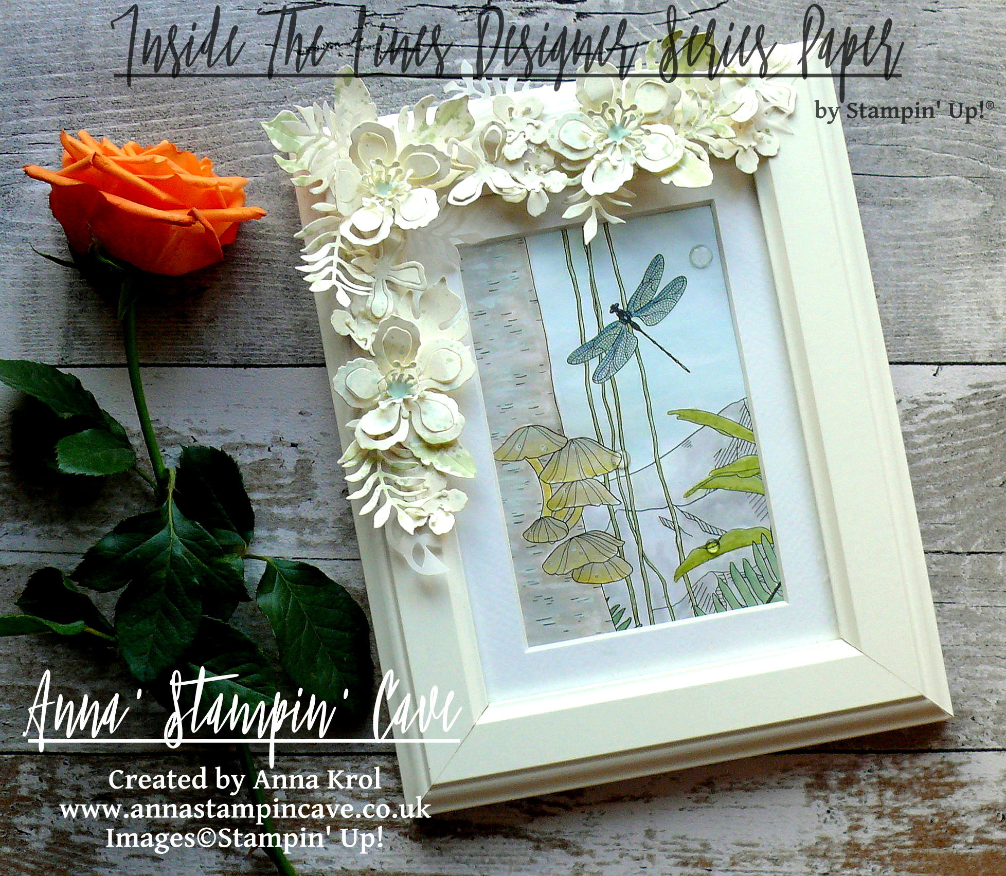
The frame is from Ikea and is called Virserum. It measures 7-1/2 x 9-1/2″ (19 x 24 cm) and comes with inside mount, hence I only needed 4″x 6″ (10 x 15 cm) piece of DSP to fit inside.

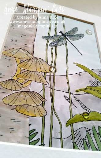
I’ve chosen this lovely, jungle-like design and cut it into 4″x 6″ rectangle. Because I was aiming for a subtle look I decided to watercolour my piece.

Bear in mind this is not watercolour paper so you can’t add too much water to it.

For the foliage, because it’s such a small area, I’ve used Stampin’ markers: Pear Pizzazz, Wild Wasabi, Old Olive, Garden Green and Always Artichoke. First, I scribbled my markers on a craft mat. I also spritz some water on my craft mat, next to the markers. I did it deliberately, to have more control of how much water I use. Next, I took dry aqua painter, picked up some water with its brush, next picked up some colour from the mat and started colouring my foliage. I was adding more colour and more water to the mat when needed. There are 4-5 layers of colour on leaves, each layer added when the first one was dry.

anna-stampin-cave-stampin-up-sale-a-bration-dsp-inside-the-lines

To colour in the rest of the image, I’ve used ink pads as my palettes.

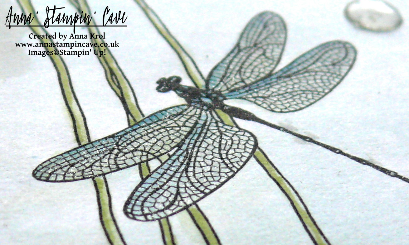
I’ve used Soft Sky for sky and dragonfly (with a little dab of Island Indigo marker). Mountains are coloured with Smoky Slate.

For the tree trunk, I’ve used Tip Top Taupe ink pad. To add some highlights I’ve used Whisper White Craft Ink (yes, I’ve used it with aqua painter too).

anna-stampin-cave-stampin-up-sale-a-bration-inside-the-lines

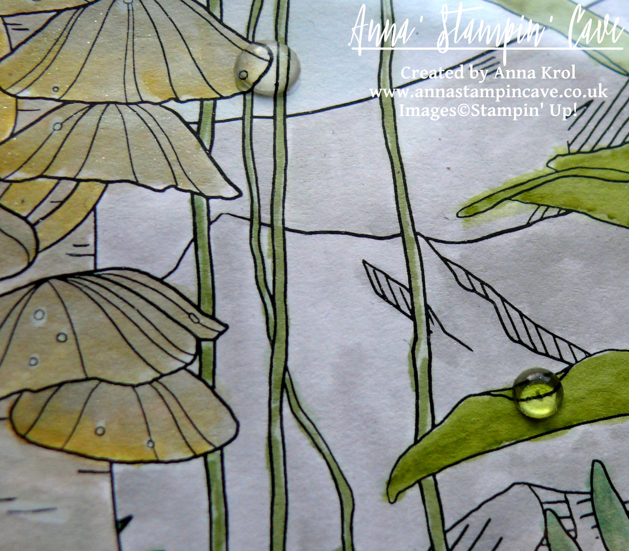
Polypores or conks (I’m not sure how they are called in the UK so forgive me if I’m wrong) are watercoloured with a mix of Sahara Sand, Crushed Curry and again some white craft ink for highlights.

For the final touch, I’ve added White Perfect Accents as dew drops (one on the sky is hiding a little boo-boo). And as a must, I had to add some shimmer with clear of Wink of Stella to the dragonfly, mountain tops, and polypores. Sadly it’s really hard to capture this lovely shimmer on photos. But now to the frame.

anna-stampin-cave-stampin-up-sale-a-bration-inside-the-lines-dragonfly

Believe it or not, this is my first ever altered photo frame. I knew I want flowers, but for a long time, I couldn’t decide on a colour. First, I wanted to go with quite a feminine look, so pinks and oranges. But once I had all my flowers ready I didn’t really like it. Typical haha. But no worries, I will use them to something else. And then I had this revelation: how about Very Vanilla?! Genius!

I die-cut oodles of flowers and leaves from Very Vanilla and Vellum cardstock. Arranged them around the frame and once I was happy with the placing, I adhered them with glue dots.

anna-stampin-cave-stampin-up-sale-a-bration-inside-the-lines-dsp-picture-frame

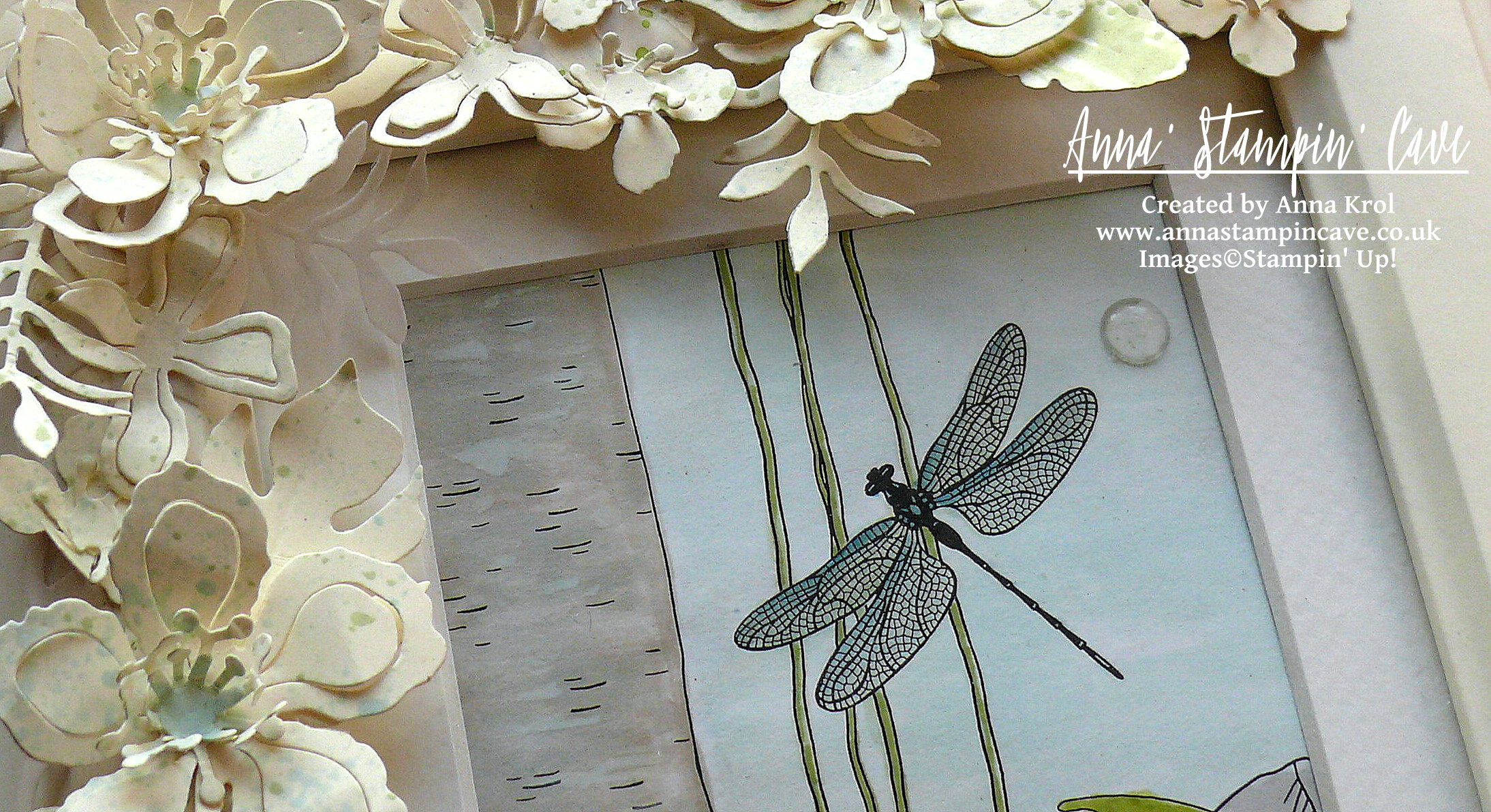
But as you may know me already, nothing can be too easy haha And when I looked at my frame something was missing, in my humble opinion. Oh right, it was too ‘clean’, too ‘white’. I needed some ‘controlled mess’.

I pressed Pear Pizzazz and Soft Sky ink pads next to each other on the craft mat and spritz it with water. I covered the glass with a piece of paper, and using a clean brush I added random and less random splatters to the flowers and leaves. And I have to say I love it now! And I hope you like my little project too.

I also want to add this project to the #071 Theme Challenge over at Global Design Project Challenge Blog. This weeks theme is ‘3D Or Off The Page’

gdp071

As always, if you wish to purchase any of products I have used, simply click the images below to go directly to my online store.

Thank you for stopping by and have a blessed day!


Inside The Lines Designer Series Paper

Inside The Lines Designer Series Paper
[143830]
£0.00

Botanical Builder Framelits Dies

Botanical Builder Framelits Dies
[140625]
£30.00

Very Vanilla A4 Card Stock

Very Vanilla A4 Card Stock
[106550]
£8.25

White Vellum A4 Card Stock

White Vellum A4 Card Stock
[106584]
£6.00

Many Marvelous Markers

Many Marvelous Markers
[131264]
£99.00

Crushed Curry Classic Stampin' Pad

Crushed Curry Classic Stampin’ Pad
[131173]
£6.00

Pear Pizzazz Classic Stampin' Pad

Pear Pizzazz Classic Stampin’ Pad
[131180]
£6.00

Tip Top Taupe Classic Stampin' Pad

Tip Top Taupe Classic Stampin’ Pad
[138325]
£6.00

Sahara Sand Classic Stampin' Pad

Sahara Sand Classic Stampin’ Pad
[126976]
£6.00

Smoky Slate Classic Stampin' Pad

Smoky Slate Classic Stampin’ Pad
[131179]
£6.00

Soft Sky Classic Stampin' Pad

Soft Sky Classic Stampin’ Pad
[131181]
£6.00

Whisper White Craft Stampin' Pad

Whisper White Craft Stampin’ Pad
[101731]
£7.25

Clear Wink Of Stella Glitter Brush

Clear Wink Of Stella Glitter Brush
[141897]
£7.25

Aqua Painters

Aqua Painters
[103954]
£15.50

White Perfect Accents

White Perfect Accents
[138416]
£4.50

Liquid Multipurpose Glue

Liquid Multipurpose Glue
[110755]
£3.75

Glue Dots

Glue Dots
[103683]
£4.75

Stampin' Trimmer

Stampin’ Trimmer
[129722]
£27.00

Big Shot

Big Shot
[143263]
£99.00

Negative Die-Cutting

Anna’ Stampin’ Cave – Negative Die-Cutting


Hello everyone and welcome! Today I’ve got for you super cool & easy technique to try out: negative die-cutting. Just a reminder: each week we are using Ronald McDonald House stamp set ‘My Hero’.

anna-stampin-cave-my-hero-stamp-set-with-negative-die-cutting

For today’s project, I’ve decided to use this lovely umbrella image. To create my card I started with a Very Vanilla card base and a Very Vanilla panel, slightly smaller than my base. First, I arranged the layout of my card using the Umbrella Weather Framelits. When I was happy with the placing, I die cut the umbrella first and the handle next, from my panel. But instead of using the die-cut piece on the card (as we usually do, don’t we?), I’ve used the negative image. Savvy tip: Don’t throw your die cuts away. You can use them for your next project.

I took my panel, placed it on the card base without adhering it, and I stamped the umbrella and the handle through a die cut holes. Stamp-A-Ma-Jig ( I love this tool!!!) was a big help to position my stamps perfectly. To create an ombre effect on umbrella image, I coloured the stamp with Crushed Curry and Tangerine Tango Stampin’ Markers (Crushed Curry to the top and Tangerine Tango in the middle). And, because I don’t own the 2015-2017 In Colour Stampin’ Markers, I carefully dabbed Watermelon Wonder ink pad to the bottom of the stamp.

my-hero-stamp-set-with-negative-die-cutting-2

When I was done with the stamping, I trimmed my layer at slightly ‘wonky’ angles, and run it through the Big Shot with a Seaside embossing folder. This folder is intended to imitate the waves, but if you turn it aside, it looks like rain streaks on a window, which is totally cool 🙂

I took a piece of Watermelon Wonder DSP from 2015-2017 In Color Designer Paper Stack (there are four different designs to choose from, but I’ve gone for dots). It was slightly bigger than my top layer, but I  didn’t want to use it all on my card. I only wanted it to peek from underneath my top layer where the ‘wonky’ angles were. So I measured it up, trimmed the piece and adhered it to the base. next, using dimensionals, I’ve added the top layer.

my-hero-stamp-set-with-negative-die-cutting

I decided not to use any additional sentiment on my card, as I think the one on the umbrella says it all. To embellish the card I’ve used White Perfect Accents. But hey, you say, these are clear, right? But did you know that you can peel off the white, sticky backing from your  White Perfect Accents, and you get these super awesome clear, perfectly round embellishments?! It’s cool or what?! But, of course, once you peel the backing off, you need to use glue to adhere them.

pootlers-design-team-week-2

So, did you liked my project?! I hope I inspired you to give this technique a go. It’s really cool and you will be hooked in no time!

Thank you for stopping by and have a blessed day,

Swirly Scribbles See-Through Window Shaker Card

Anna’ Stampin’ Cave – Simply Sketched Saturday Challenge – Swirly Scribbles See-Through Shaker Card

SSSC Header

Thank you for joining us for another Simply Sketched Saturday Challenge!  We’re so excited to be sharing this hop with you. The products used are all available in the current Annual, or seasonal, Stampin’ Up!®  Catalogues*. Simply use the buttons at the bottom of the post to keep hopping!

The sketch we’re working today with was designed by talented Keren Howell.

SSSC 11

I really like this sketch. And funny how many cards I created recently could fit this sketch perfectly. But today I wanted to make something slightly different: a see-through window shaker card.

Swirly Ccribbles See-Through Window Shaker Card

Don’t you just love Playful Palette Designer Series Paper Stack?! 48 sheets of such fun designs! I couldn’t decide which one to choose. But because I wanted to use Sweet Sugarplum cardstock for my base, these fun, wonky squares were perfect.

I cut out the window in my base first. Next, I traced the “window” on my DSP and cut it out too. Save that piece as you will need it later. I’ve used our new Foam Adhesive Strips to create the shaker. I added them around the window on the base and adhered a piece of acetate. I’ve used more foam strips around the base to adhere my piece of DSP. To finish my shaker window, I added black sequins and adhered another piece of acetate on the inside of the card.

Swirly Ccribbles See-Through Window Shaker Card 2

For the inside, I’ve used a Very Vanilla panel and a piece of DSP that I cut out when creating the window. But this time I’ve used the reverse side of that DSP. The placing is the key, so when the card is closed, you can see that piece through the window. The sentiment “It’s Your Day” was stamped in Basic Black Archival Ink, using Labeler Alphabet Stamp Set (which I truly love). And yes, I stamped it wonky on purpose 😉

Swirly Ccribbles See-Through Window Shaker Card inside

When the shaker bit and the inside of the card were done I could concentrate on the front. I die-cut two wreaths using Swirly Scribbles Thinlits Dies. One in Basic Black, and one in Very Vanilla. I glued them together slightly off-setting, so the Very Vanilla is peeking from underneath. I adhered it to the base with Multipurpose Liquid Glue. My sentiment, again, was stamped using Labeler Alphabet Stamp Set. I stamped it on a piece of Very Vanilla, and hand-cut it leaving a little border around the letters. Adhered it with liquid glue.

For embellishments, I’ve used White Perfect Accents, which I coloured black using a permanent marker. And that finish off my card.

Do you like my project?! If so please leave me a comment. I would love to hear from you!

Now, be sure to hop along and see more inspiring projects. Your next stop is Helen’s blog  go and see what she has made for you.

Thank you for stopping by and have a blessed day,


SSSC Previous   SSSC Next Blog

Watercolor Wings, Cotton Paper, Same Design And Two Different Cards

Hello everyone! Today I wanted to share with you couple of cards I created a few weeks back. In August we had two birthdays in close family: my niece had her 15th birthday, and my little sister was celebrating her round 20 🙂

For both cards, I’ve used the same layout, but by simply changing focal point and embellishments I created two cards that looked completely different 🙂

The first card I’ve made for my niece and I was dying to use our new Cotton Paper. With Floral Frames framelits, Pansy Punch and Petite Petals Punch I created this amazing 3D flower.

cotton paper 5

I’ve sponged edges of petals with Whisper White Craft ink and close to center slightly in Wild Wasabi. The sentiment comes from Sprinkles Of Life; stamped in Versamark and heat embossed in white on a piece of Basic Black.

cotton paper flower

The base for a card is 4×4″. The first layer is 3×3″ and I created this patterned paper myself. I simply used Stampin’ Write Marker in Crushed Curry and hand-drawn horizontal lines – cool, isn’t it? The second layer is a circle cut out from a piece of Neutrals DSP Stack (Soft Suede) with Wild Wasabi watercolour “wash”. For more interest, I added a banner underneath my layers and few sequins.

Watercolor wings

The second card I’ve made for my sister’s birthday. As I mentioned it’s the same design. The only difference is that I kept 2nd layer clean and for the circle, I used So Saffron, Hello Honey and Delightful Dijon “wash”. Same colours I’ve used for this gorgeous butterfly from Watercolor Wings.

Watercolors wings 4

The edges of wings and the body of butterfly I heat embossed in gold. On top, I added small vellum butterfly. Tiny yellow pearls, as well as a piece of black/gold washi tape, comes from my stash. Can you see little gold “bauble” peeking from underneath white layer? It’s one of White Perfect Accents, heat embossed in gold.

So what do you think about my cards? My niece and sister loved them to bits, so I really hope you like them too.

Thank you for stopping by and have a blessed day,