Crazy Crafters & Pootlers Spring/Summer & Sale-A-Bration Catalogue Blog Hop

blog hop header

Hello everyone! Welcome to the Crazy Crafters / Pootlers Blog Hop. We are super excited to share with you lots of new products from the soon to be launched seasonal catalogue. We hope you’ll find great inspiration from our projects. If you have arrived here from Stephanie Fischer, a big welcome to you. Be sure to click on the buttons further down to continue your journey on this blog hop.

This blog hop is very exciting not only for the sneak peeks. This is our first collaboration with amazing Kylie Bertucci and her lovely team of Crazy Crafters all the way from Australia! We are thrilled that they invited us to play along. Thank you, Kylie and her team.x

In my project today I decided to incorporate two of my favourite techniques: watercolour and inlaid die-cutting. I have used a brand new set called Rose Wonder with coordinating Rose Garden Thinlit Dies – perfect for techniques!
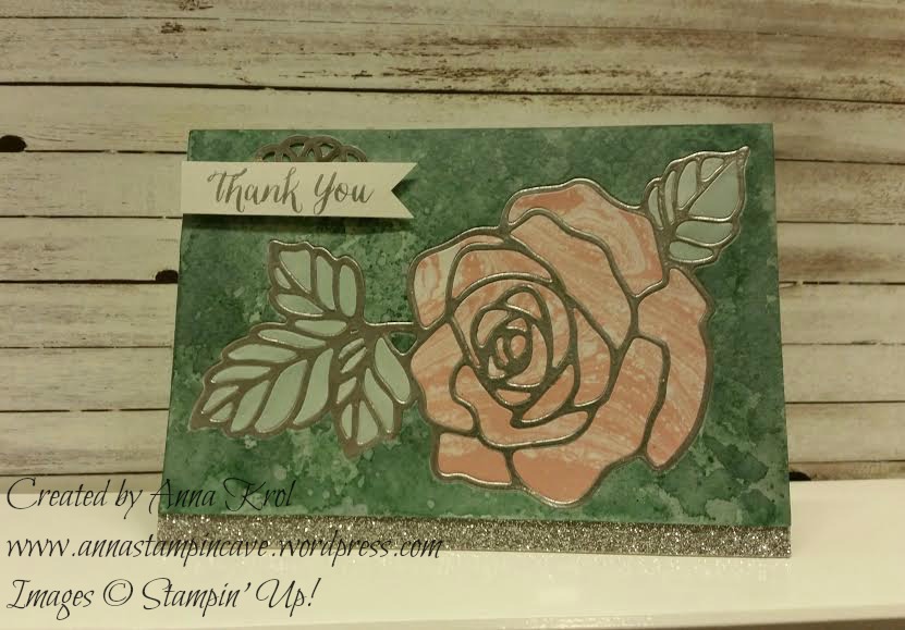
Stampin' Up! Rose Wonder Bundle

We’ve been given a theme ONE, to use only one stamp set, one ink pad, one DSP, one cardstock etc. Luckily we could also use heat embossing and embellishments. I had to come up with some smart idea how to create my watercolour card with just one ink pad.

For a watercolour panel, I’ve used Lost Lagoon ink pad. It’s such a beautiful shade of blue. But how to create a rose if you only have one ink colour? Perfectly Artistic DSP came as a rescue! All inner pieces of my flower and leaves were die-cut from this DSP and “inlaid” into the rose frame. I love this beautiful paper. It has a marbled effect design on one side, while the reverse side has a watercolour wash. And what’s even better, this paper will be available as a FREEBIE during Sale-a-bration!
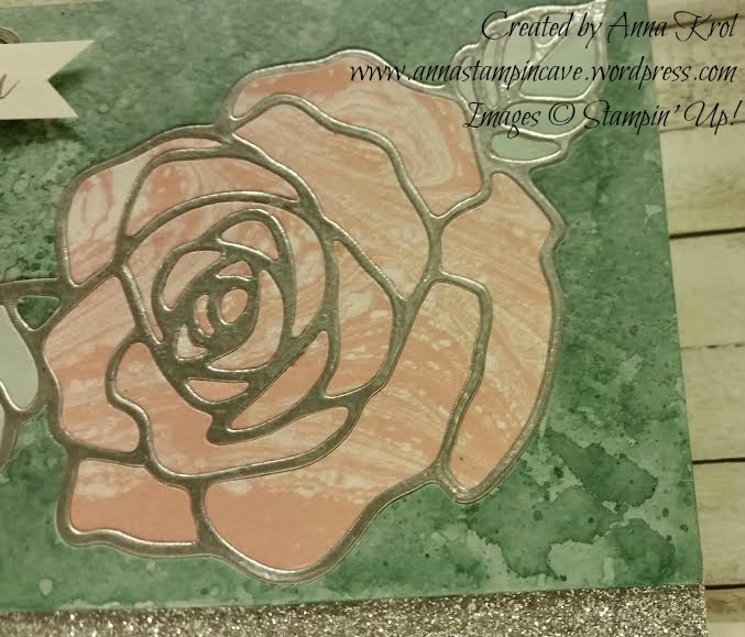
Stampin' Up! Rose Wonder Bundle

The frame of the flower, as well as sentiment, are heat embossed in silver. A glittery strip of paper is heat embossed too, using Heat and Stick powder and silver glitter.
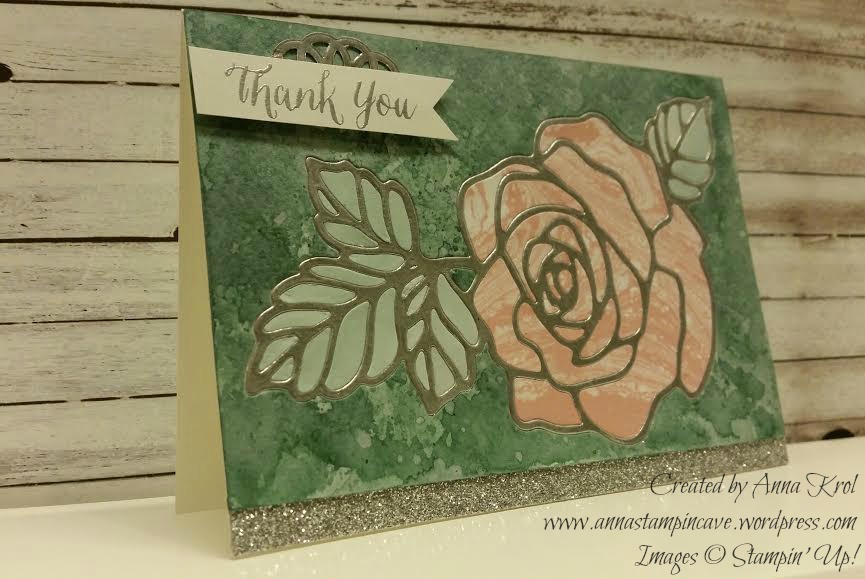
Stampin' Up! Rose Wonder Bundle

For my sentiment, I created simple, little banner with a piece of silver doily underneath to add some dimension. Don’t you just love this beautiful font? I’m in love with sentiments in this set.

I truly hope you enjoyed coming to my blog and see my card.

Now, be sure to hop along and see more inspiring projects. Below is the list of all the participants but you can also use the buttons to keep hopping. Your next stop is lovely Emilie Robinson – go and see what she has made using the new items.

Thank you for stopping by and have a blessed day!

previous button   next button

Full Blog Line Up:

Sam Hammond Donald
Angela Lorenz
Angelina Clark
Nicole Spicer
Lea Denton
Bruno Bertucci
Angela Westland
Wendy Boag
Jessie Holton
Camille Moriarty
Stephanie Fischer

Simply Sketched Saturday Challenge Blog Hop #2 – Peaceful Pines

SSSC Header

Thank you for joining us for another Simply Sketched Saturday Challenge!  We’re so excited to be sharing this hop with you. The products used are all available in the current Annual, or seasonal, Stampin’ Up!®  Catalogues*. Simply use the buttons at the bottom of the post to keep hopping!

If you have arrived here from Mandy’s blog thank you for stopping by. If you just start here please keep “hopping” to see the inspiration from our little group. I’m sure you will enjoy what everyone prepared for you this time.

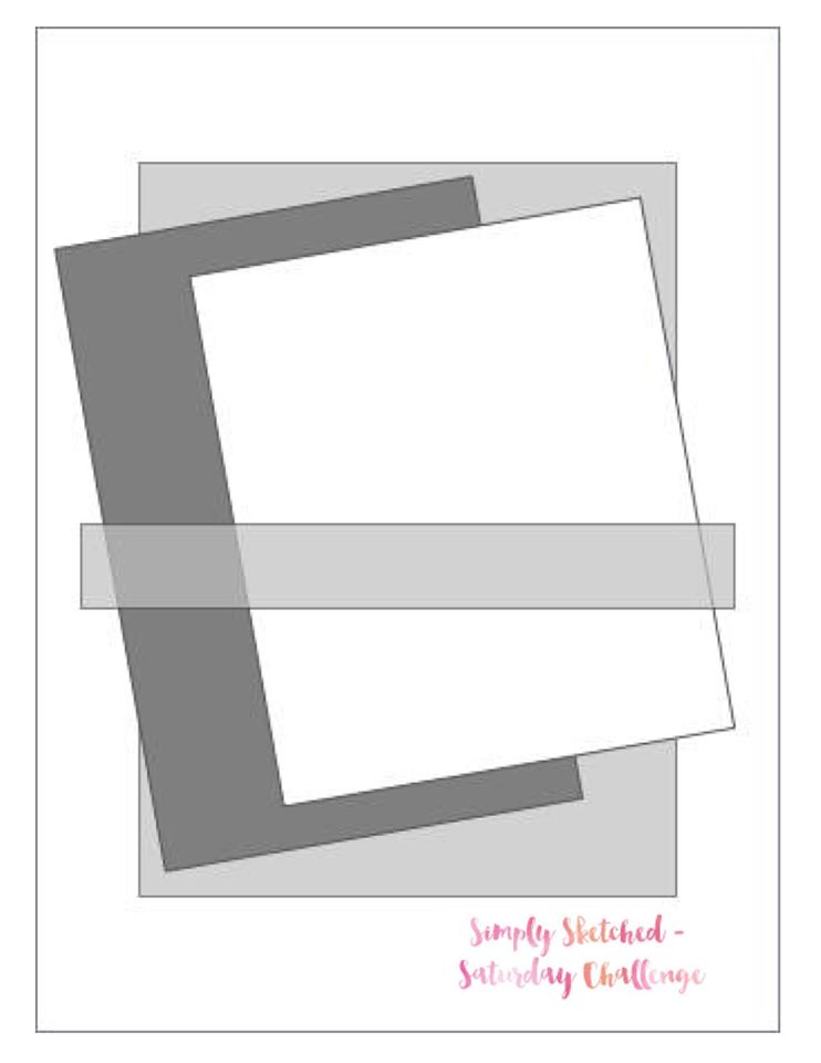
I was really excited about this week’s sketch designed by Amy from blog Engineering Home. Not that it’s an easy one. Oh, and it was her BIRTHDAY yesterday!!! Happy Birthday, Amy! ??????

SKETCH 2

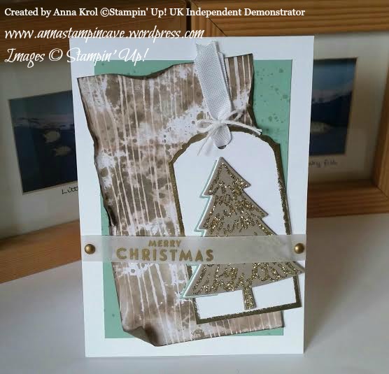
This time I decided to go with Christmas theme. And yes I know there’s still a time for Christmas cards, but hey, you’ve got to start somewhere 🙂 So here’s my interpretation of this week’s brilliant sketch:

Peaceful Pines

I know that many cardmakers prefer ever-so-popular clean and simple style, but I’m a big fan of distressing. And in my card today I tried to incorporate both styles.

peaceful pines 3

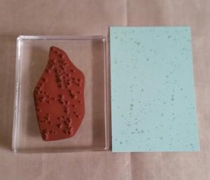
The base of my card is Whisper White card stock. A slightly smaller panel of Mint Macaron measures 5″ x 3-3/8″. I knew this panel will be mostly covered but I wanted to add some interest to it. First I thought about dry embossing but it would be too busy for an idea I had in my head. Instead, I stamped some splotches with Gorgeous Grunge in Mint Macaron for a subtle tone-on-tone look.

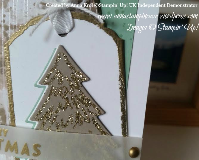
A distressed panel is a piece of white woodgrain patterned paper from Color Me Irresistible Specialty DSP. This paper is amazing, as each sheet is clear embossed, ready for inking, sponging, spritzing – getting messy in short 🙂

peaceful pines 4.2

peaceful pines 4.1

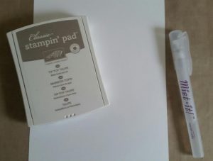
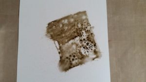
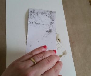
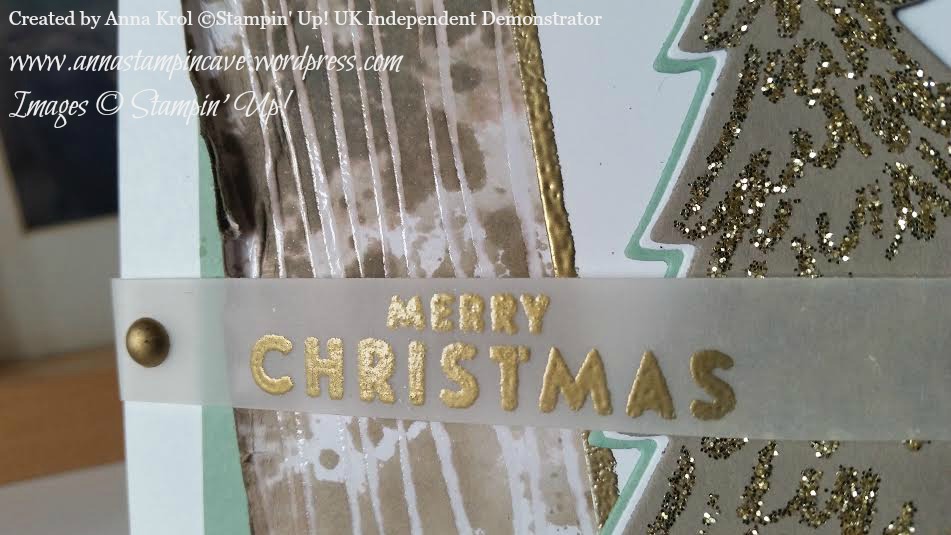
I squeezed Tip Top Taupe ink pad on the sleek surface (you can use acetate or craft sheet), spritz it with water and swooshed my paper into this puddle of colour. I added ink and water until achieved the look I wanted. I love how embossing resists the colour. When the paper was dry I stamped few splotches from Gorgeous Grunge and distressed and sponged the edges. Just a warning, this technique will warp your paper so you have to be careful, or use watercolour paper.

Peaceful Pines 3

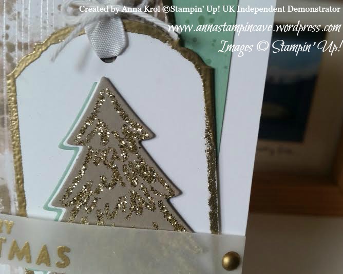
To create my tag I cut a piece of Whisper White card that measures 2″ x 4″ and punch it with Ornate Tag Topper punch. Then I dabbed the edges in Versamark and heat emboss it with gold embossing powder.

I stamped Christmas tree from Peaceful Pines stamp set in Versamark on a piece of Tip Top Taupe card stock. I heat embossed it with Heat & Stick powder and when it got sticky I sprinkled gold glitter over it (I must say that I’m in love with Gold Stampin’ Glitter). Then I die cut it using coordinating framelits. I also die cut half of the tree from Whisper White and Mint Macaron to layer them together. When the tree was ready I assemble my tag and finish it with a piece of ribbon and bakers twine. Finally, I could assemble my card. Now just sentiment left.

Peaceful Pines 2

The sentiment comes from Flurry of Wishes stamp set. I embossed it in gold on a strip of vellum and attached to my card with edges of dimensionals (folded in half). To finish it off I coloured two White Perfect Accents using gold Sharpie and added them where the adhesive was. Taa-daah!

Now, be sure to hop along and see more inspiring projects. Your next stop is Suzanne at Hullahbaloo. Thank you for stopping by and have a blessed day

SSSC Previous  SSSC Next Blog

Simply Sketched Saturday Challenge – Silver Contra Gold

SSSC Header

Thank you for joining us on the first Simply Sketched Saturday Challenge!  We’re a small group of Stampin’ Up!® Demonstrators who fancied a new challenge to share with you all. The products used are all available in the current Annual, or seasonal, Stampin’ Up!®  Catalogues*. Simply use the buttons at the bottom of the post to keep hopping!

If you have arrived here from Mandy’s blog thank you for stopping by. I hope you enjoy seeing the inspiration from our little group and continue hopping to see what everyone has made.

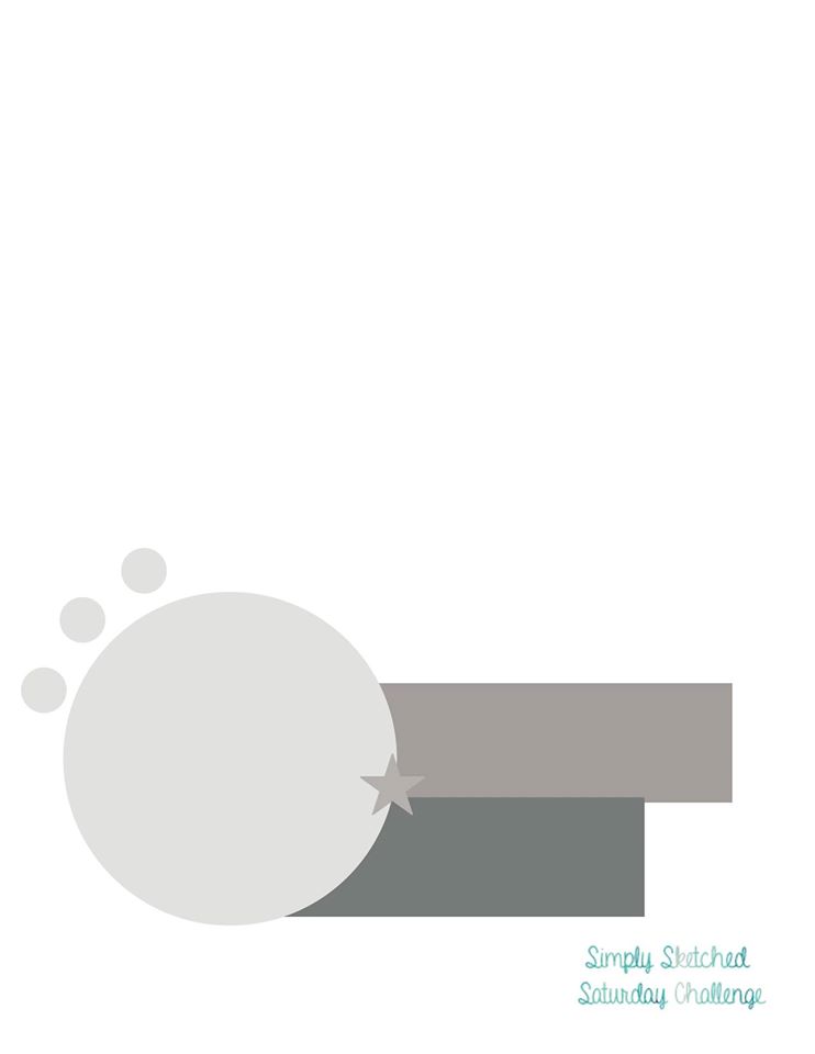
So here’s our very first sketch created by talented Sam Johnson:

SSSC 1

The moment I saw the sketch I loved it to bits. But then I thought: OMG I’m gonna over-think it and over-complicate it!  Yep, I am known for that haha Luckily it wasn’t that bad.

I created two samples one in silver and the other one in gold and meant to post one I like the most. But truly, I couldn’t decide which one, so I post both.

silver

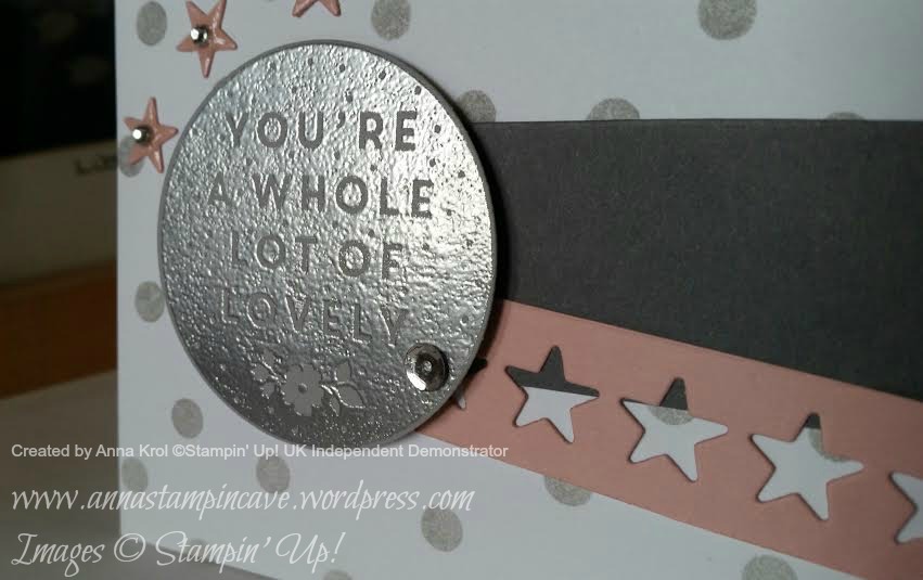
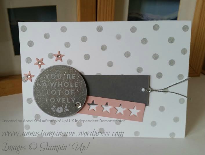
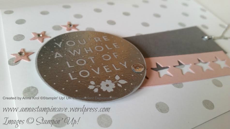
Card nr 1. The card base is Whisper White with Smoky Slate dots sponged over using one of Happy Patterns Decorative Masks. I cut two strips of paper: Basic Grey (1-1/8 x 3-1/2″) and Blushing Bride (5/8 x 3-2/8″) for a little splash of colour. I turned Basic Grey strip into a simple tag with a piece of Silver Cording Trim. For Blushing Bride piece: I run it through my Big Shot with “stars on stripe die” (however it’s called haha) from Mini Treat Bag Thinlits Die. Don’t throw these little stars away, you will use them later.

silver 3

Sentiment comes from Whole Lots Of Lovely, gorgeous, hostess exclusive stamp set. I stamped it in Versamark on a piece of Smoky Slate, heat embossed in silver, die cut it using circle die and added silver sequin for a bling. Then I took three little stars, covered them in Crystal Effects and let them dry. Once dry, I attached one tiny rhinestone to each of the stars.

silver 2

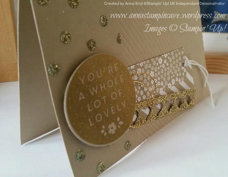
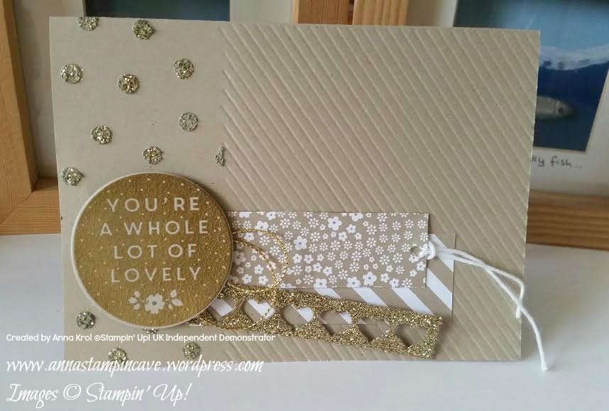
Card nr 2. I really wanted to go into gold and use embossing paste (I’ve bought it while ago at Lidl). I embossed diagonal stripes on 2/3 of my card front (Crumb Cake) and used embossing paste (same mask as with the first card) on 1/3 of the card. I sprinkled some gold glitter while embossing paste was still wet.

gold 3

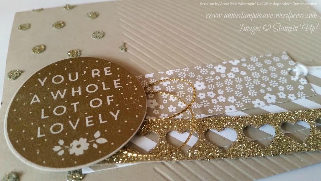
I cut two strips of patterned paper from Neutrals DSP Stack: 1″ x 3-2/8″ and 1-1/8″ x 3-6/8″. For third narrow stripe I could simply use Glimmer Paper, but I wanted to finally try my Heat and Stick Powder. I cut a strip of Crumb Cake that measure 5/8″ x 3-1/2″, die cut little hearts from it, covered my piece in Versamark and sprinkled Heat & Stick Powder over my piece (making sure it’s well covered). Then I heat it with my heat gun.

gold

When the powder melted I covered the whole piece with gold glitter and heat it again. The powder melts with glitter creating your own glimmer paper 🙂 I used the same sentiment for both cards, just this time I heat embossed it in gold.

gold 2

So? Which card is your favourite? Silver or gold? Let me know in the comments below.

Now, be sure to hop along and see more inspiring projects. Your next stop is lovely Debbie at Larli Crafts. Thank you for stopping by and have a blessed day!
 SSSC Previous  SSSC Next Blog

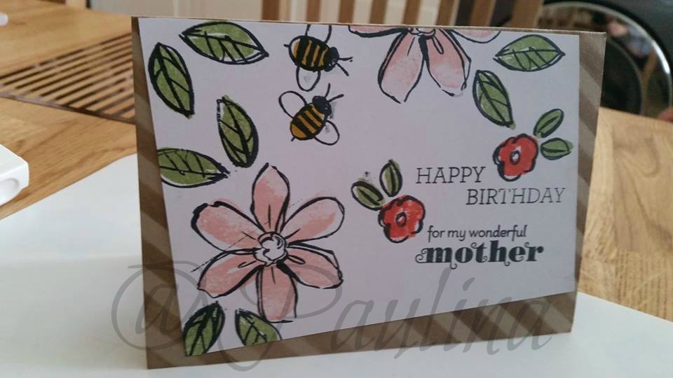
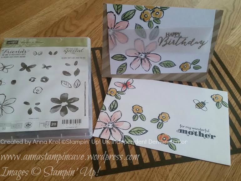
For Our Mum – Birthday Cards Using Garden In Bloom Stamp Set By Stampin’ Up!

This term seems to be really busy: with our daughter having MOCK exams in a few weeks time = parents meetings at school;  my little sister temporarily moving with us ( only for weekdays; she just started Interior Design MDes course at Coventry University); and me trying to cope with MS as best as I can + infusions in hospital every 4 weeks…there are days I can’t do anything and idea of crafting don’t even cross my mind.

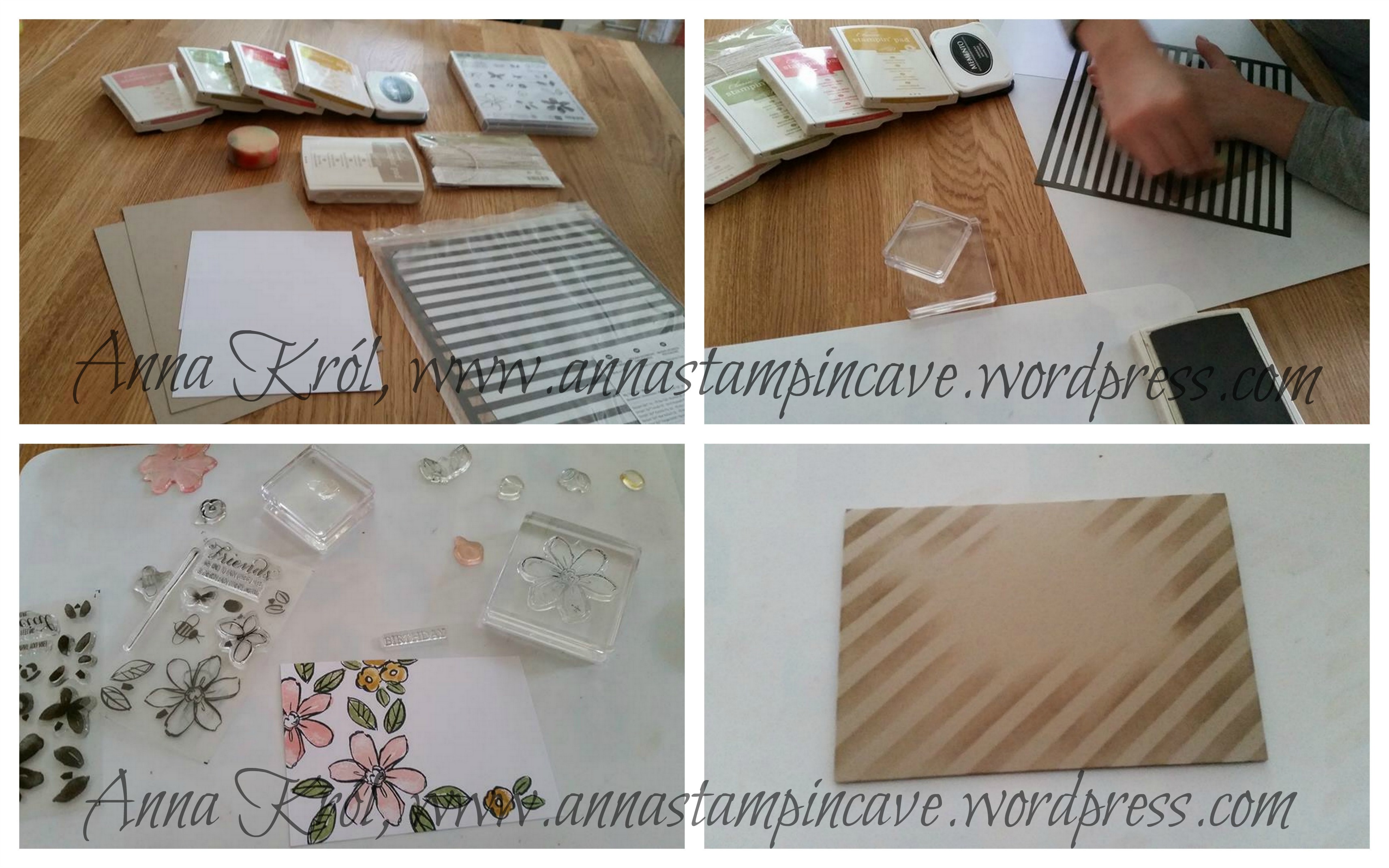
But last week there was our mum’s 63rd birthday. My sister said she really wanted to make a handmade card for our mum but she had no idea where to start. She has never done a card in her life. I took her to my “studio” so she could choose stamp sets & ink pads she liked. And she chose gorgeous Garden In Bloom stamp set + Blushing Bride, Calypso Coral, Hello Honey and Pear Pizzazz ink pads. Then I thought: oh well, while teaching her how to make a card I could make one for our mum too, right? So I grabbed all essentials: card, adhesives, masks, sponges etc. and we made our way to kitchen (my craft room is really tiny).

Do I have to say we had a blast?! It was so good to craft together…

annastampincave - collage

..and she did very well as for her first time stamping, don’t you think? The sentiment is a mix of two stamp sets: Crazy About You and retired Delightful Dozen.

paulina woźniak

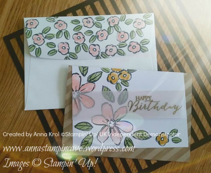
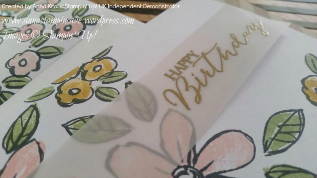
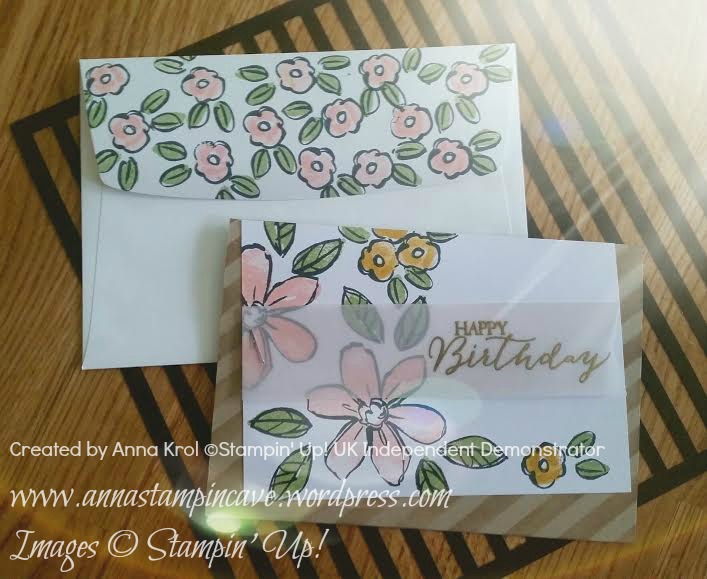
For my card, I’ve used same design/layout. Just twisted it a bit with a piece of vellum. I also made a matching envelope. Isn’t it pretty? Vellum is attached with stapler

63 urodziny 2

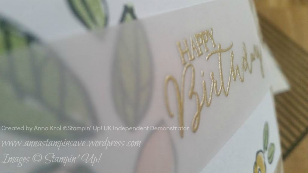
Sentiment on a card comes from Butterfly Basics and is heat embossed in gold.

I’ve also decided to decorate flap of my envelope

annastampincave bday set

Love love love how these two turned out! Chuffed even more because mum loved cards we’ve made. And my sister is now hooked, so I’m pretty sure it wasn’t last time when we were crafting together.

Thank you for stopping by,

Easy Peasy Bokeh Technique And Tin Of Cards Stamp Set By Stampin’ Up!

Bokeh technique! Have you ever tried it?! I loved this technique “from aside” for a while but never get around to try it myself. Until now 🙂 And why oh! why I waited so long?! hahaha

This is such a cool and easy technique and you can achieve this effect in many different ways. But wait, what the bokeh effect is and means?! In photography bokeh (originally /ˈbkɛ/, /ˈbk/ boh-kay — also sometimes pronounced as /ˈbkə/ boh-kə is the aesthetic quality of the blur produced in the out-of-focus parts of an image produced by a lens. The term comes from the Japanese word boke (暈け or ボケ), which means “blur” or “haze”, or boke-aji (ボケ味), the “blur quality”. The Japanese term boke is also used in the sense of a mental haze or senility. The term bokashi (暈かし) is related, meaning intentional blurring or gradation.

pobrane

Cool, hey? 🙂

To achieve a similar effect on your card you can try the watercolour technique background which can be pretty amazing, and for the “blur” you simply add lighter “circles” with white pigment ink. And what’s cool about the pigment ink, you can make your circles as soft or as intense as you wish.

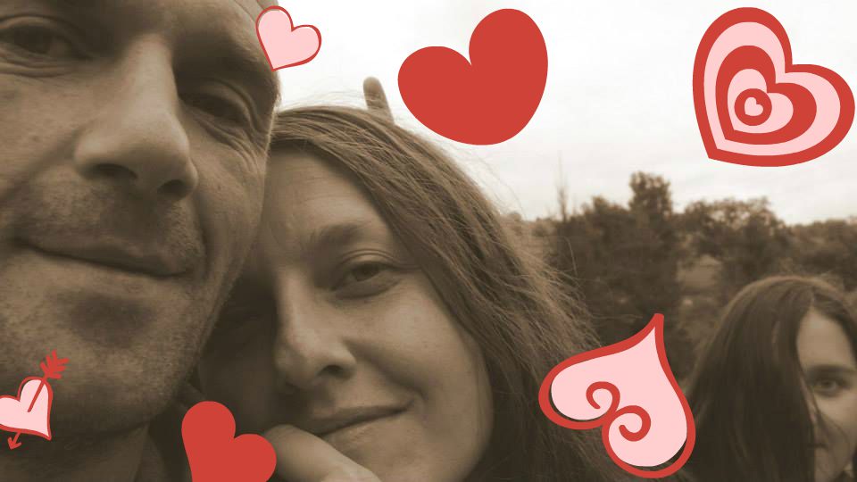
The first card I created is for my hubby’s 41st Birthday which happens to be today! HAPPY BIRTHDAY, BABY!!! I love you to the moon and back! You are such a blessing in my life xx

ja aaa

You must have noticed our ‘cheeky little thing’ photobomb the picture haha

And here’s the card –

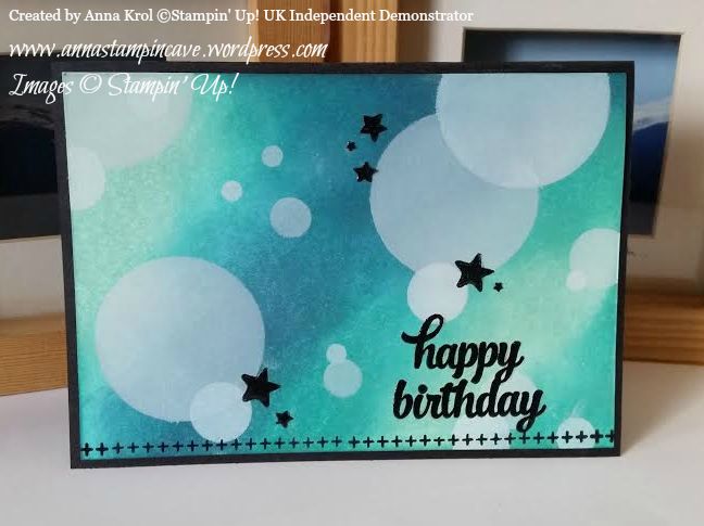
Happy Birthday Card - Anna's Stampin' Cave

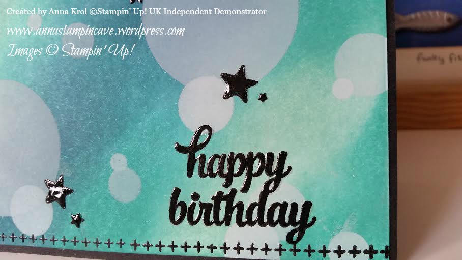
For the background, I’ve used three colours of ink: Pool Party, Bermuda Bay and Island Indigo. I’ve sponged the panel randomly, making sure all the colours are blended well. When I was happy with my background I started adding circles in various sizes with Whisper White Craft Ink and sponge.

Happy Birthday Card - Anna's Stampin' Cave

Sentiment and border come from Tin Of Cards stamp set that coordinates with Tin Of Cards Project Kit. But this set is so versatile with its bold images. Once you’ve created your beautiful kit you can use that stamp set over and over again on different occasions. I stamped the sentiment in Versamark and heat-embossed with black embossing powder. Stars are punched with Confetti Stars Punch. To add some WOW effect I added Crystal Effects to the sentiment and stars. I love how they “pop!” from the card.

But because I had all my supplies out, I’ve created three more cards using same technique and stamp set but different colours.

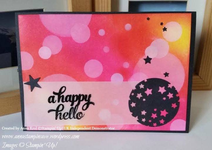
A Happy Hello Card - Anna's Stampin' Cave

For this one, I used Daffodil Delight, Watermelon Wonder and Melon Mambo. For a little twist, I stamped my sentiment onto vellum and added a circle full of punched out stars so the background is peeking from behind. I really love this effect. Larger star comes from Itty Bitty Accents punch pack and it holds vellum in place.

Thank You Card - Anna's Stampin' Cave

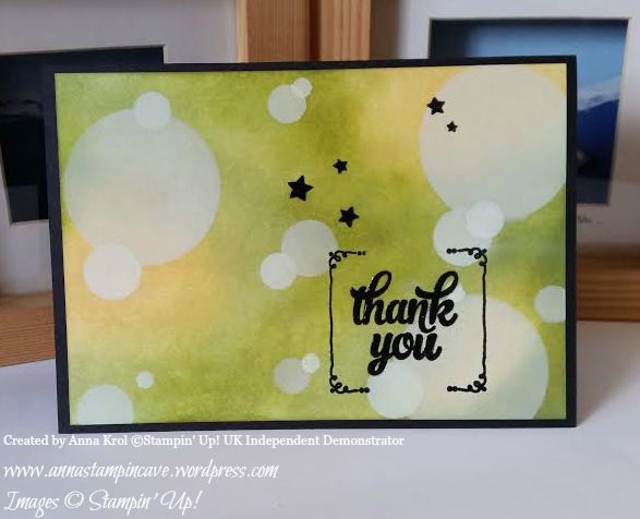
My third card is a Thank You card. And again same technique but different sentiment and colours: So Saffron, Pear Pizzazz and Old Olive. And again I used Crystal Effects on stars and sentiment.

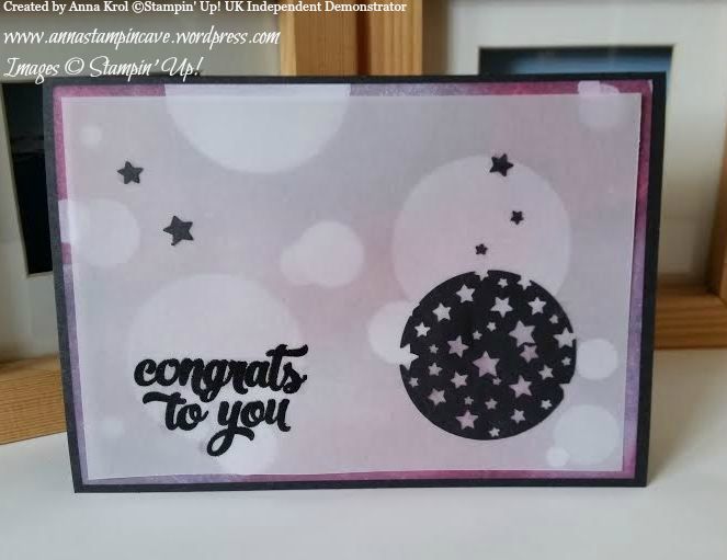
For my last card today I used Wisteria Wonder, Perfect Plum and Rich Razzleberry.

Congrats To You - Anna's Stampin' Cave

But this time I decided to add a vellum “screen” to my layout. Such an easy way to intensify the blur effect.

Hope you like my today’s cards and that I’ve inspired you to try bokeh technique yourself. Honestly, I had lots of fun creating these cards and would love to hear what you think about them. Please let me know in the comments below.

Thank you so much for stopping by,