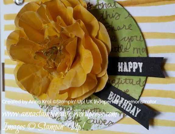
Hello everyone! Today I wanted to share with you couple of cards I created a few weeks back. In August we had two birthdays in close family: my niece had her 15th birthday, and my little sister was celebrating her round 20 🙂
For both cards, I’ve used the same layout, but by simply changing focal point and embellishments I created two cards that looked completely different 🙂
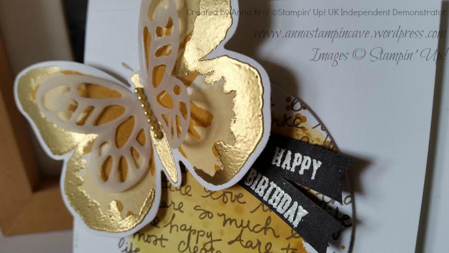
The first card I’ve made for my niece and I was dying to use our new Cotton Paper. With Floral Frames framelits, Pansy Punch and Petite Petals Punch I created this amazing 3D flower.
I’ve sponged edges of petals with Whisper White Craft ink and close to center slightly in Wild Wasabi. The sentiment comes from Sprinkles Of Life; stamped in Versamark and heat embossed in white on a piece of Basic Black.
The base for a card is 4×4″. The first layer is 3×3″ and I created this patterned paper myself. I simply used Stampin’ Write Marker in Crushed Curry and hand-drawn horizontal lines – cool, isn’t it? The second layer is a circle cut out from a piece of Neutrals DSP Stack (Soft Suede) with Wild Wasabi watercolour “wash”. For more interest, I added a banner underneath my layers and few sequins.
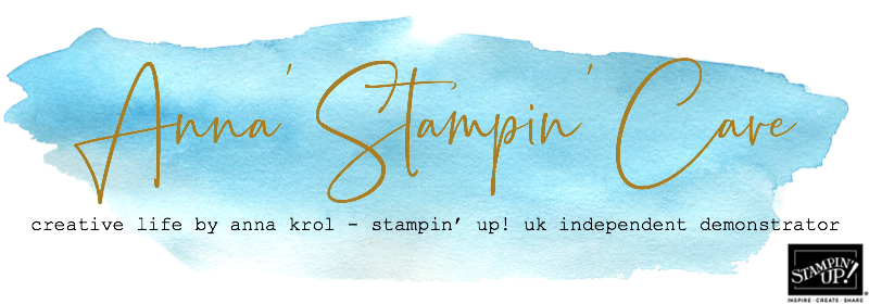
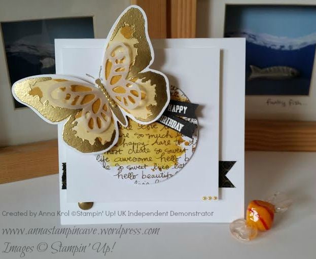
The second card I’ve made for my sister’s birthday. As I mentioned it’s the same design. The only difference is that I kept 2nd layer clean and for the circle, I used So Saffron, Hello Honey and Delightful Dijon “wash”. Same colours I’ve used for this gorgeous butterfly from Watercolor Wings.
The edges of wings and the body of butterfly I heat embossed in gold. On top, I added small vellum butterfly. Tiny yellow pearls, as well as a piece of black/gold washi tape, comes from my stash. Can you see little gold “bauble” peeking from underneath white layer? It’s one of White Perfect Accents, heat embossed in gold.
So what do you think about my cards? My niece and sister loved them to bits, so I really hope you like them too.
Thank you for joining us on another Pinkies Blog Hop! We’re showcasing lots of gorgeous projects using products from the new Stampin’ Up!® Autumn/Winter Seasonal Catalogue. Simply use the buttons at the end of each post to keep hopping!
If you arrived here from Swathi blog thank you for stopping by. I hope you enjoy seeing all these beautiful projects and inspirations.
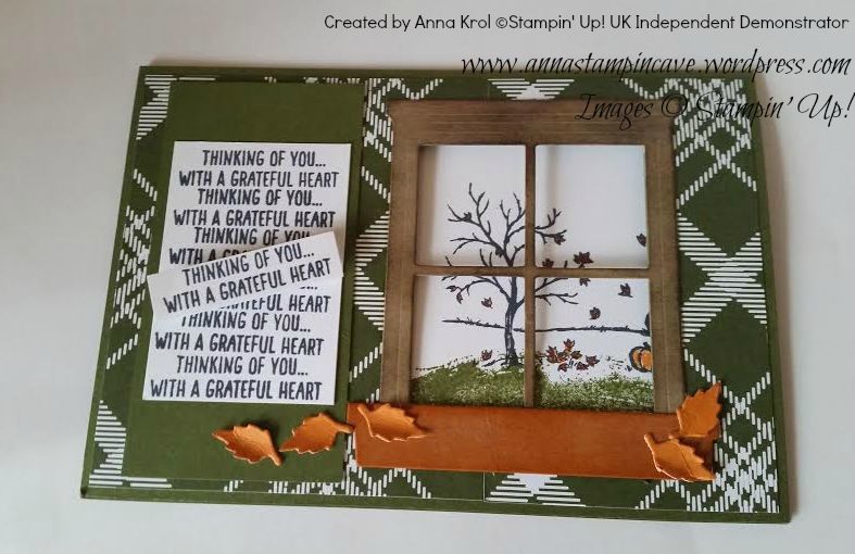
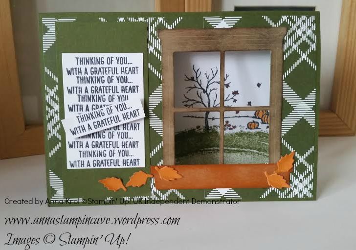
For my project today I’ve used Happy Scenes stamp set with Hearth & Home Thinlits Dies. The moment I saw these in the catalogue I knew I want to make this card. And they come in a bundle too.
For the base, I chose beautiful Mossy Meadow card stock. I layered it with a piece of DSP from Merry Moments Designer Series Paper Stack. I die-cut window and flower box from a piece of Crumb Cake. I sponged the edges of the window with Early Espresso and flower box is Tangelo Twist, to add some interest. Then, using die-cut, I measured where I want my window to be. I cut out a square in my card base and adhered my window with flower box.
For the inside of the card, I took a piece of Whisper White and stamped my autumn scene from Happy Scenes in Memento Tuxedo Black. I coloured leaves and pumpkins in Pumpkin Pie and Cajun Craze. For the “ground” I used Mossy Meadow ink pad and “swoosh” stamp from Work Of Art. I stamped it off twice for a lighter shade. The sentiment comes from Happy Scenes. I stamped it various times to create a panel. Then I stamped it one more time, cut it out and attached it (slightly crooked) onto the panel using dimensionals.
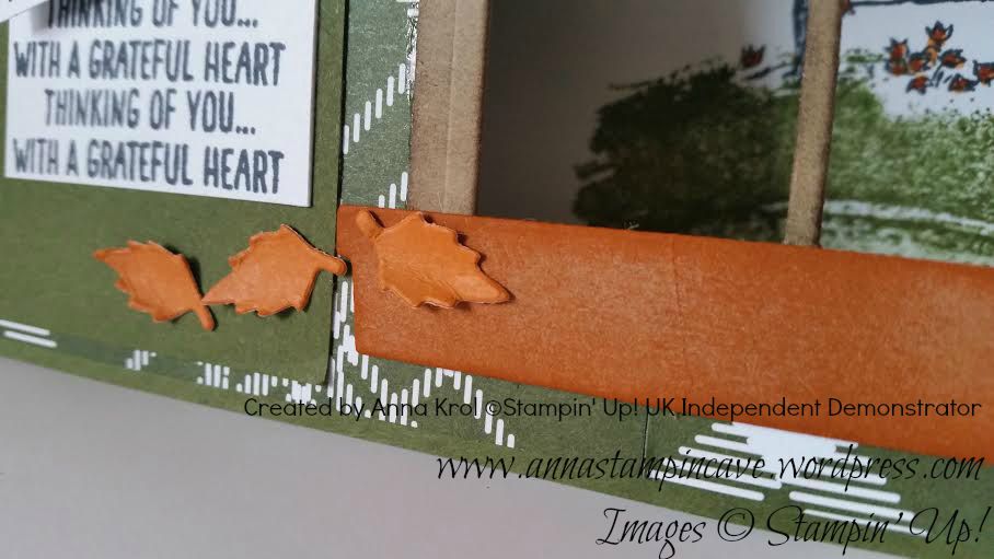
To finish off my card I die cut tiny leaves using a die from Square Pillow Box Thinlits. I used Whisper White card stock and colour them with Tangelo Twist. Then I crumple my leaves a little bit and glued them to the card.
I’m really pleased how my card turned out. It’s super cute. And I’m sure I will use this set many many times.
You can find a complete list of supplies at the very bottom of this post.
Now that you’ve seen my project, be sure to hop along and see more inspiring projects. Next in our hop is amazing Angélique.
Bokeh technique! Have you ever tried it?! I loved this technique “from aside” for a while but never get around to try it myself. Until now 🙂 And why oh! why I waited so long?! hahaha
This is such a cool and easy technique and you can achieve this effect in many different ways. But wait, what the bokeh effect is and means?! In photography bokeh (originally /ˈboʊkɛ/,/ˈboʊkeɪ/boh-kay — also sometimes pronounced as /ˈboʊkə/boh-kə is the aesthetic quality of the blur produced in the out-of-focus parts of an image produced by a lens. The term comes from the Japanese word boke (暈け or ボケ), which means “blur” or “haze”, or boke-aji (ボケ味), the “blur quality”. The Japanese term boke is also used in the sense of a mental haze or senility.The term bokashi (暈かし) is related, meaning intentional blurring or gradation.
Cool, hey? 🙂
To achieve a similar effect on your card you can try the watercolour technique background which can be pretty amazing, and for the “blur” you simply add lighter “circles” with white pigment ink. And what’s cool about the pigment ink, you can make your circles as soft or as intense as you wish.
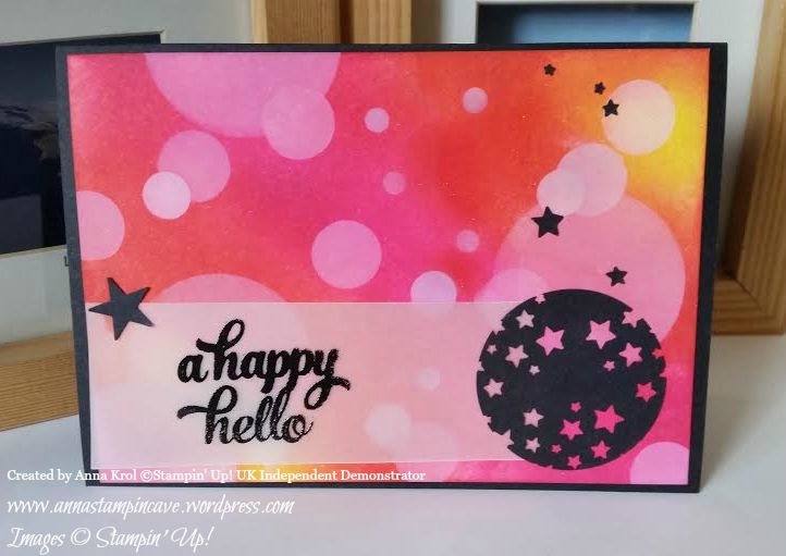
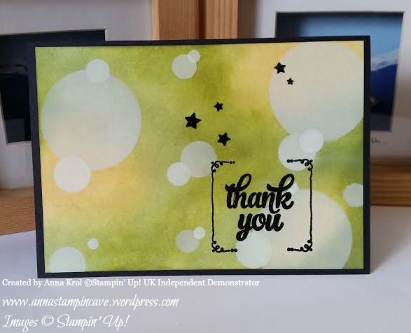
The first card I created is for my hubby’s 41st Birthday which happens to be today! HAPPY BIRTHDAY, BABY!!! I love you to the moon and back! You are such a blessing in my life xx
You must have noticed our ‘cheeky little thing’ photobomb the picture haha
And here’s the card –
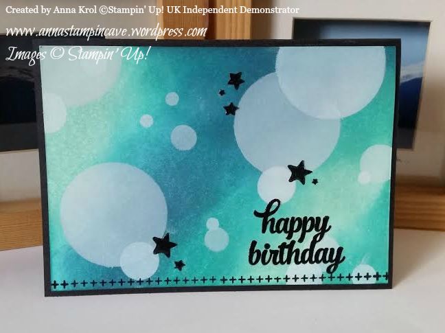
For the background, I’ve used three colours of ink: Pool Party, Bermuda Bay and Island Indigo. I’ve sponged the panel randomly, making sure all the colours are blended well. When I was happy with my background I started adding circles in various sizes with Whisper White Craft Ink and sponge.
Sentiment and border come from Tin Of Cards stamp set that coordinates with Tin Of Cards Project Kit. But this set is so versatile with its bold images. Once you’ve created your beautiful kit you can use that stamp set over and over again on different occasions. I stamped the sentiment in Versamark and heat-embossed with black embossing powder. Stars are punched with Confetti Stars Punch. To add some WOW effect I added Crystal Effects to the sentiment and stars. I love how they “pop!” from the card.
But because I had all my supplies out, I’ve created three more cards using same technique and stamp set but different colours.
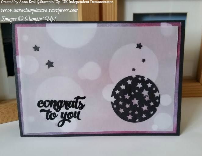
For this one, I used Daffodil Delight, Watermelon Wonder and Melon Mambo. For a little twist, I stamped my sentiment onto vellum and added a circle full of punched out stars so the background is peeking from behind. I really love this effect. Larger star comes from Itty Bitty Accents punch pack and it holds vellum in place.
My third card is a Thank You card. And again same technique but different sentiment and colours: So Saffron, Pear Pizzazz and Old Olive. And again I used Crystal Effects on stars and sentiment.
For my last card today I used Wisteria Wonder, Perfect Plum and Rich Razzleberry.
But this time I decided to add a vellum “screen” to my layout. Such an easy way to intensify the blur effect.
Hope you like my today’s cards and that I’ve inspired you to try bokeh technique yourself. Honestly, I had lots of fun creating these cards and would love to hear what you think about them. Please let me know in the comments below.
Thank you for joining us on our second Pootler’s Blog Hop! This Blog Hop is all about new Stampin’ Up!® Annual Catalogue so prepare yourself for lots of beautiful projects and tonnes of inspiration. Simply use the buttons at the end of each post to keep hopping!
If you have arrived here from Keren’s blog thank you for stopping by. I hope you enjoy seeing the inspiration from our team and continue to hop on through to see what everyone has made.
It’s actually my very first blog hop so I’m a little bit nervous but hey – let’s have some fun!
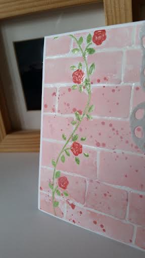
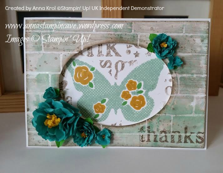
For today’s projects, I’ve chosen gorgeous new hostess set Floral Wings. The idea for today’s cards was born the minute I saw our new 6×6″ Brick Wall Embossing Folder.
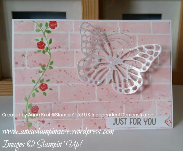
For my top layer, I stamped the vine and roses first before embossing it with Brick Wall TIEF. But I wanted to watercolour my panel so needed my images to be water-proof. To achieve it I ink vines stamp in Versamark first, followed by Pear Pizzazz ink pad – this way once stamped Versamark was on top and I could emboss it with clear embossing powder. I did the same with roses, just used one of our new In Colors: Watermelon Wonder ink pad. The sentiment is stamped in another new In Color: Tip Top Taupe.
I’ve used embossing resist technique to create the background. I applied Versamark onto the ridges of embossing folder ( on the side that says Sizzix) and run it through the Big Shot with a piece of Whisper White. Then I heat embossed it with clear embossing powder. I used Pink Pirouette, Blushing Bride and Watermelon Wonder to watercolour my panel, and added few Gorgeous Grunge splotches.
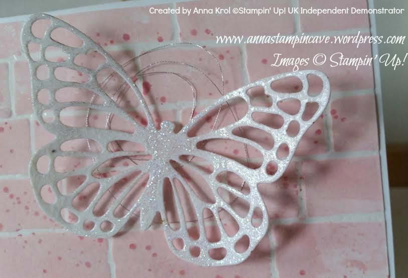
I die cut butterfly from Whisper White and embossed it using Iridescent Ice embossing powder for some sparkle. Tiny bit of new Silver Metallic Thread (L.O.V.E. this stuff!!!) and my card was done 🙂
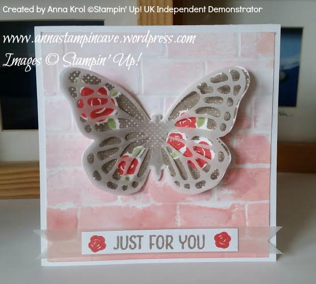
My second card measures 4×4″ and background (panel) is made using the same technique.
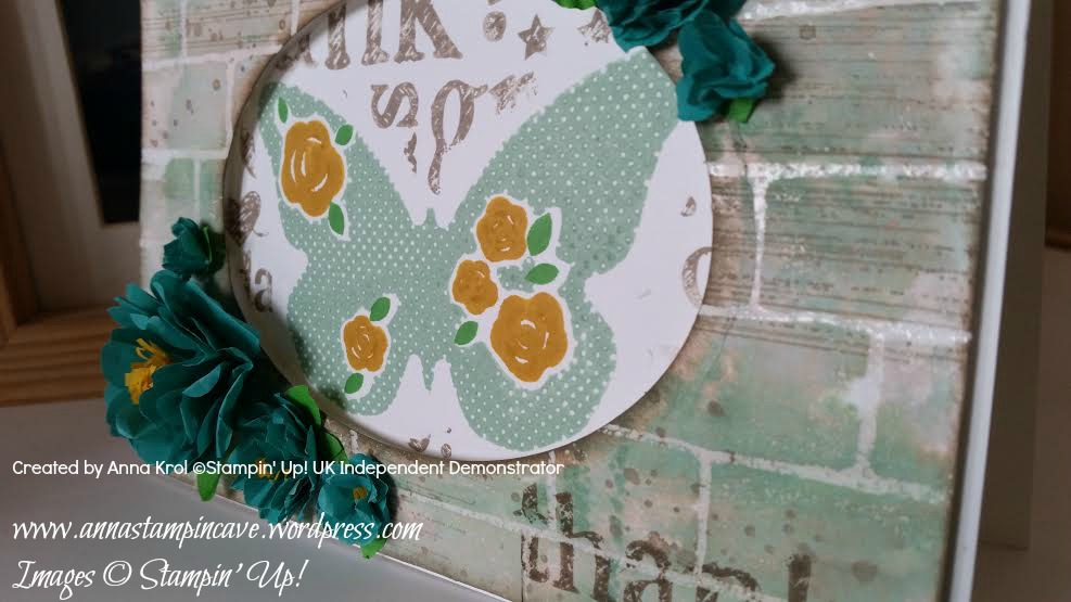
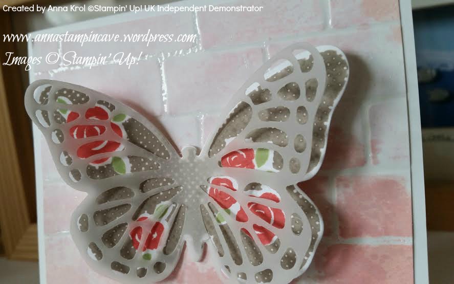
This time for the focal point I’ve used this gorgeous three-step butterfly stamp from Floral Wings set. First I stamped wings in Tip Top Taupe. Next roses in Watermelon Wonder. Leaves are the third step. I’ve used (again) Pear Pizzazz. I die cut the butterfly using new Bold Butterfly Framelits, but if you don’t have dies you can also fussy cut it. The second butterfly is die cut from vellum, this time with Butterfly Thinlits Die. I layered them together to add some more interest and dimension to the card.
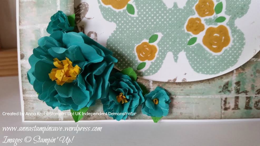
My last card for today uses same technique and stamp set like previous cards – just completely different style and different colours. I also used new background stamp A World Of Thanks and Cotton Paper. And again – I love this stuff! I know that many people got mixed feelings about it but I truly, deeply love it 🙂 Cotton paper is quite thin, like a tissue paper, but is much, much stronger. Really hard to tear it’s perfect for making flowers. It die-cuts beautifully but if you want to use punches (like me in this project) bear in mind that you need to punch through several layers at a time, otherwise it won’t punch. But enough talking – here’s my card:
I won’t go into details how I made the entire card, but…
For flowers, I’ve used Bermuda Bay cotton paper and three different punches: Pansy Punch for the largest one (six layers), Petite Petals Punch for medium flowers (six layers) and little flower from Itty Bitty Accents Punch Pack for the tiny ones (three layers for each flower).
To make leaves I’ve used Petite Petals and Flower Medallion punches and Cucumber Crush cotton paper. For the flower centres, I’ve used 2/8″ wide and around 2″ long strips of Crushed Curry cotton paper. I do not own fringe scissors however it wasn’t that hard to make tiny cuts (halfway) through those strips. Adhered them with Tombow glue.
I really hope you’ve enjoyed my projects today. Which one is your favourite? Feel free to leave a comment below. Next stop is lovely Jerim at Willow Piggy. I’m sure she’s made something beautiful for you.
Stampin’ Up!’s mission statement, called its Statement of the Heart, reads: “To love what we do and share what we love, as we help others enjoy creativity and worthwhile accomplishments . . . in this we make a difference.”
To help fulfil this statement, Stampin’ Up! launched Making a Difference program in 2003. This program facilitates corporate giving and promotes service among demonstrators and employees.
Through the Making a Difference program, Stampin’ Up! partnered with Ronald McDonald House Charities (RMHC). Each year, we design an exclusive stamp set to promote the partnership with RMHC and donate a portion of the proceeds from each sale of that set. To date, more than $95,000 has been donated from RMHC stamp set sales.
Stampin’ Up!’s demonstrators are also encouraged to volunteer their time teaching local Ronald McDonald House guests the creative art of rubber stamping through the Making a Difference program. Demonstrators also create cards at training events which are donated to Ronald McDonald Houses. Those staying at the Houses then use the cards to keep in touch with loved ones while they are away from home.
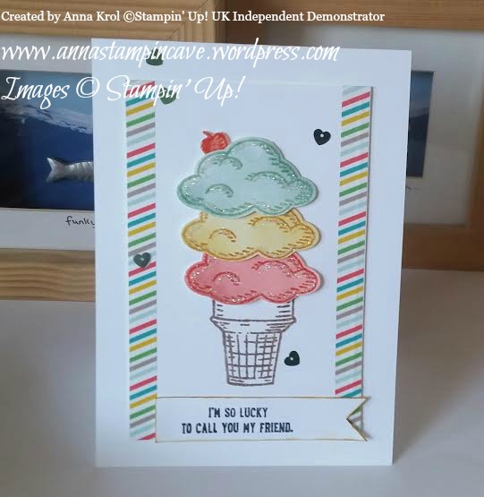
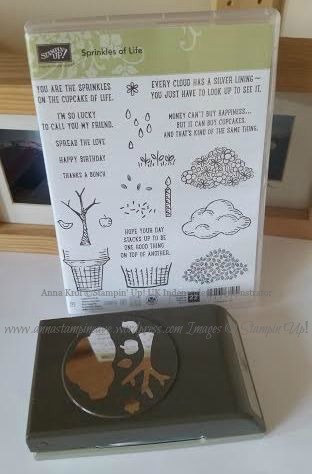
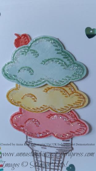
And this year is no different…except now there is a matching Tree Builder Punch that coordinate with RMHC stamp set “Sprinkles Of Life”.
Isn’t it awesome! First of all this stamp set consists of a whopping number of 22 stamps! Yep! You hear me. And it’s so versatile. You can create cupcakes, ice-creams, trees, flower pots, piles of leaves, clouds…and many, many more. With just one stamp set. Pretty amazing, right? So let me share my little make.
And truly, I won’t tell you how many techniques I’ve used on this single card: watercolouring, heat embossing, clear heat embossing on the stamped image, using glitter, sequins, washi tape… and I had tonnes of fun creating it!
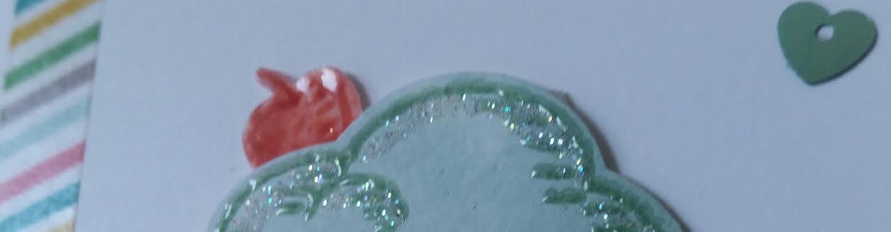
It just looks yummy! Oh, and cherry on top?!
Cherry is made from an apple, water coloured and clear embossed to add a little bit of shine.